2006/11/30

Motorola's e-paper phone

Via macsurfer, I read at the Register that Motorola is shipping a 9mm thick (!) phone with an electronic paper display. I had no idea that e-paper was ready for this kind of thing — great news for the future.

I guess this is how new displays are going to sneak up on us. First it was OLED mobile displays, and now e-paper. It’s only a matter of time before they’re enlarged and LCD becomes obsolete.

I think this really shows how well Motorola have turned around in embracing radical new ideas and technology. And that they have a really good design sense at the moment — steering clear of the bulky over-featured phones offered by the other major manufacturers. This is similar to how I’d imagine an Apple phone, actually. Bravo.

2006/11/27

Yann Tiersen at Carrick Hill

Well, I had a pretty special weekend. A long while back, I discovered by chance that Yann Tiersen was going to be touring Australia, and that he was even coming to Adelaide. Then I discovered he was playing two days at the French Festival, and tickets were only $20 a day. The marketing wasn’t great — imagine if I had missed it? I was totally there, along with the man with whom I became a Yann Tiersen fan:

You could call us “Yann buddies”, I suppose. For those not in the know, Yann Tiersen is widely known outside of France for his soundtrack for the movie Amélie, which he somewhat lifted from his other albums. It’s a lovely piece of work, and the movie wouldn’t have been the same without it.

This concert was the best I’ve been to, because what I got was so unexpected. I had heard a rumour that he wouldn’t be playing live at all — it was a cruel trick and he’d be playing via satellite or some such (I mean, $20?! That’s like 10 Euro and a bit). And then others were less than keen because he was playing guitars, and his earlier albums were very much not rock; more classically inspired, I suppose.

So the weekend crept up on me over the months (having bought my ticket as soon as I could), and suddenly I was calling up Chris asking when he’d come by so we could get there. My denial of cars does make transport rather dependent on others at time.

And with no expectations at all, after a day of light drinking, heavy eating, and tremendous heat, there appeared an incredible band with some sort of progressive rock sound, but often to the tunes I knew much better as piano-accompanied. Not that the classical elements were all gone:

but damn did that band know how to rock out. Yann switched instruments between multiple guitars, violin, accordion, and mini-pianos (?) almost just because he could,

backed by a fat bass, cello (and other strings, albeit played like a cello), and second guitar, whose methods ranged between violin bow and electric drill to produce sound from the thing. It meshed so perfectly with the metamorphasised songs I knew and the newer songs I didn’t; I never imagined it, and it surpassed anything had I tried.

His skills on the violin and accordion really shone out. When playing those instruments, his whole physique would change, his face would soften, and his hands move faster than I could keep track — how can such music be possible?

As the first day was sublime, I made a trip of it on Sunday to repeat the whole event. And the second day in a row did not disappoint.

The only other thing I have to say is that his earlier music doesn’t make its mark on his demeanour; maybe I can’t see through the French exterior, but he looks far more haunted than I had imagined from his earlier music. The music direction I heard yesterday, frenzied and powerful, suits his face a lot more. But why should it be a beautiful man who makes beautiful music?

I regret terribly I didn’t approach and talk to him briefly, but what would I have said? In another lifetime…

2006/11/22

Resolution independence: the problem with bitmaps

I can’t keep up with the discussion on resolution independence that started a little while back and to which I added my thoughts the other day.

The IconFactory rebutted the claims about their vector image being composed of bitmaps — how else do we expect such effects to appear in icons? And fair enough. The field of raster image processing is far more advanced than vector; you need vector support for things like gaussian blurs in an image format before they can be included in a vector image. None of this is impossible (see Windows Vista) but it does require work.

Many people have been saying that high resolution bitmaps are all we need. And I challenge that claim. Again, I’ll reference Ian Griffiths; this time, see this article discussing Apple’s then-new 30 inch LCD display. In particular, note the visual artifacts shown in the “Click me!” button he shows; that’s the crux of the argument.

In a nutshell: bitmaps are fine, provided they exist by themselves. Icons, for example, possibly are best represented in some ridiculously large bitmap with a million pixels or so. All it’s going to do is sit on screen somewhere and presumably change size at various points. Nothing to worry about; decimation with low-pass filters (or whatever “smart” re-sizing algorithm you wish) works fine to rescale the image nicely (see Mac OS X’s Dock).

However, interface elements that have to align with each other must not exhibit scaling artifacts that are inevitable when dealing with raster images. “Resolution independence” implies that the sizes of interface objects can be specified in real world units (points, millimetres, inches, …) and render at the correct size. A bitmap has no provision to scale its internal features accordingly. What do I mean by this?

Say you’ve got the edge of a scroll bar rendered with blurs, transparency, whatever effects you like, and this has to mesh with part of the window that cannot be drawn as a bitmap of the same size. When these bitmaps are scaled, no matter how high their resolution, when it comes time to remove pixels from the image, rounding issues are going to affect which parts of the image stay and which are removed. Similar to anti-aliasing, a sharp hairline may end up a fuzzy mess if it doesn’t snap exactly to an integer number of display pixels. Bitmaps of different sizes will rescale and render such features in a non-controllable way. So you’ll end up with lines that change width when they shouldn’t or have off-by-one errors between adjacent interface elements.

And even with high-res displays, it’s surprising how much a “one pixel off” error stands out. This problem can only be solved satisfactorily (once and for all) if interface elements that must co-exist are all depicted as vectors and are sampled to the display resolution all as one.

To summarise: icons are fine as bitmaps. But there’s more to a graphical user interface than icons.

2006/11/19

iPod vs. iPhone vs. everyone else

At this stage, I’d wager that the iPhone will not exist. But before I go into that I’d like to provide some link love for people that write better than I. These things only tend to happen when I happen to read similar ideas in dissimilar articles, especially since my del.icio.us client broke. It’s just a coincidence thing, but the (localised) convergence of ideas makes me want to write.

Everyone’s favourite chocolate-inspired developer, Scott Stevenson, writes about user interfaces, primarily concerned with the (perhaps) storm in a teacup debate about whether bells and whistles are really necessary. And provides the first reference I’ve seen in years for the (classic) Mac OS Oscar the Grouch trash animation. “Oh I love trash!”. Anyway, let’s see if I can extract the idea he talks about:

Up until the last few years, a Mac app with a nonstandard user interface usually came about because the programmer didn’t know much about the Mac. They didn’t see any particular problem with using a push button as toggle switch. […] The other major difference is that this new interface concepts are designed by people that specialize in it. […] This is in stark contrast to Unix developers in the past who would basically make educated guesses about user interface.

Hold that thought for later — arbitrary engineers don’t know interfaces. In an unrelated article on Apple’s possible “iPhone”, jesper from sweden writes about how phone software (that is, the user interface of mobile phones) is, give or take, atrocious:

I have a Sony Ericsson model that can nail a note to the standby menu screen, and the Nokia I used to have slapped the Sony Ericsson around the block when it came to the address book.

I just checked, and it takes greater than six button presses, after the message is written, to send a message on my Sony Ericsson phone. Back when Nokia became popular, it was because they managed to design their entire interface around two buttons (the big button and cancel) and two navigation buttons, up and down — and it was the simplest, easiest phone on the market to use. The self imposed hardware restrictions forced them to design a good user interface.

Somewhere in there, the whole idea of simplicity was totally lost, and within a couple of generations Nokia phones were no better than all the others, with up to five or six or seven buttons to do various things and then four navigation buttons. Is it any wonder that people want “just a phone” these days?

There are so many preconceived notions I have about mobile phones, from how ring tones are annoying, to how predictive text could be so much better — give me a damn complete dictionary and make it pre-emptive and that’s a good start. To how the whole communication model just kind of happened; no-one thought through the popularity of asynchronous conversations via text messages. Could you do the same thing with voice? (Google just implemented something similar with Google Talk.)

What I’m trying to say is that there is a mold out from which Apple could very much break. Apple could design a phone without a numeric keypad. Think about it. When do you actually have to type numbers into a phone these days? Is it often enough to dominate the hardware interface?

Finally, Brian Tiemann writes about how the iPhone might not be a phone, but just an iPod. And he nails it. Why would Apple release a separate product “the iPhone”? John Gruber wrote earlier this year “Apple’s only serious competition [to the iPod] to date has been itself.”

It would be ludicrous to put aside the huge mindshare behind their most successful product and supplant the iPod with a superior device. “Are you getting an iPod?” — “Nah, the iPhone is so much better”. Apple trademarks names it doesn’t use just so other people can’t. Just as they did with the “iPod photo” (!) and the “iPod video”, Apple will release the “iPod phone” or “iPod talk” whose functionality will soon enough become ubiquitous enough that the suffix is dropped. (Let’s face it; the rumours are solid enough that something’s going on.)

Apple doesn’t seem to think its customers will be confused by having multiple products, over time, with the same name. There’s no need for a new name. It’s not the iPod X34, replaced by the iPod GH87, with its baby brother iPod LMP331. They’re just iPods, and people, unsurprisingly, seem to prefer the simpler title (if they even notice the dichotomy in nomenclature).

In summary: Apple’s gonna make a phone. But it’s going to be an iPod. And luckily, this time round, they didn’t paint themselves into a corner with an overly restrictive name for their product.

And that’s a selection of thoughts in my head from earlier this afternoon.

2006/11/16

Debunking an anti-vector art argument

There’s been some recent discussion on Mac OS X’s upcoming resolution independence. I’ve been interested for a while in this topic, but never managed to write about it much. Eighteen months ago Ian Griffiths discussed resolution independence in relation to Mac OS X’s upcoming support and what was already possible in Windows Vista. There’s a couple of good examples in there, for general interest.

A couple of people have chimed in on how you don’t want vector art, mostly because when you shrink it down you don’t get results as high quality as a hand-tweaked bitmap. There are two things here, exactly analogous to font technology. Long story short: you don’t want to shrink down a complex image too much, because you’ll lose detail and the smaller objects in the image will just disappear. Much better to design images for their display size; for example, thickening hairlines as the size decreases.

Over at the Iconfactory, they cover such points with another: vector art takes up more disk space when it’s complex. This is fairly untrue. They use the example of the same image in “vector” PDF and in bitmap PNG, with the higher-quality PDF a whopping 30 times bigger. And opening these files in an image viewer shows that displaying the PDF is far more processor intensive.

Seemingly damning evidence. However, zoom in real close to this image and you’ll see the reason this so-called vector image is so large: you can see by the individual squares of flat colour that it doesn’t use real vector gradients!

You can imagine that if this image is actually storing individual squares of colour at the size shown above (2000% magnification), then the file certainly is going to be enormous!

So what’s the deal? What has happened in this image is that their drawing program has rasterised the gradient into the vector image, resulting in an extremely high resolution texture in the image — resulting in the huge file size and slow processing seen. So in actuality, the image is not a true vector image.

To be a true vector image, the gradients themselves would have to be represented as vectors as well. Vector gradients cannot be as complex as the generated gradients as used in their image, but they are actually vectors. The display technology used to render the gradient would compute only the pixels being actually displayed in their subtly changing colours.

I’d like to conclude by quoting ssp, who has sensible things (as usual) to say:

I do think that using vector graphics in the process of icon design may be a good idea. Working with vector graphics seems to make people think more in terms of large structures than in terms of small details. And thus, for simplicity’s and clarity’s sake, basing an icon design on vector graphics may be a good thing to do.

Apple takes to the sky; airlines ‘amazed’

Recent news out from Apple announce iPod integration in airlines. This would be pretty nice, although something tells me it will be a first-class feature only; sad news for poor flyers.

In a perplexing turn of events, however, it turns out that the announcement may have been a little premature. A Dutch friend informs me that two of the airlines, Holland’s KLM and Air France, haven’t signed up to any agreement and actually are rather perturbed about the whole incident. Dutch article here, or a Babelfish snippet:

KLM reacted however astonished to the communication of Apple. “it is correct that exploring conversations have been but the chance that it does not continue is now much larger than that it continues, however,” a spokesman of the Dutch airline company said.

(Ah, automated translation. I wonder if Google’s service works better; it’s not available, yet, to translate from Dutch.)

This is the kind of thing you don’t expect to come out of Apple, given their notorious reactions to companies that do exactly this kind of thing to them. Considering they seem to all be airlines outside of America, perhaps there were wires crossed somewhere over the ocean. Without forthcoming information, and you can guarantee there won’t be, all we can do is watch on in amusement and puzzlement.

2006/11/05

Umberto Eco on religion

Stumbled across wise man Umberto Eco’s website where he has an artice About God and Dan Brown that closes with:

I think I agree with Joyce’s lapsed Catholic hero in A Portrait of the Artist as a Young Man: “What kind of liberation would that be to forsake an absurdity which is logical and coherent and to embrace one which is illogical and incoherent?” The religious celebration of Christmas is at least a clear and coherent absurdity. The commercial celebration is not even that.

Good stuff. To add some context, earlier in the piece:

Human beings are religious animals. It is psychologically very hard to go through life without the justification, and the hope, provided by religion.

I wonder if this will always be true. Science as a religion is still new (the philosophers seem to be ahead of everyone else, as usual) and there are millennia of religious devotion to overcome. I’m keen on the idea of a religion of society (clearly, we can’t all become hermits so we need to organise ourselves around something); would it be possible to craft that well enough to fulfil the hopes of the everyman?

Wine makes you strong

I like wine. You could say it’s somewhat of genetic trait; both my father and my grandfather have a “healthy” fondness for the stuff. I can’t speak for them, but I tend to find that I also can’t stop drinking it, especially when it’s half decent. I really cannot understand how people stop after a single glass.

Digressing for a paragraph; I’ve heard people say that in blind wine tastings of red and white at equal temperature, people only have a 50% success rate in guessing the “colour”. I don’t believe it in general, although I’m sure some reds and some whites do taste similar. There’s no way a shiraz and a riesling (again, half-decent) have anywhere near the same taste. But I do believe that most of the wine tasting experience is psychological.

Before today, I thought it was but a single glass of wine per day that was supposed to be good for you. But now I learn from the dubiously impartial red-wine-and-health.com:

The key to reaping the health benefits of red wine seems to be moderate consumption […] In the US, drinking in moderation means one glass for women, and one to two glasses for men.

Well, two glasses is better than one. But the good stuff follows…

The “sensible limits” in the UK and EU are two to three glasses of red wine per day for women and three to four glasses for men.

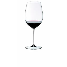
Huzzah! And we all know who live better out of the Europeans and the Americans. Presumably, the Europeans drink their four glasses over the course of the day, not all at once. Also, I guess that’s not four glasses in one of these 900mL beauties, either. That’s one dem fine wine glass, yes sir.

Not that you’d drink that much from one of those anyway, but I’m guessing they do mean four small glasses.

If I drank about 2 bottles of wine per week, that’d be around 10 cases per year. Assuming I’m drinking half-decent wine, that’s about $1000–$1500 per year for scientifically tested (and delicious) health benefits. I wonder…