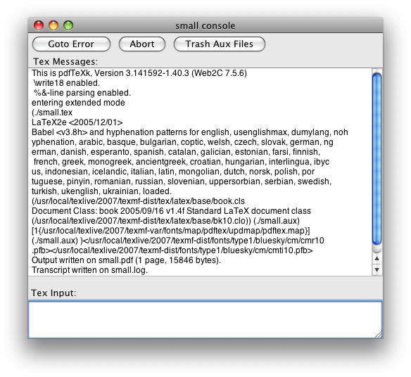
Sometimes I expend energy doing things that to the untrained eye look like a waste of time. Take TeXShop’s console window:

That’s easily the single ugliest window I have to look at on a daily basis. Running Matlab is a close second, but I’m not doing that quite so often these days. But considering both my work and my play is done in TeXShop, that’s a lot of ugly looking right back at me.
Eventually you just can’t take it any more.
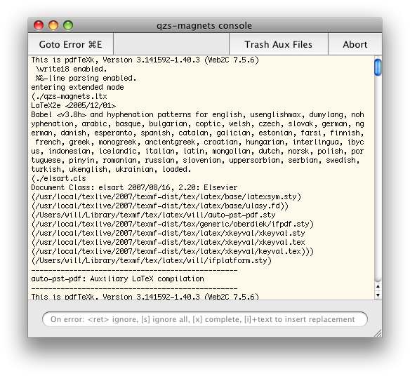
In the end, a few long minutes messing around in Interface Builder yields a relative delight:

Ah, bliss. I’m literally a happier man for veritable seconds every day. I’m sure you’ll agree that the benefits of this can not be understated.
A couple of notes about the design of the window itself. Note the output of TeX is hard-wrapped before printing to 80 characters, so it’s essential to have a fixed width font in there. Using Helvetica as the default is just crazy. Since we know that 80 chars of Monaco 10 takes up about 500 pixels, the window can be fixed to that width. (To do this “properly”, you would want to adjust the width of the window depending on the size of the fixed width font that has been chosen.)
I’ve added a slight yellow colour to the window; this facilitates easy of background recognition when you’re trying to grab a background document. When there are three windows per document (source, output, console), it’s important to distinguish them in little ways. It would probably be better to consolidate the console window into the source, visible only during a typesetting run; this is more work than I have time for, however.
The placeholder text has been carefully constructed to try and get people to use the various commands that are available on error during a TeX compilation. The best is i, which replaces the token on which the error occurred with whatever text you write. Pity it doesn’t also edit the text of your document to synchronise the correction. Again, it would be better if this text field only became visible after an error had occurred.
The destructive buttons “Abort” and “Trash Aux Files” have been moved to the right to separate them from the constructive button “Goto Error”; I like adding keyboard shortcuts to interface elements (in heavy moderation, of course) so that I remember to use them.
Finally, the scroll bar (that disappears when not required, by the way) is mini-sized. Scroll bars are an anachronism in the era of two-finger scrolling and mouse wheels/balls (to a certain extent; they shouldn’t be eliminated entirely), and the fewer pixels used for their representation, the better.
Update: the NIB file can be downloaded here: TSDocument.nib.zip. To install it, pull up a contextual menu on TeXShop in the Finder and select ‘Show Package Contents’. Then drop it intoContents/Resources/English.lproj/ (or as appropriate for your localisation; only tested with English). Probably a good idea to make a backup of the original…