2006/08/28

XML document formats (and TeX)

This post began as just a teeny tiny mention of how, with Apple supporting OpenDocument in its next release, TeX supporting unicode and OpenType fonts, and Microsoft Office using Open XML, things are going to get interesting in the document applications arena over the next few years.

But the comments thread in that last link got me going. There’s been beef apparently between the OpenDocument people and Microsoft, whereby the former believe that Office should have just used their solution and Microsoft didn’t want to fit their feature set into what ODF provided. Similarly, MathML wouldn’t have worked as a document format without extending it to support other Office features (track changes, e.g.), and that’s one of the main criticisms generally of how Microsoft “supports” standards (embrace, extend, …). David Carlisle (of LaTeX3 project fame, from my point of view) put things more eloquently in the thread under discussion.

The odd one out in all of this are the TeX-based solutions. While xmlTeX can parse, uh, XML, and ConTeXt can handle MathML, it becomes hard for me to see where or how TeX-based markup documents can co-exist with MathML apps (which will be able to copy/paste editable equations like plain text). You’re not going to want to insert some hideous MathML into your otherwise nicely marked-up TeX doc:

<math>
  <mo> &sum; </mo>
  <msupsub>
     <mi> x </mi>
     <mn> 3 </mn>
     <mi> i </mi>
  </msupsub>
</math>

But it seems that isn’t so much a problem after all, with a quick search resulting in a highly relevant paper on [MathML to TeX conversion]. The problem, finally, is editor support. With tagged PDF allowing MathML copying from PDF documents (correct me if I’m wrong, but I believe this is possible), and editor-based MathML to TeX conversion into the source, TeX would work just as well as, say, Office 2007–Mathematica (to give but an example of MathML applications) as a first-class copy/paste citizen — a situation that’s not true today.

2006/08/24

Text in UI design

Sometimes feeds roll in articles that are surprisingly congruous. Over at Impulsive Highlights there’s a screenshot (which will surely be removed soon) of an upcoming preferences panel in a Leopard app for decompressing zip files.

Sometimes you want to keep the zip file after expanding it; sometimes you don’t. (A brief shoutout here to the old Stuffit archive format since I’ll never have the chance again. It was great back in the nineties when you’d get a progress meter saying things like “Unstuffing 34 files” — I still remember the comment about how on a PC it was a lot more boring to decompress files!)

Back to this preference panel; it offers an option called “Keep unarchiving dearchived file(s)”. Either it’s someone’s idea of a joke, filler text to be improved in the future (and I love it!); or it’s a classic example of why programmers shouldn’t write interfaces. Really, “unarchiving dearchived…”? So great.

At the same time as this nugget crosses my reading path, I also come across ‘The long road to simple: creating, debating, and iterating “Add an event”’. Here, the 37signals guys show how much work is required (or, at least how much work they do) on iterating a single text element in an interface to achieve the right mix of consise-ness and explainability. Wonderful stuff.

2006/08/21

Lemon jam

We’ve got heaps of lemons:

Somewhere along the line I got the idea that it’d be a pretty good way of getting rid of them by making lemon jam. Or lemon marmalade. Or lemon jelly.

Turns out you only need like six lemons to make enough jam for a couple of months. So the long term goal of actually using those lemons is still a little way off. (I’ve started squeezing them into ice cube trays, but I’m dubious if we’ll need kilos of the stuff.) But the process of making the jam, which I now highly recommend, was a bit of fun, and the recipes I found for it were a little confusing in their variety. I just sort of interpolated on the easiest ones.

I think the fact I chose the easier recipes makes what I made lemon jam, rather than marmalade, which seems to be more complicated. Don’t even talk to me about glass jars; I just use a recycled plastic honey container.

First step in the process was to pick the lemons and wash them. And try and remember that boiling the things for an hour would kill all the germs from bird poo. Gross. So, I started off with about a kilogram of lemons:

The first time I made lemon jam, I peeled them and cut the rind into little pieces. This time, it was much easier just using a grater. I chucked this in a huge pot with about 1.4 litres of water.

Since the white stuff on the outsides ("pith") of these lemons was so thick, I didn’t want to use any of it in the jam. (Last time, I added a little and it became a little bitter; add to taste, I suppose.) After taking off all the peel, I realised that I’d lost fully half of the mass of my lemons. So I put in two more just for luck.

Since the lemons are boiled for ages, it didn’t matter that I cut them into fairly coarse pieces to add to the pot.

Then it’s just a matter of waiting. This time ‘round, I boiled the lemons for an hour with the lid on, then took the pot off the heat. (I’m wary of burning the sugar in the next step after an unfortunate housemate incident.) At this stage, the whole house smells like lemon. Yum. But not too good to eat. Now we need sugar. I added about 1.25 kilograms of it, stirring it in as I went.

Finally, I boiled the mixture and left it simmering for about another hour. Apparently I was supposed to be skimming off the foam, but I didn’t. You can tell it’s done when a little jam left on a spoon to cool sets to a jammy consistency.

So, 8 lemons down, 92 to go. To summarise:

  • Wash eight thick-skinned lemons
  • Grate the rind
  • Peel the lemons, discard most or all of the pith
  • Cut the flesh into pieces
  • Boil the rind and the lemon flesh for an hour in 1.4 litres of water, or thereabouts
  • Slowly dissolve in 1–1.5 kg of sugar
  • Boil for another hour
  • Yum!

2006/08/14

Time Machine not quite so ugly after all

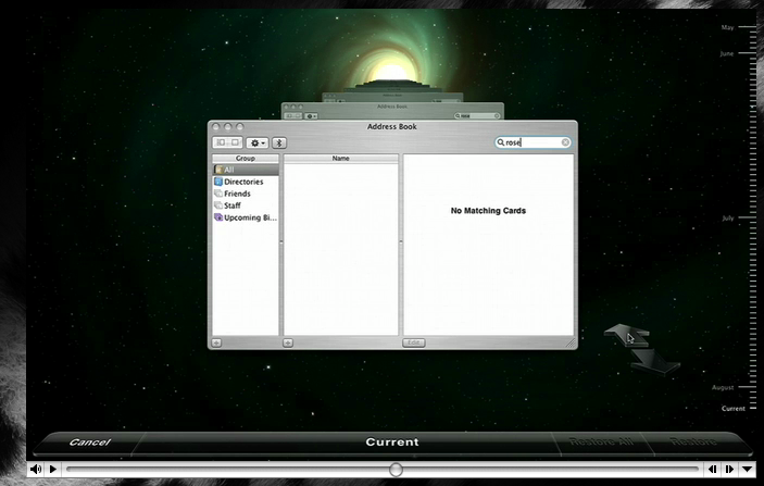
Okay, so there’s some slight good news on the interface front. While Preview.app has gone done the drain with those awful blue pill buttons, Time Machine is more toned down than shown in the keynote. Here’s the version shown publicly on apple.com:

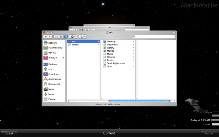
And here’s the version shown on HardMac:

I’m pretty keen on the update, although I think the bottom panel can still be improved. Fingers crossed that I’ve gauged the direction of the user interface evolution correctly; it could well be that the ugly version is the more recent!

Anyway, say what you will about the appropriate-ness of the interface. Those moving stars in the background get my vote any day. Teehee.

2006/08/08

WWDC: Paul Thurrott vs. the Mac community

Just a quick link to Paul Thurrott, who has the audacity to bitch about the newly announced features of Leopard. He’s got a couple of good points. For me, I find it’s the last 10% that makes the update worthwhile, rather than the big ticket demos.

But people in the tech community, i.e., those who should know better, really have to stop taking marketing so seriously. WWDC is covered by, like, mainstream media all over the world, so of course it’s going to be saturated with (a priori overblown and possibly propaganda) marketing. And of course Mac OS X is playing catch-up to Vista. That’s the whole nature of competition.

By now, it should be obvious to anyone interested that Vista’s going to be very feature rich, no doubt over and above Mac OS X (e.g., all the media centre and tablet PC software that Apple doesn’t, regrettably, have the hardware to support). Hell, Steve didn’t even announce anything about resolution independence. And those “top secret” features he doesn’t want to mention yet? Read “not ready yet even for public demonstration”. Here’s for a revamp of the interface (that the interfaces shown are so similar to Tiger’s this idea bears some consideration — and oh god! Mail still makes my eyes bleed).

I’d also like to see features based around resolution independence such as “online Exposé”, whereby background app windows are shrunk by a user-specified magnification factor (the inverse of Dock magnification, of sorts). Not to mention transparent support for high-res displays. I actually expected new displays today with resolution in the order of 200 dpi, but you can’t please everyone. I guess the LCDs just aren’t ready yet for any reasonable price.

Reactions to Leopard: Time Machine

Some details have been revealed for Mac OS X “Leopard”, which will be available circa the same time as Windows Vista. I couldn’t watch the keynote, either through network difficulties or plain congestion. But I’ve some comments on the new features, even if I’ve only got annoying voice-over man to explain them to me.

The most plainly useful, and innovative, feature of Leopard is its backup support through the “Time Machine” feature — see Apple’s explanatory video. John Siracusa discussed the need for this last November: (boy, where has the time gone?)

Her Mac has made creating and organizing digital content so easy that it now contains gigabytes of the stuff. I often find myself thinking ominously about the consequences of a catastrophic hard drive failure in her now almost three-year-old iMac. All those photos, all those movies, just…gone. Poof!

I’m similarly worried about my own computer at the moment, since I’ve a PowerBook with no good backup plan in place. John above proposed two hard drives in every Mac purely for the sake of data redundancy, and this is a stellar plan. “Time Machine” in Leopard is the software component that makes it even better, and is literally better than anything I imagined Apple (or anyone else) would implement. This is more than just backup.

It’s not clear to me how accessible the hooks here will allow such a thing, but imagine text editors being able to visually diff, in real time, content through revisions. That’s system wide changes-tracking, and better than what everyone harps on about in Microsoft Word. I’m now expecting this exact feature in iWork’07. More generally, will Time Machine make local version control systems redundant?

I’m with Jon Hicks though: deep space background with grotesquely distorted type (fine, “in perspective”) at the base of the screen? This could be so much more elegant while still retaining its wow factor. On the other hand, considering how infrequently — and in which contexts (oops, I overwrote a document I need; or, help! where’s my stuff?!?) — I expect the feature to be used as in the demo, I’m not even sure that such a whiz-bang interface is even appropriate! Hopefully there’ll be at least some minor visual tweaks before the final release. Don’t get me wrong, however, I think the basic premise behind the interface is fine. It’s just the useless 3D buttons and background I’m railing against here.

More comments on Leopard as time allows…

2006/07/29

CNet's (crappy) UMCP vs. Newton review

CNet (UK) has up a slightly tongue in cheek comparison review of a 1997 Apple Newton and a 2006 Samsung UMCP thing. Blah blah, the Newton wins. Cue “Wasn’t Apple great back in the day?” kind of response from all reading.

Actually, although I’ve never actually used a Newton (I did see one once…it had Daleks!), it does seem like it should have been the success story of the mid-90s Apple. Considering how far ahead of its time it was, with better marketing it could have been the iPod of its day. I presume. Pity Steve had to kill it when he returned, or whatever.

Anyway, back to this “review”. It’s a waste of time. Rather than actually looking at the two devices, they only compare the technology and potential of the devices. No actual investigation of what the two things do is shown. What’s the point in that?

Sure, I think it’s unbelievable that the Newton has 30 hours battery life and costs $50 on eBay, and is seemingly still fairly usable (read, connectable) today. But maybe its handwriting recognition is in fact 10 years behind, or maybe the Samsung UMCP really doesn’t have any software worth using on it to take advantage of the device. Maybe if the review was comprised of someone new to both platforms taking them around with them for a week and comparing those experiences, it’d be a worthwhile read.

But jeeze, comparing the glossiness of the plastics of their cases is much more interesting to me, right?

It would be exciting to see Apple take another strong interest in this market, though. Come on, 30 hours of battery life? That’s amazing, when the music players of today boast less than that. It would be a pity if all the people that did the great design of the Newton are long gone from Apple, though.

So, in summary: Newton good, wish it was newer. CNet review bad, wish they didn’t waste their time with images of people punching each other.

A bit of humour required

Sometimes people take things a little too seriously. Come on, it’s just an ad!

Here’s something a little more worth complaining about.

But I guess there are more important things to worry about than bitching by bloggers.

2006/07/26

Gartenberg's iPod vs. Zune podcast

I was just going to link this in del.ici.ous, but I wanted to make a couple of comments on it. Someone has interviewed Michael Gartenberg on Microsoft’s Zune, and I actually listened to the podcast “Analyst Doubts Zune Will Include Gaming”. (Dumb title.) I reckon this Michael guy’s pretty clue-y.

First thing’s first: don’t you reckon the girl in the beginning of the podcast sounds exactly like the radio morning broadcast at the beginning of “The Journeyman Project”? (Okay, that’s a memory from circa 1994, so it might be a little hazy. P.S. I never got anywhere in that game. I was lame at age 13.)

Way to go off-topic. Secondly: Podcasts suck for listening to when trying to do other stuff at the same time. But who wants to listen to them tomorrow when I’m walking to work? Transcripts are so the way to go. Video blogging, on the other hand, might have something to it. Ha.

Oh, so what about that Gartenberg guy? Great points, to sum it up:

  • Microsoft can only differentiate themselves by adding things like wireless and satellite radio.
  • Users don’t care for such niche stuff.
  • Steve Jobs is always one big step ahead.

Frankly, I’m appalled that Microsoft’s being so blatant about the whole thing (come on, competing against your partners? That’s so immoral), and Gruber, as usual, has it right on the nose.

The Year of Nicola Tesla

How did I only find out about this in July? I used to be, shall we say, somewhat enthusiastic about Nicola Tesla in my undergraduate years. Such an amazing and tragic life. I just read on Wikipedia that somehow scientists have managed to confirm that he did in fact communicate with Mars in his later, more esoteric, years. (Unless I misinterpreted.) Can you imagine? Pity there was no-one listening.

Anyway, check it out: it’s Nicola’s 150th birthday this year, and UNESCO proclaimed 2006 to be the “Year of Nicola Tesla”. Yay.

I discovered this reading about Sun’s financial situation from their CEO Jonathan Swartz, who — funnily enough — writes on the internet. I’m really amazed by this guy, because he comes across as candid, when all of the other “blogs” I’ve read of such important people tend to sound like marketing spiels for their companies. Sure, he’s biased, but his enthusiasm for his company really shows though. Based on his word alone, I wish Sun all the best.

Wait, I never finished my story. Jonathan mentioned his wish to own a “Tesla car”, or something. That’s exciting. Go efficient, electric cars. Or, um, efficient air-powered cars. Powered by the wind!

Well, I’ll leave this with a link to Tesla’s “The Problem of Increasing Human Energy”, a highly recommended read: (but I would say that, wouldn’t I?)

The scientific man does not aim at an immediate result. He does not expect that his advanced ideas will be readily taken up. His work is like that of the planter–for the future. His duty is to lay the foundation for those who are to come, and point the way.

2006/07/25

Lemon honey ginger chilli (garlic) drink

Having come down with a terrible cold, I thought it appropriate to write up my recipe for a hot drink that may or may not be of benefit to treating such an ailment. Beats doing the dishes, which is next on my list of things to do while staying at home in an effort to recover.

The recipe’s simple. You’ll need, in order of importance:

  • 1 lemon
  • Honey
  • Chilli (liquid or fresh)
  • Ginger
  • Garlic

Omit garlic except when you want maximum recuperative properties, as it makes the drink a bit gross. The ginger’s not extra important, but I like it. I use about one thin slice of a hunk of ginger, cut into small pieces.

I’ve got this great chilli liquid (Dragon’s Blood) that I use for the chilli (one teaspoon’s worth, or to taste), but fresh cut chilli also works (one small, hot, chilli).

Preparation: Cut the lemon in half, squeeze both halves into a mug to get the juice. Seeds can be fished out if desired. Add the chilli, ginger, and garlic, using a tea strainer (like this one) for anything solid. Fill the mug with boiling water, and add generous amounts of honey to taste. Yum. The strainer can be re-used for at least one more mug of the drink.

Okay, I don’t drink this so much when I’m healthy, but it certainly beats any sort of cough medicine you might be prescribed.

2006/06/21

iTunes' $10 movie

There’ve been a couple of reports that Apple wants to start selling feature length movies on iTunes for (US) $9.99. And that Hollywood is resisting the idea to have a flat rate. Let's disregard the problem of how this whole thing is tied to iTunes, which should only be used for music.

(As a side note, it would be ideal if buying an online film through iTunes was independent of file quality, but I’m certain that won’t be the case. I’d expect 640 by 480 resolution at most due to file size problems, but I also expect they’ll want us to pay up again when the resolutions are eventually bumped up to HD. That’d be getting something for nothing, otherwise, and there’s no business sense in that, unfortunately.)

Having been a somewhat avid DVD buyer for a few years (I’ve since — mostly — given up, as the number of movies I really want to own doesn’t increase very often), I’m totally keen on the idea of a flat rate. As a consumer, it’s incredibly galling to buy a movie for, say $15 only to find it a couple of months later for $10. The feeling is that there’s no real cost involved with selling the product and that the price is set fairly arbitrarily.

The biggest attraction to owning a DVD is that the huge volume of cinema means that if you really want to see an obscure title, chances are fairly slim it’ll be in your local video store. You’re literally paying for the privilege of being able to find it again, sometimes. Supplementary attractions to DVD ownership are those interminable special features, which always sound so good at the time but more often than not provide little of interest.

We buy movies to watch them. But we also pay money to see movies at the cinema for a flat rate. Not even a different charge (with the small exception of gold class cinemas) for different sized screens or for comfier seats or for movies that have been playing for weeks. So sure, charge more online for extra special features or what have you. But if I just want to watch a film, it’s obnoxious or greedy or both to make the consumer pay more depending on when they want to buy. The new release blockbusters will make up the profits on volume, anyway.

2006/06/16

Apple's openness: my data in 10 years?

This post centres around openness — what happens in 10 years when I want to access my stuff on my proprietry computer?

Let’s open it up with a quote that sums up where I stand. Concluding his followup article on Apple’s seeming non-openness of its x86 Darwin OS on which Mac OS X is built, Tom Yager said

The Mac platform is an overflowing basket of raw materials for innovators and creators of all stripes. It’s what Steve Jobs would fantasize about if he still worked out of his garage, and you can bet that he’d be livid to find that the vendor locked some portion of his chosen platform behind a gate without a word of notice or explanation.

Here’s the thing. I don’t think those would be good odds. “I could bet” SJ wants an open Apple? It’s the one question I’d love to know answered, but one I’m certain I’ll never know for sure. There’s no indication either way that Apple, and by personification, Steve Jobs, does care that much about locking up my data behind a gate, even if that gate doesn’t slam shut for another 10 years.

Mark Pilgrim started it all when he decided to switch away from Apple to Linux. John Gruber then wrote exhaustingly on the topic. Both make good points. Mark feels too locked in by Mac OS X (and Apple’s associated software), with the horrible thought that at some stage, his work or his life will be unable to be retrieved due to some poorly thought out software decision. The short of it: Apple only cares that software works now, not that what you produce with it will be useful in the far future.

John agrees that it’s a good point, going off for a while (justifiably, given his audience) on a big tangent how it’s a valid point to have. Data openness overrides any aesthetic considerations of Apple’s hardware or software. (And even then we all know Apple’s software can be pretty hideous at times.) John isn’t sure that Mark’s reaction is entirely the right decision:

…if Apple’s lack of openness were a disaster in the making, it (the disaster) would have occurred already.

But I disagree with this point. Only in the last half-dozen years has digital input and storage increased to such an extent that it’s not unreasonable to consider storing hundreds of thousands of photos on a computer in easily browsable form. Let alone self-edited home movies. The ease with which it is possible facilitates a much greater creative output than when we stored video on VHS and photos in shoeboxes.

People concerned with keeping their digitally written documents in a long-term storable form forsook Microsoft Word years ago, flocking to more stable formats such as SGML and LaTeX.

A larger (in my eyes) can of worms opens up when you consider digital music. This isn’t stuff you create yourself any more; now we’re talking about cash being transferred for media that you seemingly own. I’m scared to buy music from iTunes, for two reasons: it’s so god-damn easy, it’s addictive. But that’s a trivial reason. The second is more serious: what happens if all that lovely copy-protected music is rendered unreadable for one of a variety of reasons?

(The same argument holds for DVDs, one of the reasons I’ve stopped buying them. What the hell do I do with a whole collection of movies that will only play in Australian DVD players if I move to another country?)

And I’m talking about legal options here. If iTunes DRM is easy to crack now, then adjust my argument for something more hole-proof, such as Windows Media.

These issues literally make me scared of using computers, because it’s conceivable — to me — that I might wind up in a spiral of doom in which I end up with the choice of either abandoning my stuff or using the exact same system (same hardware, same software) in perpetuity. This later case clearly isn’t tenable.

So, what to do? The solution for music is to buy MP3s from emusic.com, or buy unprotected CDs from which to rip. This situation might not last forever, but I hope it does. Larger problems loom for movies.

The solution for software isn’t so clear. Software companies, in the ideal case, would acknowledge that they’re not omnipotent and won’t be around forever; the formats they use to store their information should be totally transparent. In the short term, that requires careful choice of software to use: I guess, then, that it’d be advisable to ditch iLife, et al., until Apple as a company starts supporting these issues. But then you lose iTunes, and that means trouble getting an iPod to work…so for now I just suck it up.

In the end, you’ve just got to have enough faith that someone, somewhere, sometime will code up an exporter for any data that’s been irrevocably locked away in some terrible future.


2006/06/14

MacBook FireWire port

Ha!

Quarter Life Crisis: “In the iBooks the FireWire port was the wrong way round. Not only did it feel unnatural to insert the FireWire cable with its ‘edgy’ side pointing towards rather than away from you. When using the iPod cable, you’d always see the Apple logo rather than the FireWire logo on the plug. Which means the orientation was just the opposite from what it usually is. And this has been fixed in the MacBook. “

I reported this as a bug years ago and received a “behaves correctly” reply. Good to see that someone was listening :)

2006/06/09

Living in a feedback loop

I’m afraid I’ve been a little busy in the last couple of weeks trying to make more time for myself. Funny, huh? My scheme was to wake up at 7am every morning and get to uni at 8am (or close to). Eight or nine hours “working” and then I’d be able to go to the gym or go running at five, leaving the late evening for cooking, cleaning, reading, writing, typesetting, or whatever.

Well, did it work? A couple of weeks went pretty well, but this week messed up somehow. Instead of leaving home at 7:30 after a quick shower and eats, I, well, didn’t. And I’m not sure exactly why, but suddenly it’s the end of the week and I’m going to have to start all over next week.

The advantage of the current arrangement is that I’ve been leaving uni at fairly consistent times, so if I don’t get in early enough, I simply don’t do much work that day. Which is bad, obviously, but it means that I’m aware of my transgression directly, which allows me to act on what caused the problem.

If my life is a dynamic, periodic system, disturbances cause error, and this error is perceived by me as irregularities in my schedule. I can compensate for this fairly easily if I’m aware of them, and so I’m hoping that a strict leaving work time will force the feedback loop I’m living in (acting on my awareness of my schedule is the feedback) to be stable. That is, errors such as spending too much time doing not work will be cancelled out because I realise them.

It’s all too easy to fall into the trap of variable sleep cycles (we don’t naturally have a 24 hour sleeping cycle — monophasically — unless at least four hours are spent asleep at the same time each night; see Stampi’s book “Why We Nap”, somewhere) and I find that I will generally be happy to go with the flow, since I’ve no strict times every day at which I need to work.

I don’t know if what I’ve written makes any sense, but I’m supposed to be writing regularly to practise fleshing out thoughts at short notice coherently. I’d like to expound on this topic in more detail in the future. I’m particularly intrigued by our repetitive behaviour (or perhaps more disorganised schedules) and the analogy that can be made with control systems. I do feel like constant feedback with the brain (revisiting yesterday’s writings, yesterday’s work, …) helps me, at least, be more directed in what I’m trying to do. I’d like to say “self-aware”, but that might sound too pretentious. That’s the sort of term I mean, but on a more subconscious level.

Ah, it all just rambling.

2006/05/26

PricewaterhouseCoopers' "interesting" logo

I came across a friend’s business card from PricewaterhouseCoopers and was reminded how ugly their logo is. Take a look: (sorry, PwC, for the direct link)

I brought this up in comp.text.tex, since the excessive scaling and kerning (vertical & horizontal) reminded me of the LaTeX logo (and others) that can be “a bit much” in running text:

The fact that it’s easy to obtain this logo within LaTeX, by typing \LaTeX certainly doesn’t discourage such usage. Don’t get me started on (attempted) replications of the logo in HTML. Bleah.

Suffice it to say that I find the PwC logo more visually offensive, even as a logo, than LaTeX’s. Anyway, an anonymous poster reminded me that such practise isn’t so unprecedented:

There’s a well-established tradition of doing this in modern calligraphy where the visual effect at least as important (and often more important) than the words themselves. It has precedents in medieval manuscript and classical stone carving.

And this reminded me that I took a photo of exactly this, on a trip to Paris a couple of years ago: (somewhere in Les Invalides, if I recall — and spell! – the name of the place correctly)

But this makes the distinction only more clear in my eyes. You could get away with something like this with a specially designed font (or a broad-nib pen!), but just linearly scaling characters of Optima and moving the letters around seemingly at random makes for a distinctly unpleasant look. The capital ‘P’ and ‘C’ both look too black because they’ve been scaled too much. Even the kerning looks wrong, (between, say “Pr” and “eW”) and that’s intentional!

I wonder who did the design…

2006/05/24

Cocoalicious again... Jon Hicks vs wspr

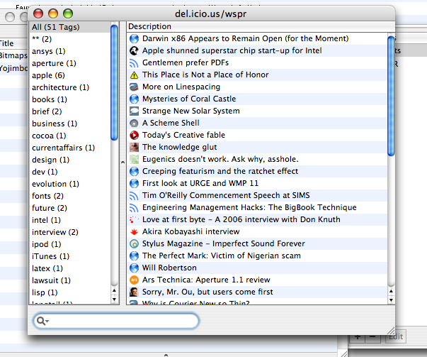
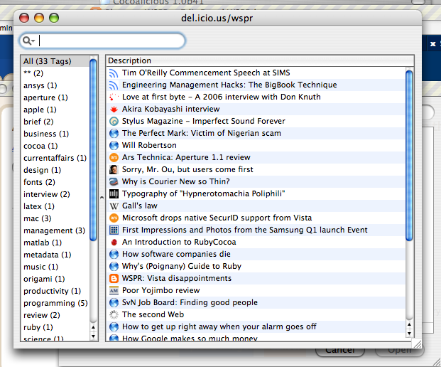
So, after my original exposition of my interface re-arrangement of Cocoalicious, I made some more changes to get rid of more of the borders. I prefer this version, except for the bottom-aligned search box (that’s just totally the wrong place for a filter-style input):

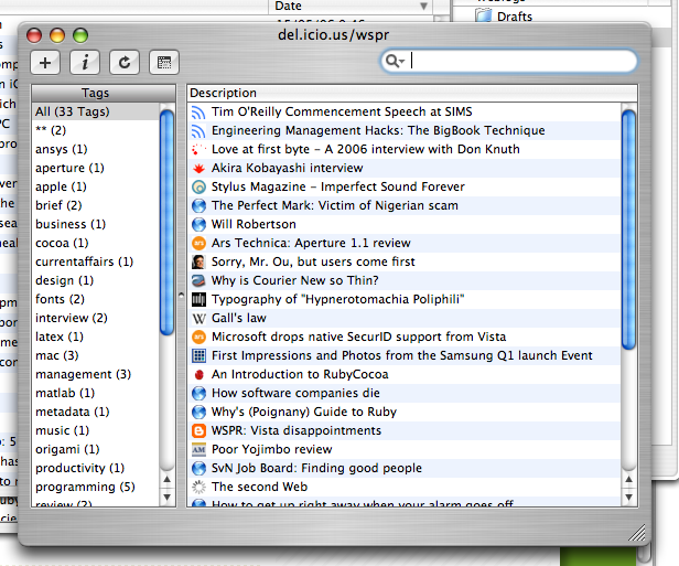
Imagine my surprise to find that Jon Hicks has performed a similar treatment! He’s been much more useful in actually providing an installer so other people can use his interface. Whereas I figured my changes were easy enough to make on your own.

I prefer not to use Cocoalicious’ integrated web browser, and you can see this distinction between the way I present my window and Jon does his. I removed the heading of the “Tags” pane because it looked metal, which didn’t work in aqua; and like I said originally, I found the buttons unnecessary so they’re out. Most importantly, I made the scroll bars mini, because really, everyone’s using some sort of scroll device by now (whether wheel or two-finger drag or the highly recommended SideTrack).

Scroll bars are so 1990s, and I can’t wait until they’re replaced by something better. Picassa, I suppose, is a step in the right direction. (Actually, I don’t mind scroll bars that much — but I do feel that they take up a pretty large amount of space considering I, at least, never use them any more.)

In conclusion, this is more evidence supporting the hundred monkey theory.

2006/05/20

MacBook second thoughts; stylus input?

There have certainly been a lot of things said about the MacBook over the last few days. A trip to macsurfer.com can give you an overly comprehensive list. Ars Technica, as usual, has pretty much the best review around (best as in covering details, but they do give it a 9/10).

I’m reassured to read in a number of places that the weird keyboard does measure up; it is weird, but it is as good, or even better, than the more conventional keyboard it replaces. I’ll be interested to see if they can cram backlights into it for the MacBook Pro models.

Here’s something a little interesting:

Touch pad: Yes, there’s still only one mouse button. Apple seems to be overcompensating for it, too, because the touch pad is simply huge—about the size of a Treo—and considerably bigger than the 15-inch MacBook Pro’s. [CNet]

“About the size of a Treo”. Wait a gosh-darn-tootin’ second. What’s stopping Apple from including a stylus for more precise input? That would just be excellent for faux-tablet functionality. And what might be next? Why, a little screen instead of the faceless trackpad.

In all reality, Apple probably just realised that larger trackpads are better, full stop, but sometimes it’s nice to dream. I do think the stylus-on-trackpad thing might work in principle, but I don’t even know if it would be possible to get a stylus to work on a trackpad, given that fingers do but inert objects don’t seem to have any effect.

Here’s an odd point:

Interestingly, when you point the built-in iSight camera at you so that your face is centered in the capture window, you will be outside the range of the optimal viewing angle [Creative Mac].

I wonder if the iSight is just a gimmick “because we can”. I’m guessing that Apple’s foreseeing pretty big things in the future for video conferencing, and they’re just anticipating everyone using iChat or video Skype. All in good time.

Finally, I wonder what it means for Apple’s product matrix to have just, essentially, three notebook computers? I love the super simplification that they’ve done on the product line (although Toni prefers the idea of an aluminium 13 incher: “the black one looks like a regular ‘puter”) but now there’s more space for something a little smaller.

Everyone’s clamoured for so long about updated Newtons, sub-notebooks, Microsoft-style UMPCs, tablets, and what have you that there’s no point discussing the options further. Except to say that I hope now that there’s a bit of space available for Apple to finally release something that will truly redefine small-scale computing. Put it this way: with the MacBook, we’ve got performance well in excess of what came before with the PowerPC iBook and PowerBooks. Don’t you think we would be able to deal with a scaled down processor that could be shoe-horned behind a tiny 8-inch touchscreen? (For example.)

Update: also, I have no problem with the name "MacBook". I haven't even seen people deriding the MacBook Pro name now; both models can be called the same thing ("MacBook"), because there's no overlap.

2006/05/18

Linewidth vs. linespacing examples

Over at Microsoft’s fontblog, they discuss linewidth and linespread with regard to the reading speed of a whole damn bunch of volunteers. They cite Miles A. Tinker’s book, Legibility of Print, with some actual quantitative analysis (gasp!) on the quality of various layouts.

I haven’t seen these sorts of numbers before, and I’m happy to see that they reflect what everyone (who knows about this sort of thing) believes: longer lines of text are harder to read, and the distance between lines of text is also important for reading quality. These are the results, which are based upon statistical data, to show people when they want to set 1cm margins on their Word document in order to save paper.

They also say:

In the comments for Typography Tip #3, Adam Twardoch asserts that the line length effects the amount of needed linespacing. Tinker’s data does not back up this assertion. This table shows that 2 points of linespacing performed the best at each line width tested.

Okay, sure, but the numbers also show that for such long line lengths, the reading speed is already shot to hell. No-one is actually suggesting that you can get away with 200mm text blocks if you have a 10pt/20pt typeface, say. (x/y refers to a font size of x and a distance between successive baselines of text of y.) No amount of leading is going to fix that mess.

Going back to that numbers business. It’s great that they’ve nicely tabulated that data for us. But numbers in a table don’t really help to get a good feel of exactly why a 43 pica line with 4pt of extra leading is actually a really bad idea. So I put together a LaTeX document illustrating the 20 different layouts examined; grab it here. The source is also available, in case you’re interested.

On the first page, I’ve put the top five layouts ranked by normalised reading speed. Subsequently, each page is dedicated to a single line width with varying linespreads. The text is chosen arbitrarily from the Edgar Allen Poe story ‘Never bet the devil your head’. Times was selected as the typeface because everyone’s used to it and it shows up bad typography more readily than something a little nicer (in my opinion). I find that this document makes it much easier to get an actual understanding of the results of the cited study.

WebnoteHappy bookmarking

Found a link to the new WebnoteHappy application in my feeds this morning. It looks quite nice, but I’m not going to bite.

So what does this app do? You get browser-independent bookmarking, del.icio.us integration, and a more complex organisation scheme than either Cocoalicious or Yojimbo. It’s certainly worth a look, although I feel US$25 is slightly on the high side for an app of this type. My real hope is that OmniWeb integrates a nice bookmark browser like this, but to be perfectly honest, I’m pretty happy with Cocoalicious and Omniweb at the moment. I’m simply not organised enough to file bookmarks as carefully as this app requires.

The one thing I miss with del.icio.us is the limited description you’re allowed. If I could be bothered, though, I’d file more rigourously in Omniweb for this functionality.

Great name, though, and I hope the release is successful. There’s a lot of room in the software space of keeping a store of information based on web browsing, I feel.

2006/05/16

MacBook amateur

Well, here it is. An I’ve got to say, I’m glad Apple played it like they did. This update has put life back into the “iBook” platform.

Some nice points:

  • The new models are thinner — close enough to as thin as the old PowerBooks).
  • They have a better screen size with 1280 by 800 pixels; I can’t stress how big of a deal this is, as an owner of a 12 inch PowerBook.
  • Black!
  • Built-in iSight is a nice gimmick…but not very useful to me, at least. I suspect there aren’t that many people yet doing video iChat.
  • Gigabit ethernet is a nice addition, but again, not all that useful in practice.
  • Optical audio in and out.
  • Don't forget MagSafe adapter and sudden tilt sensor!
  • Weird, claimed better, keyboard (see later).
  • Front Row
  • Finally, no silly 14 inch size.

Some possible downsides:

  • Glossy screen, as mentioned by Sven S Porst.
  • Integrated video, just like the Mac mini. I guess it’s better than my PowerBook, anyway.

I’ve wondered about those glossy screens before, and I can’t see how they are an advantage. Surely the greatly reflectivity, um, increases the reflections you see in the screen? Update: it looks like the glossy screens provide better contrast and colour with the detriment of added glare. I suspect they are using these screens because everyone else is, and that means they're cheaper.

So, I mentioned that weird keyboard. Apple says “MacBook features a unique new keyboard design that sits flush against the bed for a sleeker, lower profile. Plus, you’ll find a firmer touch when typing. That ought to make your fingers happy” (there’s that whole “Apple product as a proper noun thing” again; I think it was John Gruber who commented on it once before). Well, sounds good, I suppose. Take a look at the shape of the keys:

Not square! Wait, look again. They look square to me. Ohhhhh…don’t let Apple fool you. That image has been scaled horizontally on their site, but as shown above the keyboard has actually a proper proportion. In that case, damn, that keyboard looks hot. Pity about that damned Enter key, though.

All in all, I’m especially positive about this release. This Apple laptop is compact, better looking than ever, and so much faster than my 867MHz ‘book that I’m quite jealous I don’t have one. All good things to those who wait, though.

2006/05/15

Cocoalicious fun and interface adjustments

When I first came across Cocoalicious, I didn’t really get it. I didn’t really get del.icio.us, either. These things can take time, I suppose. If you don’t know what I’m talking about, check out that link on the right “del.icio.us list links”, which takes you to everything that I’ve been reading that I find interesting. But didn’t see fit to comment on here in more detail.

Cocoalicious is a Mac OS X client for del.icio.us, which allows nice things like hitting a keyboard shortcut while browsing to upload a link in one easy step, as well as providing a nice browser for all the links with their tags. Did I mention tags? I like metadata.

Anyway, I was bored and decided to play around with the interface a little, since, as it’s a Cocoa app with an easily editable interface, it was easy to do just that. Here’s the original: (click for full size)

I guess my biggest beef was the brushed metal. Too much wasted space around the edges. And truth be told, given the small amount of time spent doing the revamp, there’s more stuff that could be removed. But overall I’m pretty pleased with the result:

Oh, and I didn't like those non-removeable buttons (non-removeable in the interface, that is); keyboard shortcuts are totally the way to go.

2006/05/11

Online calendars

After renouncing the use of my PowerBook at work for efficiency reasons, I’m now in the tricky situation of having to synchronise stuff back and forth between my Mac at home and my Windows box at uni.

Generally, this isn’t a problem. I really liked being able to rsync my files back and forth when I was using Linux, which meant that I could do my writing on my PowerBook and my work on the desktop. But really, I can probably deal with using TeX on Windows; the only thing I’ll miss is BibDesk, I think.

(By the way, my switch back to Windows from Linux was due to the fact that engineering software — Matlab, specifically — just works so much better under Windows and I was sick of having to deal with Linux’s idiosyncracies. At least I know what I’ve got under Windows; even if that is an inelegant mess, it at least works for the things I need it for.)

Perhaps the biggest concern I had was a calendar platform I could use both at uni and at home, as well as allowing iSync to sync everything up with my phone. And I’ve decided it’s too hard to be worth doing. Which is a little sad, but now that I think of it, it’s not the worst thing in the world to use my phone when I’m away from my PowerBook at home.

But while trying to fix this problem, I very briefly came into contact with a whole bunch of online Web 2.0 calendar apps. A totally unrepresentative list of possible choices:

Most of these were obtained from the comprehensive TechCrunch.

I used none of them long enough to be able to actually review them in any decent capacity. But that won’t stop me from passing judgement. Each does more-or-less the same thing. It’s possible to export your data in various ways, in iCal or RSS formats, amongst others — including being able to embed mini calendars within your own web pages. It’s interesting to see the different spins each company takes, with some more successful than others at creating an experience that's interesting to use.

Of those mentioned above, I’d rank them in the order given. The first two have great, and simple, interfaces. The experience is all quite nice, and if I was the kind of person who liked web apps, I’d have no problem recommending them. (Uploading my phone calendar, however, is still a problem.) The most innovative element of both of them is free-form entry input. No more clumsy clicking. Just nice typing, e.g., “party 10pm friday at justin’s” in a text field.

The big guns, the Yahoo and Google calendars, offer exactly what you’d expect. The sort of “no design” that people like to discuss at the moment, and integration with their other services that lowers the cost of entry.

From there, Planzo and CalendarHub were respectively clumsy and broken. They just don’t have the “sparkle” to make them attractive, from more complex sign-up schemes in the former (including HTML email) to simply broken functionality in the latter (beta, I don’t care — if they’re public, they should work). The interfaces to both were cluttered and not pleasant to nest in.

But the real lesson I learned was that web apps are really at the cutting edge of interface design. I suspect this is due to the startup culture allowing designers to work really closely with the final product, in combination with the fact that the line between web app developer and designer are blurred so much that the developers actually have a clue about decent design.

It’s just a pity that the calendar in my phone has no way of getting inside one of these nice online ones. Or if there is, it’s just too hard at the moment.

Postscript: another option I looked at was using iCalX to share webdav calendars between SunBird and iCal, which has the potential for working nicely but which never quite clicked. Actually, I’m not sure why this didn’t solve all my problems so I might have to revisit it again soon.

2006/05/09

Doomed tech companies

This is disappointing news. Via Nicholas Carr, it looks like Silicon Graphics’ time is up as they apply for bankruptcy.

SGI’s heyday was really before I knew anything about them. The last time I read anything about them (lucky I’ve still got the link lying around!) was an eWeek article talking the history of the company and some cool stuff they (still) do. Well worth reading.

My comment to myself at the time was: But hang on, some of that doesn’t sound right at all? I mean, Pringles? What’s a computer graphics computer doing investigating how Pringles fall into their containers? That’s clearly more of an engineering job…

Seriously, though, some of those things they were allowed to tell us they were doing sounded seriously cool. Oh well. Here’s Cringely on SGI in 1997. And here he is again on Apple, same era, with the quote “Jobs would be thrilled to kill SGI outright”. Why throw in that remark? Well, I’ve seen numerous throw-away references over the years that Apple should buy SGI. I don’t know any of the technical details, but it sounds like it would be exciting.

There’s a bit of an obsession with Cringely today. SGI isn’t the only tech company that’s fallen under hard times (or has been for years).

I, Cringely, ‘Killer Apps’: “Sun is simply doomed. Their software isn’t better, their hardware isn’t better, and they can’t see themselves as anything but a maker of hardware or software, so my simple recommendation is that they take the rest of their cash and try entering a hot new field like – say – space flight. Or making really fine cakes. The world will always need fine baked goods. Or just give it back to the shareholders. Really.”

I don’t mind reading Cringley’s column. It’s well written, and he raises interesting (albeit far-fetched) points. But this is just impolite. Jonathan Schwartz does a pretty good job of instilling enthusiasm into his company.

Besides, doesn’t “give it back to the shareholders” sound like a solution to a troubled tech company that we’ve heard before?

2006/05/08

Storing my life in iCal

I’d like to keep my life in a calendar app. You know, almost down-to-the-minute type stuff. My calendar program is iCal, so this is probably a foolish endeavour. And I wonder on the data model for the whole thing. I mean, sure, I can add notes to items to even keep a running diary of things, but … calendar apps aren’t very sexy, you know?

I wonder if anyone’s ever made a better calendar app. Because really, it’s just a user interface to be designed. The data model is all there in the iCal format, and ideally you’d be writing to/reading from iCal’s store in order to keep synchronisation through iSync intact.

HTML+CSS for rich text rendering

Here’s a thought. In the beginning, XHTML+CSS was able to produce content with fairly minimal style. Over time, it’s improved to the extent of supporting many of the things possible with more classical “word processors”.

Selectors in CSS3 make for robust and easy tools for complex formatting. CSS supports things like page breaks and fixed layouts as found in traditional documents — it just happens to be the case that we generally like web pages to be of indeterminate height and width (the latter sometimes less so).

As long as the stylesheets provide the ability, there are no troubles with footnotes (or margin notes) and running headers. Source transformations (XSLTs) make tables of contents and indices easy, as far as I can tell. How long before someone produces an easy-to-use HTML authoring platform that produces variable layouts (screen, print, web) with no trouble at all. The input could be reStructuredText to support a greater range of elements than Markdown, while still having that whole “looks like an email” simplicity.

Where does this scheme fall down? Microtypography is always a concern and pdfTeX is as yet unmatched, although InDesign does some great on-the-fly kerning that I’d like to investigate if I had more time. Perhaps a CSS interpreter in TeX would be a nice idea…

Have other people tried this already? There are a bunch of formats for publishing to different outputs, but I don’t see any of them leveraging the full power of XML+CSS. And that’s the whole charm; producing the output is the hard part, and if it can be specified simply with structured input and some formatting rules, a lot of time is saved not having to deal with building document renderers.

All in all, just something I wanted to let my mind wander on for a few minutes. It’s not trying to solve a problem, just express my admiration for the fact that it seems possible that “browsers” will be all we’ll need in the future; who even needs to worry about PDF? Seriously, with MathML, SVG, fixed layouts and the possibility of embedded fonts (okay, that point is actually a problem not likely to be overcome), the world of XML documents is going to be huge.

2006/05/06

Origami vs. UMPC

Microsoft seemed to be on a good thing earlier this year with its hyped Origami project. Then they axed the cool name and started calling these things UMPCs. Ugh. Anyway, that’s merely cosmetic, but is indicative of the type of problems the UMCP seems to have (I won’t even come into contact with one of these for quite some time, so my comments are all at least second hand).

Here’s Michael Gartenberg’s enthusiastic comments on the UMPC platform, which is a rather more forward-looking analysis than the not-so-positive reviews (and Walt Mossberg isn't just anybody) based on actually using the things in their current form.

Self-confessed enthusiast(s?) over at umpcbuzz.com have a great dot-point list of why this type of platform is great; I agree with them all. I really do think that slate-type form factors with direct pointing/touch interfaces is the way we’re heading with computers. There’s just 20 years of mouse+keyboard inertia to overcome and some new interface ideas, paradigms even, are required — and required to be well implemented. The problem is that Windows has been pushing all this Tablet PC stuff, and now this mini-tablet stuff (which I find evolutionary in a good way) without a good usage model. The tech is there and it’s great. But the “killer apps” aren’t and it’s because Windows wasn’t designed to be interfaced in this way.

As I wrote once before, I’m actually fairly concerned that Apple doesn’t have the momentum on handwriting recognition to actually create a Tablet PC of its own at the moment. But that’s a side note.

So what are people saying about the implementation of the first UMPC? Via Daring Fireball, here’re David Pogue’s thoughts. Before I bootstrap my own brief comments off his, allow me to recommend watching his hilariously silly video on the whole thing. It’s actually a succinct way to summarise its flaws. Back to the article, he writes:

Standard screen resolution on the Ultra Mobile PC is an oddball 800 by 480 pixels. Those are such peculiar dimensions, in fact, that many of Windows’s own dialogue boxes don’t fit… In software, this is what’s known as a Big Oops.

This is really terrible. Either it’s a PC or it’s not. Get the interface right regardless. I would suspect that this type of thing should be corrected in the upcoming Vista Tablet versions of Windows given the extra implementation experience they’ve had with things like this now.

For example, there’s an on-screen keyboard; a handwriting-recognition window that offers excellent accuracy but makes editing brutally frustrating; rudimentary speech recognition; and Windows Journal, a free-form note-taking program that lets you delete, search and move your handwritten phrases.

I really like the look of the on-screen keyboard shown below; without even seeing a high-res image of it, or seeing its keycaps, I suspect for it to be useful it should be more compact and more transparent. By all accounts, however, it’s not the best thing since predictive text, which the excessive thumb motion reminds me of.

Origami onscreen keyboard

And hang on a second. Didn’t Apple’s Newton make it really easy to edit text by incorporating familiar (to some) copyediting symbols/methods?

Oh well. As the people talking about the good stuff say: this is really a good step in the right direction. Whether this technology becomes ubiquitous I think depends heavily on the software makers to re-think their approach to designing the interface of their applications. And I’m really hoping Apple makes a play here, too — the competition would be good for everyone.

MarsEdit 1.1 improvements

Dear Brent,

Here’re a few improvements that I feel could be made to MarsEdit. Thanks for listening.

  • Posts selected in the main view should be opened on hitting <return>/<enter>.
  • Posts selected in the main view should be deleted on hitting <delete> with a warning or <shift>+<delete> without a warning.
  • In fact, there needs to be a “Delete post” to bind that keyboard shortcut to and allow the possibility of user customisation via System Preferences.
  • If a “Open current post in weblog” option were technically feasible, it’d be great (“Open in Browser” for Blogger at least only goes to the main page of the weblog). I understand if it can’t be done, although I’d be a little surprised.
  • Option to remove the MarsEdit scripts menu. I’m more than happy with FastScripts (keyboard shortcuts for per-app scripts! In the free version!) or even Apple’s own scripts menu, thanks.
  • The Preview pane doesn’t remember my ‘Formatting’.
  • ‘Formatting’ in the Preview pane should allow Markdown+SmartyPants.
  • I’d like the ability to post through a filter, as I’ve implemented in my “Markdown and post” applescript. But this isn’t essential, since Applescript can do it for me…
  • The ability to search through posts by title/content would be sublime.

More as they come, I suppose. Thanks for this great app.

ZoomIn

Thanks to nat at O’Reilly Radar, I’ve been made aware of a “Google Maps” for Australia, that’s not been done by Google. And it is, perhaps literally, the best website I’ve ever seen.

I have been complaining bitterly about the state of Australia’s online street directories. Both street-directory.com.au and whereis.com.au (by Sensis, that Telstra spin-off) have ugly ugly maps with static views, and which you must buy links to specific locations.

But now, bliss, there’s zoomin.com.au. These guys deserve the link. Where to start? The website is elegant and well-designed (compare to either of the aforementioned sites of the competition). The search field has suggestions à la Google Suggest. Other pieces of Ajax-y goodness are superb.

Locations can be assigned comments and photographs. (Unfortunately, the latter seems to crash Safari; the latest OmniWeb doesn’t but sits there forever trying to do something. FireFox works great, of course.) See the link in the next paragraph for an example of this.

Finally, check out their URL system. Let’s say I want to find Chocolate Bean at 14 Union St, Adelaide. The URL to that location is http://zoomin.com.au/australia/sa/adelaide/adelaide/union+street/14/. Can you believe it?

Only one suggestion: they need a favicon. Oh, and a way to make money. I sure hope they’ve got this sorted out.

2006/05/05

DropSend and everything else

Okay, I admit. I’m way behind on learning what all these fancy Ajax Web 2.0 Ruby on Rails start-ups actually are doing. I’ve looked briefly at things like the work by 37signals, and been pretty impressed with it all.

It does seem like it’s possible to do the majority of work within a web browser these days. Anyway, I bring this up not because I like to point out my flaws, but as a convenient way to justify the fact that when I mentioned but two online storage providers in my previous post I implied in my head that there were no doubt more things I’d left out.

DropSend is a Box.net-style online storage provider, with the angle for distributing files that are too large to send by email. Their pricing is flexible enough to go all the way to 250 GB for the high price of $99 per month, but the fact they offer it I’m pretty impressed by. They give 250 MB for free, and $5 per month will give you 1 GB. This is similar to Box.net’s pricing as well.

Where am I going with all of this? There’s actually heaps of products out there, apparently with very variable pricing at this stage while the market is young. It boggles the mind that people have found better backup solutions using web browsers rather than clever network-based techniques. In the long run, will the remote distributed method end up scaling more efficiently and provide a better solution? Well, at this stage, there’s not really any competition so I don’t see why not!