2006-05-15

Cocoalicious fun and interface adjustments

When I first came across Cocoalicious, I didn’t really get it. I didn’t really get del.icio.us, either. These things can take time, I suppose. If you don’t know what I’m talking about, check out that link on the right “del.icio.us list links”, which takes you to everything that I’ve been reading that I find interesting. But didn’t see fit to comment on here in more detail.

Cocoalicious is a Mac OS X client for del.icio.us, which allows nice things like hitting a keyboard shortcut while browsing to upload a link in one easy step, as well as providing a nice browser for all the links with their tags. Did I mention tags? I like metadata.

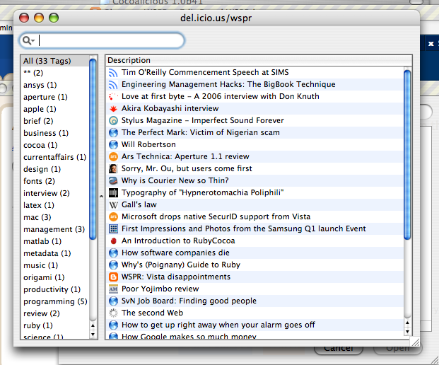
Anyway, I was bored and decided to play around with the interface a little, since, as it’s a Cocoa app with an easily editable interface, it was easy to do just that. Here’s the original: (click for full size)

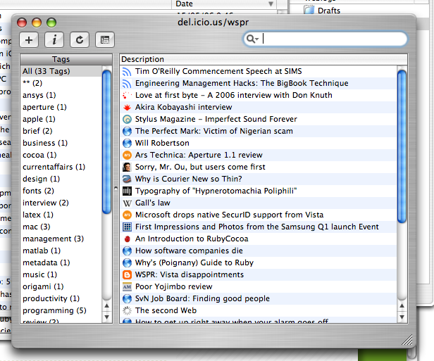
I guess my biggest beef was the brushed metal. Too much wasted space around the edges. And truth be told, given the small amount of time spent doing the revamp, there’s more stuff that could be removed. But overall I’m pretty pleased with the result:

Oh, and I didn't like those non-removeable buttons (non-removeable in the interface, that is); keyboard shortcuts are totally the way to go.

6 comments:

Anonymous said...

Just add the menu items with shortcuts. If you keep the buttons, you loose nothing. And - buttons can have keyboard shortcuts as well... :-)

Dirk, Objectpark Software

Will Robertson said...

Dirk,
Thanks for your comment. I agree, there's nothing lost in keeping the buttons -- except that I never needed them due to their keyboard shortcuts, so for me their presence was unnecessary. I wouldn't recommend Cocoalicious ship like this by default!

As a side note, I detest keyboard shortcuts that don't have an associated menu item, since (a) it's harder to discover, and (b) it's harder (or impossible?) to change using System Preferences.

Buzz Andersen said...

With a little extra work, you could also remove the metal-style bezels drawn around the tables :-).

I agree though, it does look cleaner.

Will Robertson said...

I thought I'd just give you the nudge :)
The whole thing is that it doesn't look bad in the first place, I just wanted to play around a little.

I'll keep you posted on further developments, but like I said above, you probably want to keep the buttons for the shipping version. A toolbar, although more work, would fix that problem.

Alan! said...

how about making the tags a drawer? then you can toggle it and save space.

Will Robertson said...

Alan: Nice idea. Since I'm just messing around in Interface Builder, such a feature is more work than I'm willing to put in. Would space though; many people don't like drawers but I've never exactly understood why.