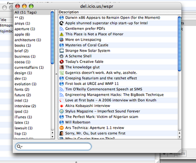
So, after my original exposition of my interface re-arrangement of Cocoalicious, I made some more changes to get rid of more of the borders. I prefer this version, except for the bottom-aligned search box (that’s just totally the wrong place for a filter-style input):
Imagine my surprise to find that Jon Hicks has performed a similar treatment! He’s been much more useful in actually providing an installer so other people can use his interface. Whereas I figured my changes were easy enough to make on your own.
I prefer not to use Cocoalicious’ integrated web browser, and you can see this distinction between the way I present my window and Jon does his. I removed the heading of the “Tags” pane because it looked metal, which didn’t work in aqua; and like I said originally, I found the buttons unnecessary so they’re out. Most importantly, I made the scroll bars mini, because really, everyone’s using some sort of scroll device by now (whether wheel or two-finger drag or the highly recommended SideTrack).
Scroll bars are so 1990s, and I can’t wait until they’re replaced by something better. Picassa, I suppose, is a step in the right direction. (Actually, I don’t mind scroll bars that much — but I do feel that they take up a pretty large amount of space considering I, at least, never use them any more.)
In conclusion, this is more evidence supporting the hundred monkey theory.
