I came across a friend’s business card from PricewaterhouseCoopers and was reminded how ugly their logo is. Take a look: (sorry, PwC, for the direct link)

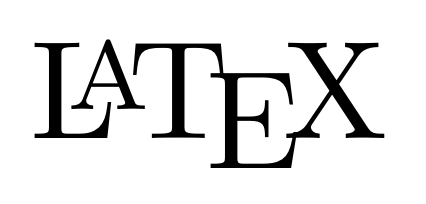
I brought this up in comp.text.tex, since the excessive scaling and kerning (vertical & horizontal) reminded me of the LaTeX logo (and others) that can be “a bit much” in running text:
The fact that it’s easy to obtain this logo within LaTeX, by typing \LaTeX certainly doesn’t discourage such usage. Don’t get me started on (attempted) replications of the logo in HTML. Bleah.
Suffice it to say that I find the PwC logo more visually offensive, even as a logo, than LaTeX’s. Anyway, an anonymous poster reminded me that such practise isn’t so unprecedented:
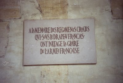
There’s a well-established tradition of doing this in modern calligraphy where the visual effect at least as important (and often more important) than the words themselves. It has precedents in medieval manuscript and classical stone carving.
And this reminded me that I took a photo of exactly this, on a trip to Paris a couple of years ago: (somewhere in Les Invalides, if I recall — and spell! – the name of the place correctly)
But this makes the distinction only more clear in my eyes. You could get away with something like this with a specially designed font (or a broad-nib pen!), but just linearly scaling characters of Optima and moving the letters around seemingly at random makes for a distinctly unpleasant look. The capital ‘P’ and ‘C’ both look too black because they’ve been scaled too much. Even the kerning looks wrong, (between, say “Pr” and “eW”) and that’s intentional!
I wonder who did the design…

