2006/05/26

PricewaterhouseCoopers' "interesting" logo

I came across a friend’s business card from PricewaterhouseCoopers and was reminded how ugly their logo is. Take a look: (sorry, PwC, for the direct link)

I brought this up in comp.text.tex, since the excessive scaling and kerning (vertical & horizontal) reminded me of the LaTeX logo (and others) that can be “a bit much” in running text:

The fact that it’s easy to obtain this logo within LaTeX, by typing \LaTeX certainly doesn’t discourage such usage. Don’t get me started on (attempted) replications of the logo in HTML. Bleah.

Suffice it to say that I find the PwC logo more visually offensive, even as a logo, than LaTeX’s. Anyway, an anonymous poster reminded me that such practise isn’t so unprecedented:

There’s a well-established tradition of doing this in modern calligraphy where the visual effect at least as important (and often more important) than the words themselves. It has precedents in medieval manuscript and classical stone carving.

And this reminded me that I took a photo of exactly this, on a trip to Paris a couple of years ago: (somewhere in Les Invalides, if I recall — and spell! – the name of the place correctly)

But this makes the distinction only more clear in my eyes. You could get away with something like this with a specially designed font (or a broad-nib pen!), but just linearly scaling characters of Optima and moving the letters around seemingly at random makes for a distinctly unpleasant look. The capital ‘P’ and ‘C’ both look too black because they’ve been scaled too much. Even the kerning looks wrong, (between, say “Pr” and “eW”) and that’s intentional!

I wonder who did the design…

2006/05/24

Cocoalicious again... Jon Hicks vs wspr

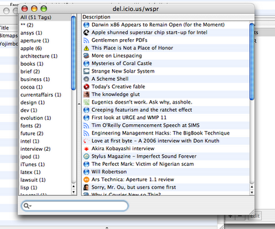
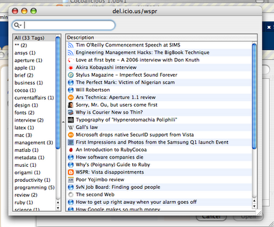
So, after my original exposition of my interface re-arrangement of Cocoalicious, I made some more changes to get rid of more of the borders. I prefer this version, except for the bottom-aligned search box (that’s just totally the wrong place for a filter-style input):

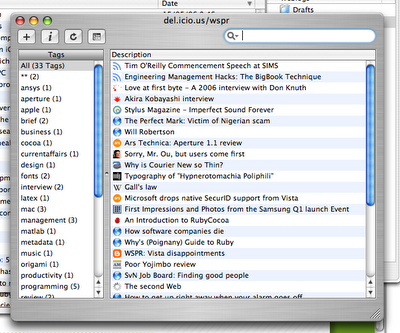
Imagine my surprise to find that Jon Hicks has performed a similar treatment! He’s been much more useful in actually providing an installer so other people can use his interface. Whereas I figured my changes were easy enough to make on your own.

I prefer not to use Cocoalicious’ integrated web browser, and you can see this distinction between the way I present my window and Jon does his. I removed the heading of the “Tags” pane because it looked metal, which didn’t work in aqua; and like I said originally, I found the buttons unnecessary so they’re out. Most importantly, I made the scroll bars mini, because really, everyone’s using some sort of scroll device by now (whether wheel or two-finger drag or the highly recommended SideTrack).

Scroll bars are so 1990s, and I can’t wait until they’re replaced by something better. Picassa, I suppose, is a step in the right direction. (Actually, I don’t mind scroll bars that much — but I do feel that they take up a pretty large amount of space considering I, at least, never use them any more.)

In conclusion, this is more evidence supporting the hundred monkey theory.

2006/05/20

MacBook second thoughts; stylus input?

There have certainly been a lot of things said about the MacBook over the last few days. A trip to macsurfer.com can give you an overly comprehensive list. Ars Technica, as usual, has pretty much the best review around (best as in covering details, but they do give it a 9/10).

I’m reassured to read in a number of places that the weird keyboard does measure up; it is weird, but it is as good, or even better, than the more conventional keyboard it replaces. I’ll be interested to see if they can cram backlights into it for the MacBook Pro models.

Here’s something a little interesting:

Touch pad: Yes, there’s still only one mouse button. Apple seems to be overcompensating for it, too, because the touch pad is simply huge—about the size of a Treo—and considerably bigger than the 15-inch MacBook Pro’s. [CNet]

“About the size of a Treo”. Wait a gosh-darn-tootin’ second. What’s stopping Apple from including a stylus for more precise input? That would just be excellent for faux-tablet functionality. And what might be next? Why, a little screen instead of the faceless trackpad.

In all reality, Apple probably just realised that larger trackpads are better, full stop, but sometimes it’s nice to dream. I do think the stylus-on-trackpad thing might work in principle, but I don’t even know if it would be possible to get a stylus to work on a trackpad, given that fingers do but inert objects don’t seem to have any effect.

Here’s an odd point:

Interestingly, when you point the built-in iSight camera at you so that your face is centered in the capture window, you will be outside the range of the optimal viewing angle [Creative Mac].

I wonder if the iSight is just a gimmick “because we can”. I’m guessing that Apple’s foreseeing pretty big things in the future for video conferencing, and they’re just anticipating everyone using iChat or video Skype. All in good time.

Finally, I wonder what it means for Apple’s product matrix to have just, essentially, three notebook computers? I love the super simplification that they’ve done on the product line (although Toni prefers the idea of an aluminium 13 incher: “the black one looks like a regular ‘puter”) but now there’s more space for something a little smaller.

Everyone’s clamoured for so long about updated Newtons, sub-notebooks, Microsoft-style UMPCs, tablets, and what have you that there’s no point discussing the options further. Except to say that I hope now that there’s a bit of space available for Apple to finally release something that will truly redefine small-scale computing. Put it this way: with the MacBook, we’ve got performance well in excess of what came before with the PowerPC iBook and PowerBooks. Don’t you think we would be able to deal with a scaled down processor that could be shoe-horned behind a tiny 8-inch touchscreen? (For example.)

Update: also, I have no problem with the name "MacBook". I haven't even seen people deriding the MacBook Pro name now; both models can be called the same thing ("MacBook"), because there's no overlap.

2006/05/18

Linewidth vs. linespacing examples

Over at Microsoft’s fontblog, they discuss linewidth and linespread with regard to the reading speed of a whole damn bunch of volunteers. They cite Miles A. Tinker’s book, Legibility of Print, with some actual quantitative analysis (gasp!) on the quality of various layouts.

I haven’t seen these sorts of numbers before, and I’m happy to see that they reflect what everyone (who knows about this sort of thing) believes: longer lines of text are harder to read, and the distance between lines of text is also important for reading quality. These are the results, which are based upon statistical data, to show people when they want to set 1cm margins on their Word document in order to save paper.

They also say:

In the comments for Typography Tip #3, Adam Twardoch asserts that the line length effects the amount of needed linespacing. Tinker’s data does not back up this assertion. This table shows that 2 points of linespacing performed the best at each line width tested.

Okay, sure, but the numbers also show that for such long line lengths, the reading speed is already shot to hell. No-one is actually suggesting that you can get away with 200mm text blocks if you have a 10pt/20pt typeface, say. (x/y refers to a font size of x and a distance between successive baselines of text of y.) No amount of leading is going to fix that mess.

Going back to that numbers business. It’s great that they’ve nicely tabulated that data for us. But numbers in a table don’t really help to get a good feel of exactly why a 43 pica line with 4pt of extra leading is actually a really bad idea. So I put together a LaTeX document illustrating the 20 different layouts examined; grab it here. The source is also available, in case you’re interested.

On the first page, I’ve put the top five layouts ranked by normalised reading speed. Subsequently, each page is dedicated to a single line width with varying linespreads. The text is chosen arbitrarily from the Edgar Allen Poe story ‘Never bet the devil your head’. Times was selected as the typeface because everyone’s used to it and it shows up bad typography more readily than something a little nicer (in my opinion). I find that this document makes it much easier to get an actual understanding of the results of the cited study.

WebnoteHappy bookmarking

Found a link to the new WebnoteHappy application in my feeds this morning. It looks quite nice, but I’m not going to bite.

So what does this app do? You get browser-independent bookmarking, del.icio.us integration, and a more complex organisation scheme than either Cocoalicious or Yojimbo. It’s certainly worth a look, although I feel US$25 is slightly on the high side for an app of this type. My real hope is that OmniWeb integrates a nice bookmark browser like this, but to be perfectly honest, I’m pretty happy with Cocoalicious and Omniweb at the moment. I’m simply not organised enough to file bookmarks as carefully as this app requires.

The one thing I miss with del.icio.us is the limited description you’re allowed. If I could be bothered, though, I’d file more rigourously in Omniweb for this functionality.

Great name, though, and I hope the release is successful. There’s a lot of room in the software space of keeping a store of information based on web browsing, I feel.

2006/05/16

MacBook amateur

Well, here it is. An I’ve got to say, I’m glad Apple played it like they did. This update has put life back into the “iBook” platform.

Some nice points:

  • The new models are thinner — close enough to as thin as the old PowerBooks).
  • They have a better screen size with 1280 by 800 pixels; I can’t stress how big of a deal this is, as an owner of a 12 inch PowerBook.
  • Black!
  • Built-in iSight is a nice gimmick…but not very useful to me, at least. I suspect there aren’t that many people yet doing video iChat.
  • Gigabit ethernet is a nice addition, but again, not all that useful in practice.
  • Optical audio in and out.
  • Don't forget MagSafe adapter and sudden tilt sensor!
  • Weird, claimed better, keyboard (see later).
  • Front Row
  • Finally, no silly 14 inch size.

Some possible downsides:

  • Glossy screen, as mentioned by Sven S Porst.
  • Integrated video, just like the Mac mini. I guess it’s better than my PowerBook, anyway.

I’ve wondered about those glossy screens before, and I can’t see how they are an advantage. Surely the greatly reflectivity, um, increases the reflections you see in the screen? Update: it looks like the glossy screens provide better contrast and colour with the detriment of added glare. I suspect they are using these screens because everyone else is, and that means they're cheaper.

So, I mentioned that weird keyboard. Apple says “MacBook features a unique new keyboard design that sits flush against the bed for a sleeker, lower profile. Plus, you’ll find a firmer touch when typing. That ought to make your fingers happy” (there’s that whole “Apple product as a proper noun thing” again; I think it was John Gruber who commented on it once before). Well, sounds good, I suppose. Take a look at the shape of the keys:

Not square! Wait, look again. They look square to me. Ohhhhh…don’t let Apple fool you. That image has been scaled horizontally on their site, but as shown above the keyboard has actually a proper proportion. In that case, damn, that keyboard looks hot. Pity about that damned Enter key, though.

All in all, I’m especially positive about this release. This Apple laptop is compact, better looking than ever, and so much faster than my 867MHz ‘book that I’m quite jealous I don’t have one. All good things to those who wait, though.

2006/05/15

Cocoalicious fun and interface adjustments

When I first came across Cocoalicious, I didn’t really get it. I didn’t really get del.icio.us, either. These things can take time, I suppose. If you don’t know what I’m talking about, check out that link on the right “del.icio.us list links”, which takes you to everything that I’ve been reading that I find interesting. But didn’t see fit to comment on here in more detail.

Cocoalicious is a Mac OS X client for del.icio.us, which allows nice things like hitting a keyboard shortcut while browsing to upload a link in one easy step, as well as providing a nice browser for all the links with their tags. Did I mention tags? I like metadata.

Anyway, I was bored and decided to play around with the interface a little, since, as it’s a Cocoa app with an easily editable interface, it was easy to do just that. Here’s the original: (click for full size)

I guess my biggest beef was the brushed metal. Too much wasted space around the edges. And truth be told, given the small amount of time spent doing the revamp, there’s more stuff that could be removed. But overall I’m pretty pleased with the result:

Oh, and I didn't like those non-removeable buttons (non-removeable in the interface, that is); keyboard shortcuts are totally the way to go.

2006/05/11

Online calendars

After renouncing the use of my PowerBook at work for efficiency reasons, I’m now in the tricky situation of having to synchronise stuff back and forth between my Mac at home and my Windows box at uni.

Generally, this isn’t a problem. I really liked being able to rsync my files back and forth when I was using Linux, which meant that I could do my writing on my PowerBook and my work on the desktop. But really, I can probably deal with using TeX on Windows; the only thing I’ll miss is BibDesk, I think.

(By the way, my switch back to Windows from Linux was due to the fact that engineering software — Matlab, specifically — just works so much better under Windows and I was sick of having to deal with Linux’s idiosyncracies. At least I know what I’ve got under Windows; even if that is an inelegant mess, it at least works for the things I need it for.)

Perhaps the biggest concern I had was a calendar platform I could use both at uni and at home, as well as allowing iSync to sync everything up with my phone. And I’ve decided it’s too hard to be worth doing. Which is a little sad, but now that I think of it, it’s not the worst thing in the world to use my phone when I’m away from my PowerBook at home.

But while trying to fix this problem, I very briefly came into contact with a whole bunch of online Web 2.0 calendar apps. A totally unrepresentative list of possible choices:

Most of these were obtained from the comprehensive TechCrunch.

I used none of them long enough to be able to actually review them in any decent capacity. But that won’t stop me from passing judgement. Each does more-or-less the same thing. It’s possible to export your data in various ways, in iCal or RSS formats, amongst others — including being able to embed mini calendars within your own web pages. It’s interesting to see the different spins each company takes, with some more successful than others at creating an experience that's interesting to use.

Of those mentioned above, I’d rank them in the order given. The first two have great, and simple, interfaces. The experience is all quite nice, and if I was the kind of person who liked web apps, I’d have no problem recommending them. (Uploading my phone calendar, however, is still a problem.) The most innovative element of both of them is free-form entry input. No more clumsy clicking. Just nice typing, e.g., “party 10pm friday at justin’s” in a text field.

The big guns, the Yahoo and Google calendars, offer exactly what you’d expect. The sort of “no design” that people like to discuss at the moment, and integration with their other services that lowers the cost of entry.

From there, Planzo and CalendarHub were respectively clumsy and broken. They just don’t have the “sparkle” to make them attractive, from more complex sign-up schemes in the former (including HTML email) to simply broken functionality in the latter (beta, I don’t care — if they’re public, they should work). The interfaces to both were cluttered and not pleasant to nest in.

But the real lesson I learned was that web apps are really at the cutting edge of interface design. I suspect this is due to the startup culture allowing designers to work really closely with the final product, in combination with the fact that the line between web app developer and designer are blurred so much that the developers actually have a clue about decent design.

It’s just a pity that the calendar in my phone has no way of getting inside one of these nice online ones. Or if there is, it’s just too hard at the moment.

Postscript: another option I looked at was using iCalX to share webdav calendars between SunBird and iCal, which has the potential for working nicely but which never quite clicked. Actually, I’m not sure why this didn’t solve all my problems so I might have to revisit it again soon.

2006/05/09

Doomed tech companies

This is disappointing news. Via Nicholas Carr, it looks like Silicon Graphics’ time is up as they apply for bankruptcy.

SGI’s heyday was really before I knew anything about them. The last time I read anything about them (lucky I’ve still got the link lying around!) was an eWeek article talking the history of the company and some cool stuff they (still) do. Well worth reading.

My comment to myself at the time was: But hang on, some of that doesn’t sound right at all? I mean, Pringles? What’s a computer graphics computer doing investigating how Pringles fall into their containers? That’s clearly more of an engineering job…

Seriously, though, some of those things they were allowed to tell us they were doing sounded seriously cool. Oh well. Here’s Cringely on SGI in 1997. And here he is again on Apple, same era, with the quote “Jobs would be thrilled to kill SGI outright”. Why throw in that remark? Well, I’ve seen numerous throw-away references over the years that Apple should buy SGI. I don’t know any of the technical details, but it sounds like it would be exciting.

There’s a bit of an obsession with Cringely today. SGI isn’t the only tech company that’s fallen under hard times (or has been for years).

I, Cringely, ‘Killer Apps’: “Sun is simply doomed. Their software isn’t better, their hardware isn’t better, and they can’t see themselves as anything but a maker of hardware or software, so my simple recommendation is that they take the rest of their cash and try entering a hot new field like – say – space flight. Or making really fine cakes. The world will always need fine baked goods. Or just give it back to the shareholders. Really.”

I don’t mind reading Cringley’s column. It’s well written, and he raises interesting (albeit far-fetched) points. But this is just impolite. Jonathan Schwartz does a pretty good job of instilling enthusiasm into his company.

Besides, doesn’t “give it back to the shareholders” sound like a solution to a troubled tech company that we’ve heard before?

2006/05/08

Storing my life in iCal

I’d like to keep my life in a calendar app. You know, almost down-to-the-minute type stuff. My calendar program is iCal, so this is probably a foolish endeavour. And I wonder on the data model for the whole thing. I mean, sure, I can add notes to items to even keep a running diary of things, but … calendar apps aren’t very sexy, you know?

I wonder if anyone’s ever made a better calendar app. Because really, it’s just a user interface to be designed. The data model is all there in the iCal format, and ideally you’d be writing to/reading from iCal’s store in order to keep synchronisation through iSync intact.

HTML+CSS for rich text rendering

Here’s a thought. In the beginning, XHTML+CSS was able to produce content with fairly minimal style. Over time, it’s improved to the extent of supporting many of the things possible with more classical “word processors”.

Selectors in CSS3 make for robust and easy tools for complex formatting. CSS supports things like page breaks and fixed layouts as found in traditional documents — it just happens to be the case that we generally like web pages to be of indeterminate height and width (the latter sometimes less so).

As long as the stylesheets provide the ability, there are no troubles with footnotes (or margin notes) and running headers. Source transformations (XSLTs) make tables of contents and indices easy, as far as I can tell. How long before someone produces an easy-to-use HTML authoring platform that produces variable layouts (screen, print, web) with no trouble at all. The input could be reStructuredText to support a greater range of elements than Markdown, while still having that whole “looks like an email” simplicity.

Where does this scheme fall down? Microtypography is always a concern and pdfTeX is as yet unmatched, although InDesign does some great on-the-fly kerning that I’d like to investigate if I had more time. Perhaps a CSS interpreter in TeX would be a nice idea…

Have other people tried this already? There are a bunch of formats for publishing to different outputs, but I don’t see any of them leveraging the full power of XML+CSS. And that’s the whole charm; producing the output is the hard part, and if it can be specified simply with structured input and some formatting rules, a lot of time is saved not having to deal with building document renderers.

All in all, just something I wanted to let my mind wander on for a few minutes. It’s not trying to solve a problem, just express my admiration for the fact that it seems possible that “browsers” will be all we’ll need in the future; who even needs to worry about PDF? Seriously, with MathML, SVG, fixed layouts and the possibility of embedded fonts (okay, that point is actually a problem not likely to be overcome), the world of XML documents is going to be huge.

2006/05/06

Origami vs. UMPC

Microsoft seemed to be on a good thing earlier this year with its hyped Origami project. Then they axed the cool name and started calling these things UMPCs. Ugh. Anyway, that’s merely cosmetic, but is indicative of the type of problems the UMCP seems to have (I won’t even come into contact with one of these for quite some time, so my comments are all at least second hand).

Here’s Michael Gartenberg’s enthusiastic comments on the UMPC platform, which is a rather more forward-looking analysis than the not-so-positive reviews (and Walt Mossberg isn't just anybody) based on actually using the things in their current form.

Self-confessed enthusiast(s?) over at umpcbuzz.com have a great dot-point list of why this type of platform is great; I agree with them all. I really do think that slate-type form factors with direct pointing/touch interfaces is the way we’re heading with computers. There’s just 20 years of mouse+keyboard inertia to overcome and some new interface ideas, paradigms even, are required — and required to be well implemented. The problem is that Windows has been pushing all this Tablet PC stuff, and now this mini-tablet stuff (which I find evolutionary in a good way) without a good usage model. The tech is there and it’s great. But the “killer apps” aren’t and it’s because Windows wasn’t designed to be interfaced in this way.

As I wrote once before, I’m actually fairly concerned that Apple doesn’t have the momentum on handwriting recognition to actually create a Tablet PC of its own at the moment. But that’s a side note.

So what are people saying about the implementation of the first UMPC? Via Daring Fireball, here’re David Pogue’s thoughts. Before I bootstrap my own brief comments off his, allow me to recommend watching his hilariously silly video on the whole thing. It’s actually a succinct way to summarise its flaws. Back to the article, he writes:

Standard screen resolution on the Ultra Mobile PC is an oddball 800 by 480 pixels. Those are such peculiar dimensions, in fact, that many of Windows’s own dialogue boxes don’t fit… In software, this is what’s known as a Big Oops.

This is really terrible. Either it’s a PC or it’s not. Get the interface right regardless. I would suspect that this type of thing should be corrected in the upcoming Vista Tablet versions of Windows given the extra implementation experience they’ve had with things like this now.

For example, there’s an on-screen keyboard; a handwriting-recognition window that offers excellent accuracy but makes editing brutally frustrating; rudimentary speech recognition; and Windows Journal, a free-form note-taking program that lets you delete, search and move your handwritten phrases.

I really like the look of the on-screen keyboard shown below; without even seeing a high-res image of it, or seeing its keycaps, I suspect for it to be useful it should be more compact and more transparent. By all accounts, however, it’s not the best thing since predictive text, which the excessive thumb motion reminds me of.

Origami onscreen keyboard

And hang on a second. Didn’t Apple’s Newton make it really easy to edit text by incorporating familiar (to some) copyediting symbols/methods?

Oh well. As the people talking about the good stuff say: this is really a good step in the right direction. Whether this technology becomes ubiquitous I think depends heavily on the software makers to re-think their approach to designing the interface of their applications. And I’m really hoping Apple makes a play here, too — the competition would be good for everyone.

MarsEdit 1.1 improvements

Dear Brent,

Here’re a few improvements that I feel could be made to MarsEdit. Thanks for listening.

  • Posts selected in the main view should be opened on hitting <return>/<enter>.
  • Posts selected in the main view should be deleted on hitting <delete> with a warning or <shift>+<delete> without a warning.
  • In fact, there needs to be a “Delete post” to bind that keyboard shortcut to and allow the possibility of user customisation via System Preferences.
  • If a “Open current post in weblog” option were technically feasible, it’d be great (“Open in Browser” for Blogger at least only goes to the main page of the weblog). I understand if it can’t be done, although I’d be a little surprised.
  • Option to remove the MarsEdit scripts menu. I’m more than happy with FastScripts (keyboard shortcuts for per-app scripts! In the free version!) or even Apple’s own scripts menu, thanks.
  • The Preview pane doesn’t remember my ‘Formatting’.
  • ‘Formatting’ in the Preview pane should allow Markdown+SmartyPants.
  • I’d like the ability to post through a filter, as I’ve implemented in my “Markdown and post” applescript. But this isn’t essential, since Applescript can do it for me…
  • The ability to search through posts by title/content would be sublime.

More as they come, I suppose. Thanks for this great app.

ZoomIn

Thanks to nat at O’Reilly Radar, I’ve been made aware of a “Google Maps” for Australia, that’s not been done by Google. And it is, perhaps literally, the best website I’ve ever seen.

I have been complaining bitterly about the state of Australia’s online street directories. Both street-directory.com.au and whereis.com.au (by Sensis, that Telstra spin-off) have ugly ugly maps with static views, and which you must buy links to specific locations.

But now, bliss, there’s zoomin.com.au. These guys deserve the link. Where to start? The website is elegant and well-designed (compare to either of the aforementioned sites of the competition). The search field has suggestions à la Google Suggest. Other pieces of Ajax-y goodness are superb.

Locations can be assigned comments and photographs. (Unfortunately, the latter seems to crash Safari; the latest OmniWeb doesn’t but sits there forever trying to do something. FireFox works great, of course.) See the link in the next paragraph for an example of this.

Finally, check out their URL system. Let’s say I want to find Chocolate Bean at 14 Union St, Adelaide. The URL to that location is http://zoomin.com.au/australia/sa/adelaide/adelaide/union+street/14/. Can you believe it?

Only one suggestion: they need a favicon. Oh, and a way to make money. I sure hope they’ve got this sorted out.

2006/05/05

DropSend and everything else

Okay, I admit. I’m way behind on learning what all these fancy Ajax Web 2.0 Ruby on Rails start-ups actually are doing. I’ve looked briefly at things like the work by 37signals, and been pretty impressed with it all.

It does seem like it’s possible to do the majority of work within a web browser these days. Anyway, I bring this up not because I like to point out my flaws, but as a convenient way to justify the fact that when I mentioned but two online storage providers in my previous post I implied in my head that there were no doubt more things I’d left out.

DropSend is a Box.net-style online storage provider, with the angle for distributing files that are too large to send by email. Their pricing is flexible enough to go all the way to 250 GB for the high price of $99 per month, but the fact they offer it I’m pretty impressed by. They give 250 MB for free, and $5 per month will give you 1 GB. This is similar to Box.net’s pricing as well.

Where am I going with all of this? There’s actually heaps of products out there, apparently with very variable pricing at this stage while the market is young. It boggles the mind that people have found better backup solutions using web browsers rather than clever network-based techniques. In the long run, will the remote distributed method end up scaling more efficiently and provide a better solution? Well, at this stage, there’s not really any competition so I don’t see why not!

The network is the computer

With apologies to Sun for the title of this brief post. A few services have caught my eye recently, along with rumours that both Google and Microsoft will be entering this space in the future as well.

Actually, the first is pretty unique. Sun has created a supercomputer for hire, located at the gold address network.com. I don’t really know much about what Sun gets up to these days, but their (now) CEO does a great job of evangelising their product; he’s obviously greatly passionate about his job, which gives me confidence in their ability to succeed. Jonathan Schwartz’s [introduction to the Sun Grid] covers everything I, at least, need to know. With a browser and credit card, you too can leverage the power of a whole bunch of computers. So that’s exciting from a tech point of view.

Moving on to slightly related territory: internet based storage. The first I heard about (besides Apple’s .Mac, which I’ll come back to) was Amazon S3; this product has similarly great marketing that it feels like the company is revolutionising the way people will behave towards data. The premise is simple: with some tech and a credit card, you can store essentially as much data as you like on Amazon’s servers. And it sounds damn cheap: $0.20 per GB of data transferred, $0.15 per GB per month of data stored. Not only that, but it god-damn supports BitTorrent for distributing the stuff you put up there. Fancy.

More recently, I came across Box.net, which sounds fairly similar, if targeted slightly differently. S3 is aimed more at commercial use, I gather, whereas the Box is oriented towards consumers, backup, and syncing. And it’s also cheap: the FREE account allows 1 GB of stored data with a file size limit of 10 MB (that’s more of a problem), with 5 GB available for $50 per year and 15 GB for $100/yr. (All the prices I mention are in American currency, by the way.)

Amazon’s service is cheaper, but Box.net’s approach probably makes it more useful for a regular user. Amazon’s tech, frankly, also looks more impressive.

But this is all interesting to me because it occurred to me that Apple has provided for all of this type of thing in the form of .Mac for years now. They are now obviously hopelessly out of their league with regards to pricing and performance (.Mac altogether is $100 per year for 1 GB of data with another $100 increasing that to a measly 4 GB; granted you get more your money than just online storage), but you’ve really got to give Apple credit for being so far ahead here. It would be really great if they ended up partnering with one of the big guns to develop .Mac into a really solid and cost-effective solution, but it looks like Apple’s happy enough satisfying rich consumers.

All in all, things are starting to look pretty interesting as bandwidth becomes ubiquitous enough to consider offline storage of GBs worth of data. I know it fully solves the problems that John Siracusa discusses about data integrity and the concern about eventual hard drive failure in something like an iMac:

My sister’s iMac, like many Macs today, is a victim of its own success. Her Mac has made creating and organizing digital content so easy that it now contains gigabytes of the stuff. I often find myself thinking ominously about the consequences of a catastrophic hard drive failure in her now almost three-year-old iMac. All those photos, all those movies, just…gone. Poof!

On the other hand, if Apple say were to start shipping cheap enough home servers with enough space for redundant backup and internet access, would services such as Box.net be all that necessary?

2006/05/04

The future of research

The internet has improved access to a great amount of information. It’s easier now than 20 years ago to do academic literature reviews, simply because all new publications are available in electronic form. A program such as BibDesk to organise this information for you is the icing on the cake.

But there’s still a long way to go. Publications are provided with automatic citation information, but this isn’t linked in any way to the electronic document that is the research paper. I imagine a much more useful system in which documents that arrive on your computer are automatically catalogued and cross referenced.

Similarly, there is no facility in these electronic documents for defining relationships, predominantly citation references. At this stage of the game, such things must all be done manually. In the future, it will be nice when a citation in a paper can be clicked on obtain the referenced text. At the moment, some Elsevier journals support such features; I’m very impressed.

And don’t even get me started on the problems with maths. IEEE publications persist on using bitmap maths fonts, which really has no excuse. I’m appalled by the lack of typographic quality found in today’s research journals compared to themselves of forty years ago.

Anyway, this was all prompted by something that’s going on at Nature; they’re looking to data mine their publications for creating a posteriori relationships (I presume) between them:

Nascent: Open Text Mining Interface: Much better, surely, to have a common format in which all publishers can issue their content for text-mining and indexing purposes … The Open Text Mining Interface (OTMI) is a suggestion from Nature about how we might achieve that.

(Via Ars Technica.)

Sounds great. It’s inexcusable for any publisher not to be looking into all sorts of techniques for actually enabling a “semantic web” for their publications. I look forward to a future where keeping track of events in your research field is a matter of subscribing to sufficiently specific syndications that pools all the new stuff together automatically.

2006/05/03

OmniWeb 5.5 sneaky peek

Fed up with waiting for OmniWeb 5.5, I googled for it…and discovered that it’s been sneakily sitting in public beta for a while now! It’s found in a secret location inside a passworded disk image.

The page contains instructions on how to obtain that password. (Just join up to the OmniWeb forums.)

My impressions: damn, it’s fast. Feels like a real browser again. I’ve only got a tardy 867MHz Powerbook, and it was becoming a bit of a chore to actually browse with OmniWeb. (Which was my reason for eventually leaving it temporarily a while ago.) Now no longer. Opening new tabs, switching between tabs, and switching between workspaces (that is, all the UI stuff) is actually snappy.

Since this release has been all about updating to WebKit, the new features list is a little thin. It’s still not possible to subscribe to syndicate feeds in other applications; to be frank, OmniWeb’s behaviour here is obnoxious and this really needs to be fixed. Everything else is so good, it’s a pity it falls down so much here.

I’m looking forward greatly to see how the betas progress. I haven’t been using it long, but certainly no trouble so far…

2006/05/01

Polyfun

I never got around to writing up my polyphasic sleep experiment. It didn’t turn out so well. Despite what I said after 36 hours and 50 hours, after four days we all just slept for a full nights sleep by mistake.

Efforts to continue were hampered by similar such unexpected sleeps, and my research at uni was suffering dramatically. The problem was a lack of rigourousness. Oversleeps simply cannot happen, or your body doesn’t adapt to the half-hour nap.

Secondly, it’s damn hard to keep awake for the first four days. I should have expected this, but we all underestimated greatly the amount of will power required to physically keep moving. And once you’ve stopped, that’s it. A five minute sit down on the couch is doom in the critical stages.

I’m seriously considering re-starting my experiment tonight to see if I can do better. It depends if I can finish my paper once and for all. If so, my target is for 36 hours on a strict schedule; if I can’t make that, I can’t make anything. Once I get there, I’ll decide what to do next.