2008/10/29

Vista plus one

Microsoft has been talking up their next version of Windows. They seem to be getting the direction right in terms of marketing their progress going forward.

I believe the vague analogy between Vista and Mac OS X is a pretty good one: both represented forwards looking technology that was a bit of a hurdle to get over in the beginning. But the future potential makes it all worth it.

Competition between the platforms is really a win-win situation for everyone involved. For what it’s worth, I’m just as enthusiastic about Snow Leopard than I was about any “feature-based” upgrade to Mac OS X.

Now, not to knock Microsoft here but I’ll believe the new Explorer features when I see them in actual shipping versions of Windows. (I was rather disappointed the amazing Explorer features shown in a demonstration of Longhorn never made it to Vista, seemingly. Not that I actually use Windows, but the ideas were fantastic.) But these user interface features for window management sound insanely useful:

Dragging a window to the top of the screen maximizes it automatically; dragging it off the top of the screen restores it. Dragging a window to the left or right edge of the screen resizes the window so that it takes 50% of the screen. With this, a pair of windows can be quickly docked to each screen edge to facilitate interaction between them.

The transition between these states had better be very clear about what’s going on, or that’s going to be some weird-feeling behaviour.

On a tangential note, as many people have commented before, it’s just crazy that window placement doesn’t have “snap-to-edge” in either of the major platforms yet.
A Good Review

I like it when journals publish articles about academic publishing. Now, this one, called “A Good Review”, doesn’t say too much, but it does have a nice list of dot points: (and I quote)

  • A good review helps the members of the scientific community achieve standards higher than what they might be able to do without expert feedback.

  • A good review helps the authors learn something new or consider something they had not thought about.

  • A good review helps to improve the communication of the material and alerts the authors on statements that may be misleading, misunderstood or plain wrong.

  • A good review is done in good faith; it addresses the contents of the manuscript at hand not the state, status or character of the authors.

  • A good review is not about the expertise or cleverness of the reviewer, it is about the quality of the proffered manuscript—and, really, nothing else.

Me again: Generally, in my limited experience, I would say that feedback from the reviewing process has made my (few) papers better. At times, you don’t really want to hear what they have to say, but after changing things around and spending some extra time, the manuscript is improved.

Having said that, I don’t believe the huge lag times for this process are justified, and we’d all be better off with a more informal system like arXiv. The papers that are good will still be cited and read. Despite the whole review process, you still get some stinkers even in the so-called “high impact” journals.

Rather than hindering the publication of new material, we “just” need a better way to catalogue and access what’s already there. Should new postgrads really have to re-create entire literature surveys for every single project? One day, I would like to create the “Wikipedia of literature reviews”. But not like Wikipedia, coz that’s not the best model for this sort of information.

2008/10/24

Email client wishlist

Due to Poul-Henning Kamp, via Karl Fogel:

But let me suggest a few pop-up windows I would like to see mail-programs implement whenever people send or reply to email to the lists they want me to subscribe to:

  +------------------------------------------------------------+
  | Your email is about to be sent to several hundred thousand |
  | people, who will have to spend at least 10 seconds reading |
  | it before they can decide if it is interesting.  At least  |
  | two man-weeks will be spent reading your email.  Many of   |
  | the recipients will have to pay to download your email.    |
  |                                                            |
  | Are you absolutely sure that your email is of sufficient   |
  | importance to bother all these people ?                    |
  |                                                            |
  |                  [YES]  [REVISE]  [CANCEL]                 |
  +------------------------------------------------------------+

Okay, that one’s a little silly. But this suggestion deals with a problem even I (I know!) have had in the past:

  +------------------------------------------------------------+
  | Warning:  You have not read all emails in this thread yet. |
  | Somebody else may already have said what you are about to  |
  | say in your reply.  Please read the entire thread before   |
  | replying to any email in it.                               |
  |                                                            |
  |                      [CANCEL]                              |
  +------------------------------------------------------------+

2008/10/21

Poor writing

I’m currently reading a paper related to my thesis. Remind me not to write like this:

In this section, the design of a beam-mass system, whose efficiency in converting the energy of vibration sources into electricity is increased by means of permanent magnets, is proposed.

Moreover:

This section consists of several subsections.

2008/10/12

US Election 2008 FAQ

I don’t know how this only just turned up in my feed reader, but Peter Norvig of Google fame has a great collection of information about the upcoming US elections:

http://norvig.com/election-faq.html

For the record, I’m pro-Obama but I’m sure that McCain would do a much better job than Bush. I’m pretty appalled by Sarah Palin, however.

I’m still amazed by the tax plans proposed by the two rivals; how McCain’s “cut tax to the rich and give (basically) nothing to the poor” could possibly be rationalised, especially by voters, really makes me wonder on its logic.

Anyway, that’s all I’ve really got to say in the matter, since I’m not American and can’t vote.

2008/10/04

In an ongoing series…

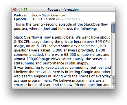
iTunes 8.0.1 fixes the gutter problem of this insignificant window:

podcast-information3.png

Compare:

ugly-podcast-window.png

That scroll bar chrome still looks out-of-place, and the window still floats above all others even when iTunes is not frontmost. I think that bottom decorative strip should be the same height as the titlebar of the window; before it was too thick, but now I think it’s too thin.

Baby steps…

Diaeresis

Here’re two examples of some odd typography with which I’ve recently become enamoured:

diaeresis.png

diaeresis2.png

Courtesy, who else, the New Yorker.

I’m planning on this diaeresis usage for my thesis, but my supervisors have already raised questions about it. Perhaps it’s not such a good idea. After all, few people seem to find the spelling exactly intuitive, and even fewer, I’d wager, are familiar with the term “diaeresis” in the first place.

The diaeresis looks exactly like an umlaut, but has a rather different meaning. The umlaut, say in the word über, is an accent that indicates a change in vowel sound for that letter. It’s not really used in English (where double-consonants more often serve a similar purpose of changing the preceding vowel sound), but the umlaut is rather common in many European languages.

By contrast to that particular diacritic, the diaeresis is used, such as in the word naïve, to indicate that the two adjacent vowels are pronounced separately. nay–eve, instead of (er) nyve, let’s say. Even though all English speakers will pronounce the more commonly spelt naive correctly, anyway.

Which brings us back to the examples I showed above. The New Yorker, then, does not use hyphens to separate the halves of compound words. This is desirable in order to reduce the number of marks used on the page to represent the word; this has implications both for visual simplicity and running length of a piece of text (i.e., hyphenation and justification are easier when less characters are used).

And when it ends up that a compound word is used but the absence of the hyphen results in two adjacent vowels—then’s the time for the diaeresis in words like coördinate, coöperate, and so on. Personally, I think this is quite tidy and quaint, and I’m trying to emulate their style.

2008/10/01

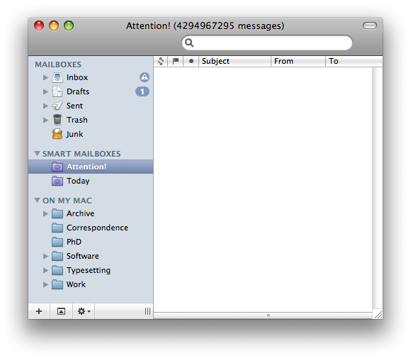
2³² − 1 messages

I was so happy to achieve ‘Inbox Zero’. In the final hour, Mail.app had the last laugh:

silly_mail.png

Jokes aside, I’ve found the message count for smart mailboxes to be fairly flaky.