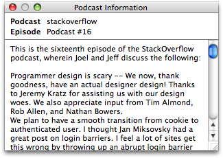
A little while ago I complained about the “Podcast Information” window in iTunes.
Well, there’s now been an iTunes update, and I’m sad to say things are now much, much worse. On the plus side they fixed my bug.
It’s a pity they had to hit the damn window with an ugly stick at the same time.

Come on, guys. It’s not that hard. At least the old one had some padding in there:

And that new shadow looks ridiculous. Really.
They also didn’t paid any attention to improving its behaviour. That’s okay. The other new features in iTunes 8 are rather nice.
But this window now floats above all others even when iTunes is not frontmost. This is the least appropriate behaviour this window could possibly have. I guess I’ll have to file another bug report…