2008/04/29

Applescripting Mail.app

Applescript support for Apple’s own applications has typically been absent or poorly implemented. Leopard’s Mail.app is no exception, which is a pity because there are many nice things that a functioning scripting interface could perform. In this post, I’ll expound a couple of irritating bugs I have quickly run into while trying to write Applescripts for Mail.app; I’ll finish up with a useful Applescript that actually works and that I frequently use.

Bug the first

This one’s easy to sum up: get the properties of just doesn’t work. This works fine:

tell application "Mail"
    get the front message viewer
end tell

The usual way I write Applescripts is to just bung in a the properties of after the get to receive a nice list of, well, properties that I can extract and set for the object. Sure, I can get this sort of information (in the abstract) from the documentation, but querying the object with Applescript is easier and much more useful for debugging purposes. Alas, Mail does not support this, despite claiming to be able to:

properties inherited from item [snip] properties (record) : All of the object’s properties.

Here’s an example of the fail:

tell application "Mail"
    get the properties of (the front message viewer)
end tell

Update: this is Bug ID# 5981534.

Bug the second

I find Mail’s “Inbox” to be largely useless, because I filter much of my mail into sub-mailboxes as it arrives. Only unfiltered Mail is shown in the Inbox, which isn’t very helpful when there’s no “jump to next unread message in any mailbox” feature.

To work around this perceived problem, I have a “Smart Mailbox” to collect all Mail that needs my attention:
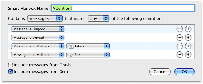
attention-mailbox.png

The “Message is in Sent” is so that I file/delete my own messages rather than let my Sent mailbox accumulate to thousands and thousands of emails.

Now, I really like Mail.app’s ⌘1 shortcut to select the “Inbox” mailbox. But since I don’t use the Inbox, I’d much rather it select my “Attention!” mailbox instead. This is the perfect case for Applescript, and should be a one-liner:

tell application "Mail"
    set the selected mailboxes of the front message viewer to {mailbox "xxx" of application "Mail"}
end tell

where xxx is the name of the mailbox. Well, sure, that works fine for a regular old static mailbox. But for a smart mailbox? Not a chance.

tell application "Mail"
    get the selected mailboxes of the front message viewer
end tell

With a selected Smart Mailbox the result is {application "Mail"}, and trying to set the selected mailboxes to a Smart Mailbox just gives an unhelpful error. Not very helpful at all, in the end.

Update: this is Bug ID#5981547.

Bug the third

This bug is less major because it can be obviated by using GUI scripting. I’m not really a fan of GUI scripting, though. Not very elegant (says the Applescript user).

Anyway, I’d like to be able to customise the template used to construct “Reply” emails (as you could in Mac OS X 10.2 or so by tweaking some hidden system files); specifically, I find the line

On 02/04/2008, at 9:13 PM, Will Robertson wrote:

terribly verbose and overly detailed. There’s a couple of other things that could be improved, too (cf. this year-old post by John Gruber in a similar vein; by the way, I’m a staunch bottom-posting advocate — although I prefer a top poster than a bottom poster who doesn’t snip).

The main problem is that Mail’s reply Applescript command has buggy side-effects:

tell application "Mail"
    set sel to the selected messages of the front message viewer
    set repl to reply (first item of sel)
    set repl_contents to the content of repl
end tell

Two reply windows are opened, only one of which is the actual reply. More often as not, the message repl is the other one, which is simply an empty Mail message. To add insult to injury, the empty reply requires a save/discard confirmation when the window is closed, whereas the actual reply lets you close its window (and destroy its content) with nary a warning in sight.

Finally, adding to reply the boolean without opening window doesn’t do what it claims.

I’ll probably adapt Gruber’s script, in the end, to do what I want. But this stuff is supposed to be quick and easy — and it’s not.

Update: this seems to have been fixed in Mac OS X 10.5.3; it's necessary to call `reply (first item of sel) with opening window` to get the reply window to appear.

A nice script I use

Okay, I don’t want to complain too much — when it works, Applescript can make life much easier and I bug report because I care. Now I’d like to share a script, Next-message.scpt, that I use many times in Mail on a daily basis (with the help of FastScripts to assign it the convenient keyboard shortcut ⌘\ ).

This script exists to make it easy to jump to the next message when you’re not using Mail’s three-paned interface (I greatly prefer having to open the message in a new window). To quote from the blurb at the top of the script:

This script is designed to open the next message in a thread when Mail is used in two-paned mode. To elucidate the problem, when viewing messages in the third pane below the mailbox list of messages, the space bar does a great job of jumping to the next unread message. When the message pane is hidden and messages are opened in their own window to be viewed, there’s no way to get to the next message without switching to the message list, selecting the next message, and opening it. This script automates this process, closing the original message and placing the next message in a window of the same size, in the same location.

The script currently does not detect if the next message is part of the same thread as the current. In fact, I don’t think it’s possible within Applescript to detect that (especially as their subjects will not necessarily be the same). Besides, sometimes you want to jump to the next message even if it’s not in the same thread as the one you’re reading.


As soon as I can I’ll write these up formally for Apple’s bug reporter. I needed to get them off my chest before doing that, however.

In closing, I really appreciate the power that Applescript can give, especially for cross–application tasks that would be otherwise impossible to achieve. For example, running a script in TeXShop to highlight uncited references in BibDesk.

I’m happy to see even lacklustre support despite the frustrations when it doesn’t work; I hope that, over time, Applescript support improves for all Mac OS X applications.
2008/04/21

iTunes customer service

One of the less tangible aspects of shopping online is the lack of any face-to-face contact in the inevitable case that something goes wrong. I haven’t had much experience with online shopping in general, but I have had a couple of things go wrong for me on iTunes. And I’m happy to report that, in Australia at least, their customer support is excellent.

My problems

The worst of my problems occurred quite some time ago when iTunes was periodically crashing on me. Not really sure how or why, and iTunes these days is fairly reliable, but back then it was rather a pain in the ass. Playing music over wireless was fraught with embarrassment (“aren’t Apple products supposed to just work?”), and buying music online a risky business. Once or twice, iTunes crashed midway through an iTunes download and a song or two from the purchased album was lost in the æther. (Usually this problem can be fixed with the Store > Check for Purchases… menu item — but not in this particular case.)

Another time, I simply bought the wrong album, due to the ridiculous setup where iTunes will often sell both an AU$18 basic album as well as an AU$22-ish album with music videos or live or bonus tracks — generally I buy the more expensive version, but in this case the link from the iTunes main page was for the basic version and I bought it before checking for the other.

Finally, just the other day I bought the “iTunes Live” Nick Cave and the Bad Seeds EP and found that the last track ended abruptly, mid-chorus, at 5:13. Clearly something had gone wrong with the encoding of this track, and the one review of that album mentioned the anomaly in rather negative terms.

Reporting those problems

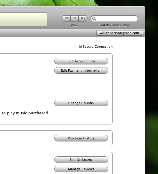
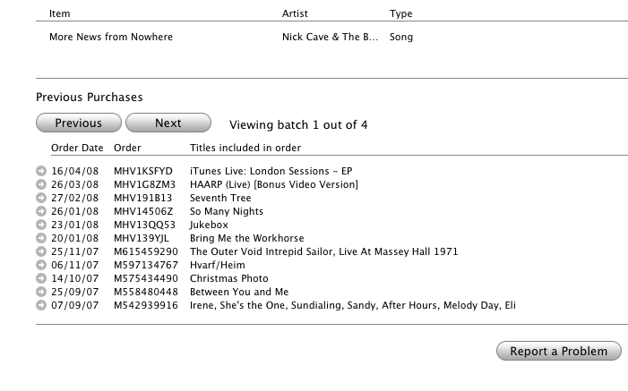
In each case, the response from Apple was swift and appropriate. I had to look around for a little while before I worked out how to report a problem. Recently, Apple’s been sending email receipts on all purchases, and these emails make the “Report a Problem” links rather more prominent. Through iTunes, however, here’s how you do it. In your iTunes account, access your purchase history:

itunes-purchase-history.png

You can then select any of your purchases with the little circled arrows:

itunes-purchase-history-items.png

Thus, each item that passes through your iTunes account can be separately reported upon.

Apple’s response

As previously mentioned, I have been completely satisfied with Apple’s response for each of the small number of problems I’ve had over the last few years. After a very short interval and despite the very brief exchange of words on both sides, I’ve always received a full “refund” to fix the problem by re-downloading the content. (As you would expect considering the cost to them is negligible, and you get to keep what you originally purchased, so it’s more of a “credit” than a “refund”. Whatever.) Apple claims to reply within 24 hours, and I think that’s about right (the most recent one certainly was). It even only took them a couple of days to fix the clipped Nick Cave track, restoring the missing ninety-odd seconds.

To conclude, how they cope with failure is a pretty important measure of the customer service of a business. Any misstep could result in alienating their very customers, especially when the business is as faceless as the iTunes store. (I wonder if this sort of thing can be fixed in the bricks’n’mortar Apple Stores in the U.S.) Disregard for now the causes of the problems that I had, which could probably be blamed in various measures on iTunes itself — that’s a rant for another time. In my own experience, iTunes’ customer service is very satisfactory and reassures me against any further problems down the road.

2008/04/16

Make (in)visible Applescripts

John Gruber’s latest fireball discusses invisibility in Mac OS X. He rightly comments that using the SetFile command line utility (which is bundled with the Developer Tools) is probably not that convenient when dealing with the visibility of items in the Finder.

For simple cases, however, I find the use of programs like “Super Get Info” to be overkill to an extent. Many years ago, I wrote two Applescripts for the exact purpose of using SetFile in a user-friendly way in the Finder.

The first, Make-invisible.scpt, is pretty simple; just select the items you want made invisible and run the script.

The second, Make-visible.scpt, obviously can’t be used by first selecting the invisible items! On run, it will display a list of currently invisible items in the frontmost folder window, from which you can select items to make visible.

To use these, you’ll want to use either the system-wide Applescript menu bar, Red Sweater Software’s FastScripts, Waffle Software’s ThisService, or something else again.

So, there it is.


One thing I just noticed is that the admin privileges no longer work;

do shell script … with administrator privileges

is failing with

Finder got an error: A privilege violation occurred.

Uh, isn’t that the sort of thing with administrator privileges is supposed to avoid? Oh well — I don’t have time to debug this (in my experience, Applescript support from Apple products tends to be a minefield of poorly tested functionality literally riddled with bugs) so if anyone can help with this I’d be greatly appreciative.

Update: this error comes about because the do shell script (with admin privileges) is situated inside the tell application "Finder" scope. Please find new versions of the scripts that fix this error in the links above.

Useless proposal #1

This is an idea that requires way too much engineering, but I wish it could happen: How cool would it be if Mac OS X had a concept of “subscribed RSS feeds”, so that no matter which browser or feedreader you used, viewing a site’s webpage would not offer you the “subscribe” link if you already were indeed subscribed to it.

At present this would require browsers parsing the formats of whichever feedreader the user was using, which is clearly a rather unscalable approach. If all feedreaders used a common format file (ahem, not OPML) then this would be a lot easier :)

2008/04/11

Twitterrific notes

I’ve been using Twitterrific for a while now as my Twitter client. There’s no huge reason, really, that the web interface isn’t just fine, but a dedicated client is nice for a few reasons, such as: polling for updates, albeit bad for productivity; shortcuts for replying; a more compact interface; and so on.

I don’t have time to write extensively about any of my wish-list, so a bulleted list will have to do. Here are a few of features that, individually or together, could make Twitterrific even better:

  • Own posts are automatically marked as “read”.
  • “Favourited” tweets are indicated visually (or at the very least the action of favourite-ing them is indicated; I’ve got many favourite posts by mistake trying to hit CMD-2 to reply and missing).
  • Last read message is remembered so that relaunching Twitterrific doesn’t result in 40-odd unread tweets. (Alternatively, simply zero-ing the unread counter on launch.)
  • On that note, it would be even better if it could track back through the pages of unread tweets until it found where I was up to; currently when I wake up my ’puter in the morning there’ll be way more tweets that I’ve missed than Twitterrific gives me.
  • The input text box grows with my text rather than fixed to a certain height.
  • Less UI preferences. You guys are good designers! No need to ask us if the window should have a drop shadow or not.
  • Auto tinyurl (or snurl, or …) of pasted links.
  • Auto-expanding tinyurl-ed links.
  • Auto-completion of followers’ handles when manually typing replies to them (say there aren’t any of their actual tweets currently visible).
  • Perhaps: ability to un-follow people.

Now, I’m sure some of these suggestions are technically unfeasible due to network latency/efficiency. But without thinking too hard about the underlying technicalities, I think it’s not a bad list. So what have I left off?

2008/03/24

‘View as single page’

Yet another reason to love the New Yorker:

newyorker-singlepage.png

Clicking through multiple pages of a single article is one of my least favourite things on the web. I know I’m not alone in this. I don’t know why it is exactly; I think the mental hiccups that it causes impede the natural reading flow, or something along those lines.

It has always been possible to read articles in the New Yorker on a single page via their ‘Print’ version of each one. I suppose they must have realised that all of their longer articles (which can get up to, oh, eight or nine web-pages) were being read in this form because it’s clearly much more pleasant. Rather than restrict us this luxury because of lost ad impressions, they made the whole thing easier even for people who previously did not realise that you could access the single-page version.

The New Yorker is the only periodical I read. This is the kind of reason why.

Update five minutes later. It occurs to me that this is also good for the New Yorker, because people who were likely to read the single-page articles would probably also be inclined to link to them; the ‘Print’ pages lack the all important context links that keep people browsing the entirety of the website; it's therefore in their interest to provide linkable pages that do contain the rest of the auxiliary content (“Subscribe for just 85¢ an issue” possibly being the big one). The fact of their acting as capitalists bothers me not one whit; I'm even gratified by it. (I’d rather them be pragmatists that stay in business.) Because, after all, they could be like all of those other websites that don’t allow you to view their articles in a single page.

2008/03/18

iPod timezones

With great fanfare I’d like to report one of the bugs fixed in the latest iPod firmware update. Since, you know, no-one seems to know what they are (fourth dot point).

Back in 2003 when I first started earning money, I saved for a few months and bought the brand-spanking new 12 inch PowerBook and 3G iPod. This was the first iPod, if you recall, that introduced the touch sensitive buttons and that was actually quite small. The iPod that really gathered the momentum on Apple’s success with the product since. Before then it was a cool gadget only used by a select few. By the time the 4G iPod came around, white earbuds were popping up all over the place.

I digress. Does anyone remember the popping bug that plagued the 3G iPod initially after its release? It was fairly surreptitious but annoying once you noticed it; a faint click whenever you skipped or moved between tracks. It was sorted in relatively short order (the buzz about this bug on the internet was, as always, ridiculously over the top), but clearly the iPod firmware guys had their hands full at that stage, because they unfortunately forgot little old Adelaide when building their list of timezones. Obviously iPod owners in South Australia are a fairly niche market, all things considered. But how hard is it to get GMT+9.5 in that little list? And how could you possibly omit it in the first place?

I dutifully filed my bug and long ago forgot about it. Let’s face it; the iPod wasn’t exactly man’s best organisational friend. I certainly wasn’t using it to check up on my calendar when my phone could do the same as well as add new events.

But Apple didn’t forget about me, and a couple of days ago I received the blissful line in an emailed reply:

We believe this issue has been addressed in the latest iPod update (version 1.3).

Five years might be a long time to wait for alarms that go off at the correct time and appointments that aren’t half an hour out, but it’s nice to know that sometimes they do listen.

2008/03/10

Leopard bugs: Finder symlinks

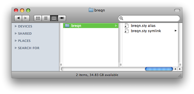
Here’s a Finder window in Mac OS X showing an alias and a symlink, respectively, to a file:

symlink.png

See the problem? (The image might be being cut off on the right.) The symlink is being displayed as if it were a folder, with the triangle on the right of its name. Obviously it’s not a folder, so that triangle is a big fat bug. Bug #5789538, to be precise.

Digital music

News over the last little while included the staggering (to me) nugget that Apple is now the number two music retailer in America. It’s pretty inconceivable how much music this actually is, and it’s pretty damn impressive given that Apple’s only been in the music business for pretty much bang on five years.

Credit being given where it is due, I do believe that Apple has done extremely well at executing an idea that, before them, really wasn’t feasible given the restrictions of the music industry.

Michael Gartenberg’s reaction:

The question is can anyone overtake them? Or even come close?

DRM or lack thereof is not the issue that will change the game here. It’s either going to be another device that can drive consumers elsewhere (devices still drive consumers to the stores and services, not the other way around) or a totally game changing experience that re-defines how music is purchased and consumed.

Apple has clearly managed to reach a demographic with iTunes that is not particularly tech-savvy in that no-one really cares about the DRM that is being served up. For all of the noise against Apple for the low-quality and DRM-crippled files they sell, it’s worth remembering that they were the first to get unencumbered MP3s sold through a major label.

(The irony of Apple lock-in due to the labels’ demand of DRM is sweet, all the more so for it convinced the labels to drop the DRM in the first place. Online video will hopefully follow the same path, but if the future turns out to be in video rental I guess it’s not such an important point.)

Amongst those music purchasers who are both aware of DRM and leery of buying into it, the newly-constructed Amazon store seems to have gained a fair bit of mindshare. EMusic was always the crowd favourite (and online store #2 after iTunes) but against Amazon it’s hard to imagine how it can retain that lead. The big question is: after Apple finally re-negotiates with the labels to get DRM-free music across the board, will Amazon’s store retain its popularity?

Here’s where a critique of iTunes itself comes in. iTunes, as a browsing and discovering online store, is pretty woeful. If I know what I want, buying music is easy. Too easy, even. The emails I receive from Apple about new releases on the iTunes store being particularly effective of keeping my in the buying cycle.

But in terms of discovering new music in the first place, iTunes is really nothing more than a spreadsheet that plays music, in the insightful words of Ian Rogers. But do mainstream customers care? iTunes isn’t much worse than most media players around the place. Could it be better? God yes. But is it good enough? Unfortunately yes. Here’s to some vision inside Apple to improve it like they’ve improved that product that actually made them all this money: the iPod. No-one’s come close, because it’s improved at such a rate that the competitors are playing catch-up half the time.

So what about the question “Can anyone come close?” ? It’s hard to imagine in the near-to-medium future.

I originally thought that the “subscription music” model sounded pretty convincing on paper. Literally all music (that has been licensed online) unrestrictedly available to listen whenever you like? What’s not to like? Well, a monthly fee, I guess. If you buy less than one album a month that you’ll seriously be interested in an listen to, well, forever, then paying a monthly fee isn’t really worth your while. Especially when your music goes kaput when you stop paying your fees. Over a five year period you’re better off buying your music outright (for some definition of “buying” and “outright”). Broadly speaking.

I don’t really have a closing argument to all of this. I’m strongly in favour of buying digital things. Particularly ones that don’t lock me in so that five years later I’ve got gigabytes of encrypted junk that is no longer playable. Music is crossing into that sweet spot and Apple’s in a damn good position to sell yet more and more of it. Hopefully things just get better here on in.

2008/02/25

Brain numbers

I’m fascinated by reading about the brain in abstract terms. Here’s a new article in The New Yorker by Jim Holt that takes a broad look at the research being done by Stanislas Dehaene in Paris. He takes high resolution 3D scans of peoples brains while they’re thinking about or doing things to try and understand how our mind works.

This might seem like madness: “well, I know the left side of my brain is responsible for jumping” (say). But by isolating separate thought processes and functions to separate brain areas, you can gauge the limits of certain types of thinking.

The aforementioned article discusses numbers in this context: turns out that there’re neurons in the brain that fire specifically to recognise groups of objects in numbers of up to about five. Any more than that and you need to count the objects individually before you can know how many there are.

Here’s a result that spins me out:

A few years ago, while analyzing an experiment on number comparisons, Dehaene noticed that subjects performed better with large numbers if they held the response key in their right hand but did better with small numbers if they held the response key in their left hand. Strangely, if the subjects were made to cross their hands, the effect was reversed. The actual hand used to make the response was, it seemed, irrelevant; it was space itself that the subjects unconsciously associated with larger or smaller numbers. […] He even suspects that this may be why travellers get disoriented entering Terminal 2 of Paris’s Charles de Gaulle Airport, where small-numbered gates are on the right and large-numbered gates are on the left.

Say what? What implications does this have for other cultures who write and do maths in other directions? What implications does it for how we read a number like “728456” where the smallest number is on the right? Could we suddenly become better at doing maths by hand if we reversed our number system?

And speaking of being better at maths (there are tangential parts of the article that discuss the immensely better mathematics teaching programs in Asian compared to the western world), I am absolutely stunned by this:

Chinese, by contrast, is simplicity itself; its number syntax perfectly mirrors the base-ten form of Arabic numerals, with a minimum of terms. Consequently, the average Chinese four-year-old can count up to forty, whereas American children of the same age struggle to get to fifteen. And the advantages extend to adults. Because Chinese number words are so brief—they take less than a quarter of a second to say, on average, compared with a third of a second for English—the average Chinese speaker has a memory span of nine digits, versus seven digits for English speakers. (Speakers of the marvellously efficient Cantonese dialect, common in Hong Kong, can juggle ten digits in active memory.)

If this is true (and the result is logical to me), then why on earth haven’t we invented new words for our numbers? In a bit of a coincidence, I’ve been thinking recently how inefficiently I count numbers in my head and lazily trying to improve how I do that. I thought the inefficiency of my technique was verbally thinking each number as it passed, which is extra slow in the teens and seventies. My plan was to try and simply visualise the numerals in my head ticking past and not say them at all; I found I could actually do it for small stretches of numbers but I’d quickly fall back on my old techniques. Does everyone count in their head by thinking of the actual words? (I probably should have mentioned by now that the article says that yes, this is the case; and furthermore, you always use the language you were taught to count in originally. Large numbers and multiplication are stored in memory, apparently, as language strings.)

Of course, this is all for “average” humans; it sounds like the experiments that have shown these results are only just getting off the ground and it would be interesting to see what things look like for autistic mathematicians (not to mention magnetic field-induced temporary autism).

Interesting stuff.


“one, two, tee, for, fev, six, sen, ate, nen”

“one tee + ate fev = nen ate”

2008/02/21

Mac security

Another day, another computer security rant and rebuttal. Here’s a recent piece over at MacUser by Dan Moren.

Now, don’t let it be said that I disagree with the article in general. This is gold:

Okay, if an instant message window pops up on your computer, with a screenname you’ve never seen, asks for your Social Security Number and you give it to them, then frankly you didn’t deserve that identity in the first place.

But I feel Dan goes a little overboard here in his refutal of whatever some jackass is saying:

Mac users need security software, too. Oh, I know: Mac lovers will respond to this statement by puffing up their chests, raising their chins and sniffing, “Ha, my Mac always has been and always will be virus free. I don’t need no stinking security software.”

Who are these people? Where does one find them? Maybe it’s those same people who go to oxygen bars and drink fancy bottled waters and have weekend quail-shooting parties before jetting off to some balmy Caribbean island where they play shuffleboard and laugh about how they don’t need security software.

Okay, sure. The article is good. Make sure to teach the kids not to let in Trojan horsies. And that paragraph above made my giggle a bit. But you know freaking what? My Mac always has been and always will be virus free. I don’t need no stinking security software.

2008/02/20

Hilarity

I don’t do short posts here much. Perhaps I should. I can’t remember whose link I first followed to “Guy in the Hat”, but I’m glad I did:

It’s almost like watching one pseudo-journalist giving another fellatio via email.

It’s funny coz it’s true. But it’s funnier because Gruber deserves it. Well, I think so, anyway.

Oh wait, does that mean I now have to swallow?

2008/02/19

Free dictionaries and "Dict OS X"

It’s really annoying that there are hardly any free and good multilingual dictionaries. Except that there are loads of online ones. I don’t like online services much, mostly due to latency. But also because native clients have the potential to be simply better.

Speaking of which, all the dictionary programs I’ve seen are really ugly. The content available for these programs generally don’t take advantage of the fact that they have an effectively unlimited amount of space to show you as much information as you might happen to want.

Imagine a translation dictionary that gave you conjugations and declensions of every word you asked of it and showed it in use in multiple contexts. (If you wanted that much information, of course.) That’d be, like, really useful for learning a language.

Of course, it’d be harder than transcribing a print dictionary into a searchable computer program. And I’m guessing there’s not that much money to be made from dictionaries at the best of times. But it would make a good free project/labour of love for language geeks.

Well, we gotta live with what we got. And I found it quite a pain to get dictionaries locally installed that can be accessed through a native application in Mac OS X.

Not knowing where to start, OmniDictionary seems pretty ideal to begin with. By all accounts, it’s “easy” to set it up to grab local dictionary content. But Jens Ropers’ DICTataro, recommended by Omni, is down at time of writing, so no luck there. Trying to manually set up a local dictionary server was a dismal failure. The links at dict.org are all rather old (i.e., nothing is actively maintained) and the Java programs listed there simply bailed when I tried to run them.

I finally had some luck with Dict OS X. The 0.1 version number and 2004 release date notwithstanding, at least it works. It comes by default with an English dictionary, and English to Czech and vice versa translation dictionaries. (Instructions for the program itself are all in Czech but luckily self-evident.)

More dictionaries can be downloaded from freedict.org. After downloading, say, the English to French files, there are a few steps to get the dictionary into Dict OS X:

  • Uncompress the eng-fra.dict.dz file. This is most easily done by renaming it to eng-fra.dict.gz and opening the file; Mac OS X’s extraction tool does the job.
  • Delete the compressed file and rename the containing folder to something like “English to French.dictosx” to turn it into a bundle (the name you chose is what appears in Dict OS X’s interface). It should contain the .dict file and a .index file of the same name.
  • Finally, move the newly created bundle to ~/Library/Application Support/Dict OS X/

Phew. And once you’ve gone through the tedium of doing all this, you’ll sadly discover that the dictionary is woefully inadequate:

dictosx.png

That’s right. There’s no gender information for the nouns in this dictionary. It’s better than nothing, at a pinch. But I wonder what it would take to get a free dictionary like this off the ground. Because we certainly need something better.

2008/02/08

‘Yahoo!’: all about the name

Many thoughts around the place on Yahoo!’s probably acquisition by Microsoft for forty billion dollars. I like Gruber’s take.

I think the way to analyse this deal is by looking at what Microsoft gets out of buying Yahoo. Does Yahoo actually provide any products that Microsoft doesn’t? By and large, no: Microsoft has been bleeding money trying to replicate Yahoo’s online presence. Search/portal/community — there’s nothing that Yahoo has in material terms, give or take, that Microsoft doesn’t already (try to) do.

Except for the whole customers thing.

This is more like Google buying YouTube: after trying and failing to complete with the largely more successful product, the easy way out is to buy the mindshare. And you can’t keep the mindshare without retaining the original product.

So Microsoft can ditch its own attempts at creating a Yahoo knock-off and simply reap the rewards of owning the Yahoo name. The seemingly obvious thing to do with the acquisition is to keep the Yahoo stuff that makes money (search, email, Flickr, …), close down the competing areas that Microsoft does better (I guess that’d be the Zimbra thing that people keep mentioning), and watch the cash roll in. Or something like that.

As a non-Yahoo and non-Microsoft devotee, it doesn’t make any difference to me. (Oh, I’m a casual user of del.icio.us, but I had no idea they were owned by Yahoo and I can give it up without losing any sleep.) I hope for the sake of it’s fans that some semblance of Yahoo is left after the merger. Surely things couldn’t turn out as badly as everyone is saying?

2008/02/06

To-Do management: “Things”

The bane of productivity is multi-tasking. Context switching in your brain slows down pretty much everything you think about and can make it impossible to dig deep into the hard problems. That’s why Richard Stallman doesn’t use a web browser and Don Knuth doesn’t even use email.

But multi-tasking is pretty damn addictive. It’s not something that most people have the will-power to give up — nor would they want to. Outsourcing your memory to a computer is an easy step to free up some mental capacity for problem solving.

Now, I’ve never been much of a ‘diary’ person to keep track of things I have to do. Generally my brain’s been good enough for most things. The extent of the project management in my various endeavours has been a flat list of flagged emails in Mail.app. One obvious problem with this is that tasks for which I don’t receive email don’t receive as much attention. And the non-hierachical system I set up makes it easy to lose the one important one you’re looking for in a big list. (For similar reasons, Mail and iCal’s revamped To-Do list in Leopard is not really the answer to my problems.)

This is one of the reasons I’ve never had a very good system for organising my long-term goals. Especially for my PhD, to be honest. However, with my new, ubiquitous, MacBook, I’ve the liberty of exploring software to address this personal deficiency of mine. Judging by the plethora of software that’s emerging in this space, I’m not the only one.

Now, ages ago I once used OmniOutliner to try and keep something of a project management ‘outline’, but it’d didn’t stick so well in my mind; it’s pretty essential that the application that you put all your forward-thinking thoughts into is easy and enjoyable to use. If there’s any mental burden just to get started, it will never survive as a long term commitment. Bearing this in mind, let’s look at the first app that I’m trying out as a candidate to fill that particular gap in my brain: Cultured Code’s “Things”.

First thing’s first: I’m not a fan of the name. It’s about the least Google-able name of any software ever. People are already resorting to calling it ‘Things.app’ just to be able to differentiate it from, well, normal sorts of things. But it’s certainly a name that strikes a chord amongst Mac users because it sounds like a name that Apple itself would use.

They claim this is an alpha-release preview; despite this, the interface is quite polished and the application seems very stable. Having said that, I do hope that some refinement to the interface is made to simplify it some more.

But let’s start off with the good things. The killer feature of this program is being able to set repeating schedules of To-Do items. I’ve been wanting this for as long as I can remember. “Mop the floor” repeat every second Sunday. Chores are the very first thing that I forget/neglect to do when I’m having a Sunday at home. Note, however, that this feature doesn’t exist yet. But I’m predicting that it will be awesome based on their recent comments on the feature.

Second up, the workflow of the program has been exceptionally well design; adding and deleting To-Do items and projects is as easy, often, as hitting the space bar. There’s also a system-wide heads-up display from which you can add a To-Do whenever. And did I mention that the program is very attractive? Fluid to use and handsome looks makes an app that you like to spend time, or ‘nest’, in. So far so good.

Now the application gets a little complex to describe in words. To-Do items themselves can be arranged in terms of their focus: today, next, later, and postponed. This is a good breakdown, I feel. Granular enough to segregate the items that don’t belong together, but coarse enough that you don’t lose items in categories that are too fine.

This is the first layer of metadata that can be assigned to To-Do items. The second layer of metadata that “Things” gives are: projects and areas. A project is something to be completed that requires many To-Do items. An area (of expertise) is the broad categories that your projects fall into. I might be using “Things” to track my both PhD and Typesetting work, which each have various projects attached to them.

Here’s the kicker: each project can only belong to a single area of expertise, and yet in the organisation of the application, projects and areas are treated roughly as orthogonal. Take a look:

things-dupl.png

In the sidebar there’s a list of projects in an ungrouped list. In the main window, the same information is presented but this time divided into categories.

In my opinion, this duplication of information reveals an underlying flaw in the interface of the program. Projects should exist as sub-categories of Areas, which would help keep the projects logically separate in the sidebar and eliminate the redundancy — while simplifying the interface.

In brief, here is the current design in full ASCII glory:

ORGANISE
  ▾Projects
    WSPR 
    Thesis
    Experiments
    LM fonts
  ▾Areas
    Web
    Chores
    PhD
    Typesetting

And here is my proposed design:

AREAS
  ▾Web
    WSPR
  •Chores
  ▾PhD
    Thesis
    Experiments
  ▾Typesetting
    LM fonts

This efficiency of the list is only slightly improved, but the duplication of information in the main window is no longer necessary. Fewer equivalent ways to view data equals less confusion.

One of the reasons this interface should be simplified is because there’s a third layer of metadata that can be applied to all of these To-Do items: Tags. These provide an arbitrarily extensible way to group To-Do items into smaller and smaller sub-groups, if you so desire.

Tags allows you to filter items into arbitrarily granular (and non-exclusive) categories. A GTD-type approach is suggested to use tags for contexts like Home/Work/Phone/Whatever. (I’m not a GTD kind of guy, by the way.) Alternatively, it might be impractical to list every single Ruby script or LaTeX package you maintain as an individual project; tags allow you to do this without cluttering the interface of the main window.

I can’t do the tags feature justice with words, but suffice it to say that tags in “Things” are Done Right. And they will stay completely out of your way if you’d prefer to keep things simple. This is extremely important in hooking people in with a simple-seeming application that hides its power in its flexibility.

My only other complaint after a short time of using “Things” is the button bar at the bottom of the main window. I loathe buttons I can’t get rid of, even more if they’ve got labels that I can’t even hide. (For example, now that I’ve assigned Control+Space to quick-add To-Do items I guarantee I’ll never click that button ever again.) I think it’s very important to have scalable interfaces, where in this case the scalable refers to being able to hide away the complexity of unnecessary features after you’ve learned the shortcuts or decided to mentally pass on that particularly feature of the application.

To wrap up this mini-review, I’m optimistic about things. No, sorry. I’m optimistic about “Things”. Time will tell if the application is sticky enough for me to nest in it over time and create the extension of my brain that is really the goal of this sort of program. I think it will be. I’m hoping that with feedback from the community before the ‘v1.0’ release, things will only get better. Oh, sorry again. “Things” will only get better.

2008/01/30

Internet Explorer 8

With all the brou-ha-ha around Internet Explorer 8, I thought I’d add a couple of words to the debate.

Read James Bennet’s excellent summary (thanks for the link, Daring Fireball) for all the gory details. In short, IE8 makes a bit of a mess all over the web because it requires a metadata flag to tell it to render documents according to proper web standards.

That is, documents that have been written for IE6 and below that use the wrong box model will still look okay, and new sites that are developed correctly according to the standards require a special flag to render equivalently in Safari, Firefox and IE8. But without the flag, Safari and Firefox will still render them fine, only IE8 will do things wrong.

So, who wants a special “Microsoft fucked up” flag on every single page developed from now to eternity? Well, things look like that won’t be the case if IE8 renders HTML5 according to the standards no matter what. In which case this is all a storm in a teacup and the problem will disappear in the next couple of years as HTML5 becomes dominant. (Poor old XHTML.)

But if that’s not the case (that backwards compatibility precludes this standards-HTML5 mode) then Microsoft should just make a clean break and create a new web browser from scratch. I’m serious! Call it “MS Browser” or whatever and use all the code from IE8 that’s actual correct as far as standards are concerned. Then people that require IE can continue using that, which will be frozen forever. But home users can start afresh with a browser that can and will continue to support standards and doesn’t have to deal with backwards incompatibility kludges.

That’s a much cleaner solution, in my eyes, and moves Microsoft away from the perhaps tainted “IE” name. But it’ll never happen. Because no-one listens to me:)

2008/01/28

New MacBook New Life

Well, I finally did it. After ruminating for possibly years on getting an iMac and then realising that I needed a primary machine in two locations, I’ve now sprung for a MacBook. Not, in the end, a MacBook Air; more on that later.

The buying periods for seasoned Mac fans deserves some words. While most people will just up and buy a new computer whenever they need one, following a computer company as obsessively as some of us follow Apple (well, we need some way to fill the void) attunes one to the ebbs and flows of product releases.

For many months, I was going to buy “the first iMac released after Leopard”; not only do I get the new operating system gratis, as it were, I’d also be buying the latest and greatest — obviously to maximise the performance/cost ratio as well as the advantages gained from subsequent generations of hardware. (While some will advise never to buy first-generation products, I’m not so leery about exercising warranty options; if you’re the unlucky type, then the hardware will break on you no matter what. And vice versa.)

But as time went by I realised that I was slowly starting to detest my working environment at uni. Windows PC and all that. The new McAfee anti-virus that literally slowed everything down by minutes to load was the last straw. And I thought how nice it would be to work on my PhD on a computer I actually enjoyed using. Loving your tools, and all that. With the Core 2 Duo, any Mac I bought would improve the speed of multitasking and at at worst remain about the same for simulation time in numerical software like Mathematica and Matlab. Buying a notebook would allow me to work on my PhD — which should be my primary purpose right about now — in comfort and even on weekends.

With a desktop at home, the chance of me doing real work on it would be essentially zero. With a notebook for my uni work, I could bring it home out of hours. Now, I’m not necessarily saying that I’m going to be enjoying doing some number crunching on Saturday mornings; the sort of time I shall save will be the workflow improvements that I’d otherwise be doing during the weekday. It’s not good time management to spend a few days making sure that the figures and diagrams I’m producing match the fonts of my thesis. But I can’t ignore those sorts of details, so I’d have the spend the time somewhere.

In the end, a MacBook just made sense. So, then the waiting game became “wait for Leopard and then see how we go”. By the time Leopard was released I was waiting for my tax return and the MacBook was due for an update; but by the time the latest of the MacBooks was released, there were rumours of Apple’s then-secret MacBook Air. After waiting so long on the MacBook, another couple of months wasn’t going to make much difference. And I had deadlines that I didn’t want to push back for accommodating a radically new computer in my life.

Finally (and I do mean finally — the wait had been interminable by this stage) Apple released their MacBook Air and I almost bought one within hours of watching the announcement. What’s not to like? With 60% of the weight of a standard MacBook, it falls into the category of light enough not to worry about. And I love the idea of soldered RAM. Seriously. I just added 4GB of RAM to my MacBook, the maximum possible, for AU$160; that’s less that 10% of the price of the machine. And that’s a huge amount of RAM. The days of swappable RAM in consumer machines are numbered. The upside is cleaner design and cheaper computers.

But the MacBook Air didn’t quite cut it for me as a main machine right now. On top of the $400 excess for the design, I’d likely need an external DVD drive which made the thing even more expensive, and the compromises for that price point just didn’t add up for me right now (probably with the CPU being the biggest factor). But I’m gunning for the MacBook Air to become the MacBook as soon as possible and it’s definitely my “favourite” machine in Apple’s lineup. I hope in the future they release an even smaller machine that uses a widescreen display the width of the old 12 inch PowerBook. While I don’t mind the size of the 13 inch MacBooks, I am more taken by the more diminutive PowerBooks of yore. The slightly smaller screen totally justifies the rather dramatic reduction in size of the notebook, in my opinion. I’d like to think that the reason the MacBook Air isn’t that size is that Apple’s engineers simply couldn’t shrink things that much. That’s a rather self-serving opinion, however.


(By the way, guess what? Even my Dad knew about the MacBook Air shortly after its announcement. Now that’s something for Apple marketing, I’d say.)


So here I am with a fancy new computer with all my music, my typesetting, my code, my data. I’ve got a new-found respect for software like OmniWeb that just didn’t cut it any more on older hardware. iCal is now useable and I can organise my life in it. Mail.app has a convenient ToDo list that might get me to finish all of my unfinished projects. I’ve got large displays at home and at work so Mac OS X has room to breathe; something it totally deserves.

There’s a feeling of association that you have with a computer that fits your needs and responds to your commands that really shouldn’t be lacking from any computing experience. When web apps start being faster than desktop apps, you know there’s a problem. When you sigh when sitting down in front of Windows every day to have to deal with all of its idiosyncrasies, that’s not a positive environment for work.

It sounds silly, but when I sit down in front of my new MacBook, I start to feel at one with this extension of my brain that is before me. There’s a long way to go in getting computing just right, but I feel that we’re starting to home in on what that is.

‘Children of Húrin’ by Tolkien (2007)

I imagine that Peter Jackson’s epic telling re-stimulated interest in J.R.R. Tolkien’s The Lord of the Rings. I’d be interested to see the numbers. What I think many people don’t realise is that the story depicted in there is a small part of the tale imagined by Tolkien over his long years.

The backstory of ages past forms a greater story than The Lord of the Rings itself, albeit told in less detail. Tolkien spent his entire life drafting fragments of stories and poems of this history, much of which has been posthumously published by his third son, Christopher Tolkien. The most recent, and most ambitious, of these is The Children of Húrin.

Small reflections of this greater tale can be seen in brief moments in The Lord of the Rings, such as:

For of Beren and Lúthien was born Dior Thingol’s heir; and of him Ewing the White whom Eärendil wedded, he that sailed his ship out of the mists of the world into the seas of heaven with the Silmaril on his brow. And of Eärendil came the Kings of Númenor, that is Westernesse.

The story of Beren and Lúthien is referred to in the Lord of the Rings due to the parallels between the relationship of Aragorn and Arwen. The Children of Húrin takes place in a similar time and covers a separate branch of the family.

Unlike previous works such as The Silmarilion and Unfinished Tales, which are a collection of short works that read more like history books, The Children of Húrin is a complete narrative seamlessly composed from a vast array of reference material. The result is a story that is dark and sombre where the Lord of the Rings is hopeful and sometimes even light-hearted.

For those who have read The Lord of the Rings and would like to continue reading works in the same vein, Children of Húrin can be recommended without reservation. It’s a great loss that Tolkien could not bring more of his works to completion, as the stories that survive are tantalising glimpses into the great imagination that he possessed and the entire worlds that existed in his head. We can but be thankful that his son has been able to construct such a collection of works out of the material left behind.

2008/01/23

Can't see past the pinstripes

The evolution of pinstripes in Mac OS X has been quite a ride. Remember when things looked like this? (Extracted from a screenshot at GUIdeBook.)

pinstripes.png

Some people thought this looked a little bit over the top. In hindsight, yes, that is a bit visually noisy. As time went by, Apple continued to tone down the pinstripes until they were almost entirely gone in Mac OS X 10.4, remaining only very faintly in the menu bar and in the title bar of background windows.

I would much have preferred them over the years to keep the pinstripes and keep the brushed metal away, but there you go. The brushed metal never bothered me too much aside from the occasional niggle.

With Mac OS X 10.5, the pinstripes in the menu bar have been replaced with transparency, and haven’t we had fun complaining about that, too? For what it’s worth, I’m also not a transparent menu bar–hater. At least they didn’t make it a brushed metal menu bar at any stage.

But wait! If you look hard there are indeed pinstripes in Leopard. And they’re unlike any pinstripes you’ve ever seen — well, except the ones you seen in real life:

vpinstripes.png

Squint, and you’ll see ‘em. Here, this might help; they’re pretty subtle:

vpins-zoom.png

Vertical slimming lines in an otherwise unadorned window. And they’re lighter than the window. Quite unexpected. I’ve only seen them here in iCal, too. Do I like them? Well, I guess I’d rather not have them there. Noticing them did prompt this entire post, after all. But were they to be replaced with yet more gradient fills, I’d be more upset, I think. Too many gradients just kills me.

So there you have it. An insignificant graphical frill that will probably be never again seen in any Apple product, but one with enough back-story to make it worth mentioning. Perhaps.

Period Space Space

Typographically speaking, typing two spaces after a period ending a sentence is the wrong thing to do.

Extra space after a sentence was popular around the 19th Century, but these days it is no longer in fashion. By default LaTeX still adds the extra space, and you can turn it off with \frenchspacing. Don’t forget TeX’s typesetting was inspired by early 20th Century textbooks and you can understand why the extra space is the default.

But let’s get this clear: this extra space was used to help justify the lines of type without overly increasing the space between words inside the sentences themselves. That is to say: the extra space was not exactly two spaces wide. For some sentences it was more, sometimes less. (In some old books the extra space can be grotesquely large to my eyes.)

When typewriters came along, they needed all of the readability improvements they could get. Using a double space after the period works well to separate sentences that would otherwise run into each other visually. But proportional text doesn’t have the same problems.

Even if you wanted to add extra space after your sentences, it should be the job of the typesetting program to do this for you. Just like you shouldn’t hit Return twice in Word to separate paragraphs (if you know what you’re doing), you shouldn’t hit Space twice to separate sentences.

The only acceptable time I can concede that the double space is appropriate is for markup reasons. LaTeX does not support this, but a typesetting program that only added extra space in conjunction with the double space would be a little more elegant in cases where a period doesn’t end the sentence (e.g., after an abbreviation). I’m not a big fan of LaTeX’s syntax in this instance: cf.\@ previous, where the \@ suppresses the extra space that would normally be inserted. Luckily TeX is clever enough to assume that a period following an uppercase letter will generally not be ending a sentence, and suppresses the extra space automatically.

Phew.

Let’s just make life easy for ourselves and use \frenchspacing.

2008/01/22

Combining Quick Look & texbin

Mac OS X 10.5 has a handy technology called “Quick Look” that allows you to preview documents in a floating window without actually opening them up in a dedicated program. Ideal when you want to briefly check on the contents of something while you’re in the middle of another task.

Modern TeX distributions come with a convenient program texdoc for quickly finding documentation for LaTeX packages and so on. It’s nice to use Quick Look as the viewer for texdoc–found files, as I often open up package documenation just to check the syntax or spelling of some obscure command. Here’s a shell script to do this:

#!/bin/sh
qlmanage -p `texdoc -l $1 | grep -e '.*' -m 1` &> /dev/null &

Save it somewhere in your path in a file called, say, teq and you’ll be able to write teq pdfpages to called up the pdfpages documentation in a floating window. Nice.

2008/01/16

With money to spend: MacBook ±Air?

A year ago I wanted to buy an iMac. Long story short: I changed my mind. Primarily because I became frustrated with using a Windows computer at uni and wanted a notebook to replace both my home and work machines. Towards that end, I’ve got big (enough) displays in both locations that I’m okay with the ergonomics situation. Disk space is also fine as long as my music is kept on an external hard drive.

Now the MacBook has been recently updated, and today brings the announcement of Apple’s new ‘MacBook Air’. This marks the beginning of the end for the current form-factor MacBook; it’s only a matter of time before it’s replaced by its svelte brother. So it’s time to buy; my 867MHz PowerBook is so flaky these days to be largely unusable for anything serious. I don’t want a MacBook Pro because (a) they’re expensive, and (b) they’re large; if I’m lugging the thing on my half hour walk to and from uni every day, the smaller the better. So the MacBook Air looks like a good idea from that respect. And it’s small. I like small! (To throw in an empirical point of argument.)

The only problem is the performance/price trade-off. For approximately AU$400 less, I can buy a MacBook. And the processor will be about half as fast again over the ’Air, all else being about equal. But even my uni computer is only a 2.4GHz Pentium 4. The two cores and greater efficiency of the Core 2 Duo means I won’t be down-trading much at all on the performance I need to run Matlab and Mathematica.

So I’m leaning greatly towards the MacBook Air. I’ll give it a day of deliberation before I make my decision.

P.S. Why is it ‘MacBook Air’ but ‘iPod touch’? (Note the capitalisation of the qualifier.)

2008/01/01

2008

Here lies a new day, a new week, a new year. I don’t know what’s going to happen next, although I’ve got some plans. By the end of the year I could be in a different country. I will be called “Doctor”. I will hold my head high, and my future will be trodden with a steady step. I will help others around me and I will not judge. Friendships will be strengthened and new friendships made. My time will be well spent and I will not regret the idle moments. Happy 2008!

2007/12/31

‘The Beginner's Guide to Winning the Nobel Prize’ by Peter Doherty

To take a break from some rather involving fiction novels, I picked up ‘The Beginner’s Guide to Winning the Nobel Prize’ where it had been laying dormant for a year or so on my bookshelf. Not exactly the kind of book that I’d buy for myself, but no an unwelcome present, either.

Peter Doherty won a Nobel Prize for some work in immunology, and this book is a pastiche including his recollections of the prize, a summary of his work itself, general thoughts about science in the future, the conflict between religion and science, and some general tips on how to win a Nobel Prize yourself. I’ve probably missed some in there. The book is interesting and thoughtful, but not too insightful.

On of his comments that resonated with me was in the conclusion of his section of religion vs. science:

What greater betrayal can there be of God’s good grace, or the continuity of our species and all life, than to embrace polarised attitudes of mind and practices that compromise the lives and opportunities of the generations that are to come?

It’s a statement that I have a hard time believing that anyone, religious or otherwise, could disagree with, and it’s a tidy summation of a morality for everyone.

‘Shantaram’ by Gregory David Roberts

I haven’t read such a page-turner as Shantaram in a long time. I read the whole thing in about 2 or 3 weeks (including a day out of good reading time for Blink). Considering it’s 900-odd pages long, that’s pretty good for me; admittedly, it’s been a slow end to the year.

Shantaram is a fictional story heavily inspired by a hugely pivotal part of the author’s life. To summarise the gist of the story, Gregory David Roberts escaped from a Melbourne jail while serving a twenty year sentence and ended up India, where, alone and unknown, his past life was slowly stripped from him and he began a journey towards another life. There is a sometimes disconcerting contrast between the voice of the author and the actions of the character of the book. It can be a bit of a shock to read about gouging people’s eyes out after the author’s personal reflections on love and loneliness.

The fictionalisation of the story is part of what makes this book such an interesting read, but it’s the personal side that brings home the more philosophical moments. In broad brush strokes, this is obviously a novel that paints the picture of Roberts’ life at the time. His true story is amazing, and the life-changing effects on him are unmistakable (and indeed, emphasised in the book). Having worked with with Bombay mafia, however, he’s obviously writing fiction for the general detail of the story. Suspension of disbelief here gives the novel its immediate appeal, I think. Obviously the story itself is integral to the book. Without the personal side to buoy the narrative, however, the plot would probably be a little too neat and tidy, and yet in the end of it all the plot ends abruptly and finishes nowhere.

This is a book that, in softcover, has pages thin enough to make casual page turning harder than usual. From the author’s point of view, splitting the book in two probably makes no sense at all, because it’s the spread of experience that he’s working from to write the story and finishing it earlier would leave his emotional development unfinished.

Now, I can’t say that Roberts’ writing is perfect; I found he was occasionally over-enthusiastically profound; for example,

The truth is that, no matter what kind of game you find yourself in, no matter how good or bad the luck, you can change your life completely with a single thought or a single act of love.

But I forgive him due to his sincerity. After his experiences he’s allowed the exuberance.

2007/12/19

‘Blink’ by Malcolm Gladwell

I bought a book today that’s a gift for my cousin. But I read it first because, well, I had to ensure that the Christmas present was a good one, right? This is the second time that I’ve read a book cover-to-cover in a single day and there really is something to be said for it. Edgar Allen Poe discussed the point once when talking about his short stories: everything that needs to be said is able to be digested as a whole. (Obviously he used more words that I.)

Don’t get me wrong; for many novels it’s an absurd idea to sit down and read until you’re done. But, for me, it worked for Perfume and today it worked for Malcolm Gladwell’s nonfiction Blink.

Malcolm Gladwell is a writer, and a journalist in the best sense of the word. His work I’ve read in The New Yorker has been well-researched and entertaining without exception, although I’ve only read a handful of his articles so far. I’m somewhat dismayed to just have discovered an extensive archive that I fear may take up a lot of my time in the near future.

He is also an excellent speaker. At TED he talked about pasta sauce and the way choice and like isn’t as clear-cut as it seems. And at the New Yorker 2012 conference he talked about genius and the difference between the geniuses of today geniuses and those yesteryear. Both talks give a good insight into his intelligence, his wealth of knowledge, and his style of collecting and reporting information.

This is his second book. I haven’t read his first, The Tipping Point, but I will one day. (In fact, I’ll do a lot more reading in general, if my insatiable appetite for sleep ever slackens and my indelible desire to procrastinate dissipates.) Blink discusses, from a dizzying number of viewpoints, the ways in which our brains work in the seconds before conscious processing kicks in. “Blink, and you’ll miss it”. I won’t try and replicate his examples or spoil the more surprising results; suffice it to say that when an expert tells you their opinion on something after seemingly a split second’s though, it’s worth trusting. On the other hand, to overcome our own gut reactions to things that we judge too quickly takes a lot of training — and in many cases is impossible. Our state of mind can influence our perception — no surprises there, I guess — but to such a degree that we should never take our own opinion of things too seriously.

Blink is an engrossing read by a writer who deserves his fame. Gladwell’s compilation of a slew of seemingly unrelated stories creates a compelling spiderweb of evidence to convince me, at least, that there’s a hell of a lot more going on in my brain than I give it credit for on a day-to-day basis. The most sobering part: think too much about something and you’ll destroy your opinion of it. Hmmm. I guess what I said above should now be reconsidered!

2007/12/07

Medicine

I’ve never been attracted by medicine as a science or profession. But I’ve become interested in the field recently, in a vague sort of way, because, well, I know I’m going to get sick one day. Everyone dies, right?

Disregarding outlandish (but hopeful and tempting) theories involving nanobots to replace our organs (Ray Kurzweil), and even an “anti-aging singularity”, after which the rate at which we can prolong people’s lives exceeds their actual deterioration due to ageing (Aubrey de Grey), there’s still huge amounts of progress still to be made in the field. This point is made so very clearly in an article in the New Yorker, “The Checklist”, discussing the huge improvements that can be made in intensive care simply by following checklists when performing tasks, rather than relying on memory and experience:

In the Keystone Initiative’s first eighteen months, the hospitals saved an estimated hundred and seventy-five million dollars in costs and more than fifteen hundred lives. The successes have been sustained for almost four years—all because of a stupid little checklist.

Boggles the mind, really. It’s sweating the details like these that will be keeping us alive longer on average. For something even more amazing, again via the New Yorker, check out this speech on Regenerative Medicine. It’s now possible to grow bladders from scratch (from a sample) and implant them in the patient whose original requires replacing; kidneys are almost there as well (the bladder is the easiest because it’s hollow). This had just reached the implementation stage now. And this is the stuff that can be done without stem cells. Fifty years ago, we couldn’t even transplant organs.

I don’t have a clue how these people do it. And I’ll no doubt never learn. But I can’t wait to live to see where we end up.

2007/12/03

Tolkien in a chocolate review?!?

Blogs. I hate the word. But I do love the medium. Seriously, think for a sec: where else can you read something anywhere nearly comparable? Don’t get me started on newspapers. (Well, in Australia they’re mostly tabloids in disguise, anyway.) Magazines work as is in they’re interesting and stuff, but you’ll never read the raw, unadulterated opinion of some guy just smashing away at his keyboard (or some girl, well, tinkering at hers).

Take Brian Tiemann, who’s the subject of this piece. Don’t ask me who he is. I don’t even know why I read what he writes on a regular basis. He’s entertaining almost all of the time. I guess that’s about it. He often writes about things I like. For example, he’s just started reviewing some varieties of dark chocolate. (Which is truly my favourite.) And here’s a little piece of what he has to say about a particular brand:

The chocolate doesn’t really melt, it sort of collapses like a Jenga tower into a heap of rubble on the tongue, which you then have to sweep out of the way like the ruins of a decrepit Vegas casino redolent of pipe smoke and loveless sex.

You don’t get self-indulgent, brilliant, evocations like that in a serious publication. Followed but one sentence later with:

Just a mouthful of wreckage that you’re eventually glad is gone, and a cloud of something gray and gassy, indistinct and vaguely sinister, floating over the whole scene, looking towards the West, only to be dissipated by a firm breeze from over the Sea

Imagine the brilliance of using a Tolkien metaphor to describe the aftertaste of poor chocolate. Would that ever work in a piece written for, you know, money? You’d have editors going “oh, no-one will follow that; it’s too many words, anyway”. And while they’d be right, they’d be depriving me of a moment’s joy at the end of a tedious day.

2007/12/01

“Theatre” by W. Somerset Maugham

A couple of years ago my father mentioned “The Razor’s Edge” by W. Somerset Maugham as one of his favourite books. His recommendation was, of course, good — I’m quite taken by that book. Well, since I liked that one so, time to get another. I picked up a bunch of Maugham books in hardcover at a secondhand bookstore and just finished the first of those last night.

“Theatre” is an odd book. Most of the way through, to be honest, I wasn’t particularly enamoured by it. It lacked the style and gravitas of Razor’s Edge that I so enjoyed; indeed, three paragraphs into the novel comes the phrase:

With the experienced actress’s instinct to fit the gesture to the word, by a movement of her neat hand she indicated the room through which she had just passed.

This is the kind of writing I abhor; not because of the old-fashioned wordy style (which does take a little getting used to — Maugham wrote many many books back in the early–mid 1900s). Rather, it’s the explicitness of the description that gets my goat. It’s probably the easiest way to spot the terrible writing in books like “Di Vinci Code” — everything is spelled out in excruciatingly unnecessary detail. (Note it's the ‘unnecessary’ there that's key word; I do like books that have lots of words.)

But Maugham isn’t a bad writer. As the novel progressed, it turned out that these passages reflected an inner dialogue of the main character, an ‘actress’ (that word’s not politically correct these days) who is self-centred and shallow; while we do empathise with her emotions, the writing style is almost a parody of her self-view and re-inforces her vapid interpretation of the world.

As the book progresses, we are slowly treated to some outside interpretation of who this woman is, and their points of view jars or even contradicts with what we’ve learnt through her eyes. So to dismiss this book early would be a mistake, because it’s only over time that the writing style reveals itself as a device to give insight on the character followed by the story. By the very end, her own plot lines (in her world) have been satisfactorily resolved while the insight on her character has completed its descent from grace to emptiness. Or is it us all who are empty and meaningless?

2007/11/21

‘On crappy reviews’

Simone Manganelli writes on crappy reviews at Technological Supernova.

I’d like to deconstruct [Andy Ihnatko’s Zune 2 review] to point out how typical this is of mainstream technology publications.

It’s good stuff; it captures exactly the sentiment I hold for the majority of reviews and general ‘tech info’ I read around the place. My writing certainly doesn’t stand up next to that of a journalist proper, so I’m one to talk, but all I really want to see is a story. A myriad of details out of context don’t help me form an impression of the device through the eyes of the reviewer. I want to know what you liked about it, or didn’t, and why — under the proviso that you’re well-versed enough in the field of whatever you’re reviewing that your ‘whys’ can be considered half-way considered and, even, objective.

It’s not fair to Andy to use his piece as an example; he’s certainly amusing at best. Don’t even get me started on the people who spread half-truths and pessimism around simply to get the rebuttals. Rebuttals equals page views, you see.

Can we get a moratorium on further useless technology articles? Please?

I wish.

Obviously the solution is to avoid reading reviews from people and places that you’ve previously discounted. And only read the people you know to provide the good stuff, information-wise. News will travel through almost all sources so you don’t need to subscribe to the mainstream ones in the first place unless you really want the firehose of information.

The real trick is to find someone who aggregates current affairs (of any kind) so that you’re only presented with material that passes through their quality filter (under the assumption that were you to perform a similar task, your lists would largely overlap). Sadly, such people are few and far between.

But really, the solution is just to ignore the crap. Seriously — there’s too much else to do :)