2008/10/24

Email client wishlist

Due to Poul-Henning Kamp, via Karl Fogel:

But let me suggest a few pop-up windows I would like to see mail-programs implement whenever people send or reply to email to the lists they want me to subscribe to:

  +------------------------------------------------------------+
  | Your email is about to be sent to several hundred thousand |
  | people, who will have to spend at least 10 seconds reading |
  | it before they can decide if it is interesting.  At least  |
  | two man-weeks will be spent reading your email.  Many of   |
  | the recipients will have to pay to download your email.    |
  |                                                            |
  | Are you absolutely sure that your email is of sufficient   |
  | importance to bother all these people ?                    |
  |                                                            |
  |                  [YES]  [REVISE]  [CANCEL]                 |
  +------------------------------------------------------------+

Okay, that one’s a little silly. But this suggestion deals with a problem even I (I know!) have had in the past:

  +------------------------------------------------------------+
  | Warning:  You have not read all emails in this thread yet. |
  | Somebody else may already have said what you are about to  |
  | say in your reply.  Please read the entire thread before   |
  | replying to any email in it.                               |
  |                                                            |
  |                      [CANCEL]                              |
  +------------------------------------------------------------+

2008/10/21

Poor writing

I’m currently reading a paper related to my thesis. Remind me not to write like this:

In this section, the design of a beam-mass system, whose efficiency in converting the energy of vibration sources into electricity is increased by means of permanent magnets, is proposed.

Moreover:

This section consists of several subsections.

2008/10/12

US Election 2008 FAQ

I don’t know how this only just turned up in my feed reader, but Peter Norvig of Google fame has a great collection of information about the upcoming US elections:

http://norvig.com/election-faq.html

For the record, I’m pro-Obama but I’m sure that McCain would do a much better job than Bush. I’m pretty appalled by Sarah Palin, however.

I’m still amazed by the tax plans proposed by the two rivals; how McCain’s “cut tax to the rich and give (basically) nothing to the poor” could possibly be rationalised, especially by voters, really makes me wonder on its logic.

Anyway, that’s all I’ve really got to say in the matter, since I’m not American and can’t vote.

2008/10/04

In an ongoing series…

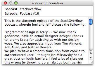
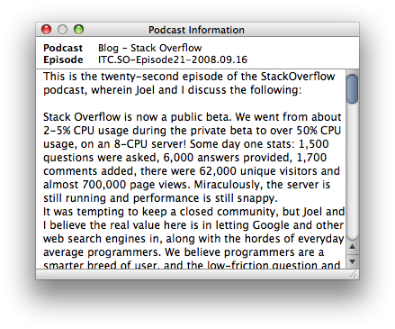
iTunes 8.0.1 fixes the gutter problem of this insignificant window:

podcast-information3.png

Compare:

ugly-podcast-window.png

That scroll bar chrome still looks out-of-place, and the window still floats above all others even when iTunes is not frontmost. I think that bottom decorative strip should be the same height as the titlebar of the window; before it was too thick, but now I think it’s too thin.

Baby steps…

Diaeresis

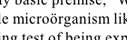
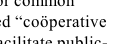
Here’re two examples of some odd typography with which I’ve recently become enamoured:

diaeresis.png

diaeresis2.png

Courtesy, who else, the New Yorker.

I’m planning on this diaeresis usage for my thesis, but my supervisors have already raised questions about it. Perhaps it’s not such a good idea. After all, few people seem to find the spelling exactly intuitive, and even fewer, I’d wager, are familiar with the term “diaeresis” in the first place.

The diaeresis looks exactly like an umlaut, but has a rather different meaning. The umlaut, say in the word über, is an accent that indicates a change in vowel sound for that letter. It’s not really used in English (where double-consonants more often serve a similar purpose of changing the preceding vowel sound), but the umlaut is rather common in many European languages.

By contrast to that particular diacritic, the diaeresis is used, such as in the word naïve, to indicate that the two adjacent vowels are pronounced separately. nay–eve, instead of (er) nyve, let’s say. Even though all English speakers will pronounce the more commonly spelt naive correctly, anyway.

Which brings us back to the examples I showed above. The New Yorker, then, does not use hyphens to separate the halves of compound words. This is desirable in order to reduce the number of marks used on the page to represent the word; this has implications both for visual simplicity and running length of a piece of text (i.e., hyphenation and justification are easier when less characters are used).

And when it ends up that a compound word is used but the absence of the hyphen results in two adjacent vowels—then’s the time for the diaeresis in words like coördinate, coöperate, and so on. Personally, I think this is quite tidy and quaint, and I’m trying to emulate their style.

2008/10/01

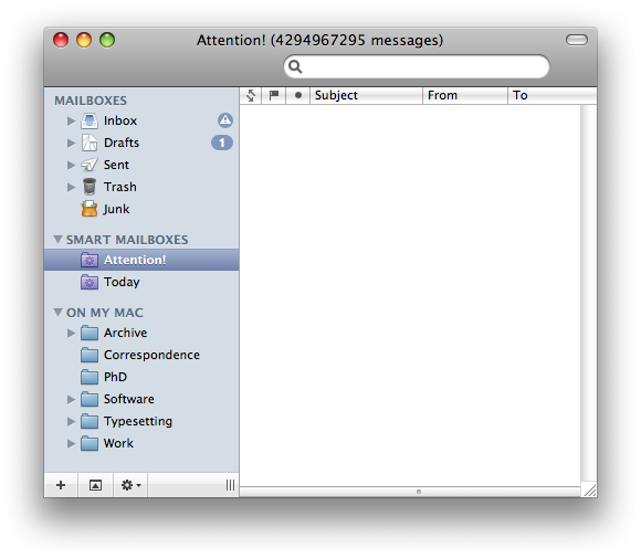
2³² − 1 messages

I was so happy to achieve ‘Inbox Zero’. In the final hour, Mail.app had the last laugh:

silly_mail.png

Jokes aside, I’ve found the message count for smart mailboxes to be fairly flaky.

2008/09/18

Rands on slides

Rands has written some really great articles on how to give and prepare for seminar presentations (too lazy for links; use Google). Here’s another gem of his via Twitter:

If you can’t practice the hell out of your slides, you can, at least, care the hell out of your slides.

I believe the point here is that with carefully-done slides, half of your problem is solved already. When your slides don’t help to pull you along in your train of thought, it’s easy to lose momentum and lose the coherency of your overall “message”.

2008/09/13

Oh god, my eyes

A little while ago I complained about the “Podcast Information” window in iTunes.

Well, there’s now been an iTunes update, and I’m sad to say things are now much, much worse. On the plus side they fixed my bug.

It’s a pity they had to hit the damn window with an ugly stick at the same time.

ugly-podcast-window.png

Come on, guys. It’s not that hard. At least the old one had some padding in there:

podcast-information.png

And that new shadow looks ridiculous. Really.


They also didn’t paid any attention to improving its behaviour. That’s okay. The other new features in iTunes 8 are rather nice.

But this window now floats above all others even when iTunes is not frontmost. This is the least appropriate behaviour this window could possibly have. I guess I’ll have to file another bug report…

2008/09/10

iTunes’ “Genius” logo

This logo, for iTunes’ new “Genius” feature, is only going to look good once we have displays capable of 200 dpi:

genius-logo.png

Too many jaggies in the lower half of that centre orbit.

2008/09/09

Google Earth and running

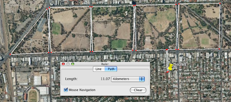
Let me just say that one of the few actual uses I’ve found for Google Earth is utterly indispensable to me right now. Path distance measuring:

running-map.png

With only eleven days to go before the 12km City to Bay run, I’ve got some training to do…

2008/08/31

A thought on iPods, 2008

Jesper wrote the definitive prediction list for what Apple might reveal in this year’s iPod lineup refresh, but I just wanted to make a comment or two to see how badly I’m wrong when the announcements are actually made.

Firstly, I believe that if solid state drives were large enough, Apple would have no problem retiring the iPod classic. Not that it doesn’t have advantages over the iPod touch (“blind” operation, first and foremost), the iPod touch is a much better device in the scheme of things.

However, while it’s possible the iPod touch could reach 64GB this year, I still don’t think that’s big enough to drop the 160GB iPod classic. Next year, though, definitely.

Jesper raised a possibility I hadn’t considered: the iPod shuffle could be retired in favour of the iPod nano. (Not the iPod nona, which still has strong support in the Mediterranean community.) Considering you can buy 4GB flash drives for less than $30 these days, it’s probably going to happen sooner rather than later. I think the timing is a shade too early to completely drop the iPod shuffle entirely, and this is a change that will be happening next year, not this.

If a new product was going to be announced, I’d peg money on a re-designed iPod nano that has a similar form factor the iPod touch but much smaller. That is, an approximately 16/9 ratio device with a screen on one side and a button or two on the edges. Removing the scroll wheel allows for a large screen without really increasing the size of the whole device. And I think the screen would be just large enough to accept a limited range of input behaviour.

But really, I don’t think that’s going to happen (I can imagine an iPhone nano product sooner than this one); my predictions for this year are lack-lustre: no new products, very big de-emphasis on the iPods shuffle and classic; bumps on specs and price drops across the line for the iPods nano and touch. Hopefully bigger announcements regarding software and services. It’s about time for a bit of a refresh of the iTunes store, methinks. I could dream about a re-designed iTunes itself, but I don’t want to get my hopes up.

2008/08/16

The chngpage package vs the changepage package

It occurs to me that there aren’t many people writing on the web about LaTeX. Mostly, I suspect, for the same reasons you don’t see as many people writing about HTML+CSS these days. It’s just a tool that some people use.

(That’s not to say that there aren’t periodicals and the like for people to write about what’s been going on.)

Anyway; here’s a nugget of information that might be of some use to some people in the near future.

Peter Wilson’s memoir LaTeX class is a major, recent, project that ties in many ideas for how to layout and customise a document in a single class. Some of the ideas in the class are also broken out into separate packages so that people who aren’t using memoir can still take advantage of them.

“chngpage” was one such package. It allowed you to locally change the layout of the text block in various different ways (for example, to place a figure that is centred on the physical page rather than centred in the text block). It also provided the very nice ability to robustly detect whether you’re on an even or odd page at any given position in the document (which is harder than you might expect).

Unfortunately, because chngpage was written before memoir it differed in one important way; to cut a long story short this made it tedious to write code that required the chngpage package because you had to jump through hoops to get it working in memoir as well. (As an example, see my addlines package.)

The problem was that neither memoir nor chngpage could be changed because of backwards compatibility problems. So Peter Wilson wrote a new package “changepage” that provides the same functionality as chngpage but uses the same interface as memoir; the result of this new package is that chngpage should no longer be used.

While it can still be found in the “obsolete” section of CTAN (here), chngpage is no longer included in TeX Live (as of TeX Live 2008). Packages that use it should switch to changepage, which is simply a matter of something like s/\ifcpoddpage/\ifoddpage/ for those who like regular expressions.

That reminds me. I’ve got a package that uses chngpage that I really need to update now…

Update: Fearless Leader (a.k.a. Karl Berry) has convinced me that any backwards compatibility problems caused by removing chngpage outweighs any nice ideological benefit from removing the package entirely. So it still exists in TeX Live! (Which was not my decision, but I agree with it.) The moral of the story, in the end, is the same: in new documents and packages, use the new changepage so that you play nicely with memoir

2008/08/11

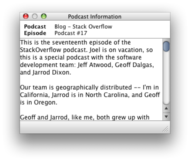
iTunes’ “Podcast Information” window doesn’t scroll

This is bug #6139143.

SUMMARY

iTunes’ “Podcast information” window doesn’t accept scrollwheel or two finger trackpad scroll input.

STEPS TO REPRODUCE

  • Open the “Podcast Information” window (note that there’s no menu item for it, too)
  • Select a podcast with a long enough blurb so that the scroll bar appears
  • Try and scroll the text with the trackpad or with a scroll wheel

RESULTS

Doesn’t scroll.

Should.

NOTES

While we’re on the subject, what’s with that weird window re-size widget?

podcast-information.png

2008/07/22

Problems with LyX #1

This is the first article in a possibly ongoing series documenting the problems in LyX that I’ve had to debug for people in my department. If you’re not a LyX or LaTeX user, there won’t be much to interest you here.

I’m a LaTeX guy through and through, and while I would never think of writing in LyX myself, I can totally appreciate that “normal” people find LyX much more approachable (and easier!) than LaTeX. Nonetheless, LyX is a rather leaky abstraction, and most errors that people have are due to their complete lack of understanding of the underlying LaTeX layer. In my limited experience.

That’s okay; LyX is free software and they can’t afford to test on beginners. I’m sure heavy LyX users (and the developers) don’t run into the same problems that I have to solve, because they know what they’re doing and don’t make the same mistakes. At the same time, I’ll go out on a limb and suggest that sometimes their knowledge of LaTeX isn’t as comprehensive as someone like me who actually writes documents and programs packages in it.

Now, the errors I report here are necessarily vague and don’t pin down problems very well. That’s because I can’t afford to spend any more time on this at all. That said, if contacted directly I’ll do my best to reply quickly and in as much detail as I can. Here we go:

  • Please make it much easier to insert a floating graphic; it’s the 99% case and should be a single action in the GUI. New users see “Insert graphic” (or whatever it says) and paste it inline in their document. If it were wrapped in a float, they’d get what they actually wanted.

  • Especially in maths mode, if non-existent macros are typed they shouldn’t be displayed in a pretty way. For example, I had a user who was used to typing “\alpha” to get greek type slashes before all roman characters in maths (e.g., “\x”). The visual display in this case (simply an italic “x”) implied that this was legal when it in fact produced sometimes complicated errors (in the case that an accent macro was typed such as, say, \i).

  • The prettyref package for automatically formatted cross-references is basically the worst choice from a variety of packages that do this function. Use the refstyle package instead.

  • If there is no bibliography inserted in the document, please prompt for one (with explanation) if a citation is attempted. It’s not obvious that you have to insert a bibliography before you’re allowed to reference citations (the logical flow is the other way around: I cite a paper and a bibliography is created from that). Adopting the biblatex package and putting the \bibliography{} into the preamble would help things in this regard.

  • File paths seem to continue to be a big problem. Yes, it offends my sensibilities when people use analphabetic characters in the directory names (not to mention spaces), but these damn users are just doing what the OS allows. If putting a LyX file inside the folder “# New Stuff/” causes the compilation to fail, then it should either protect the path better or just tell the user straight up to rename the folder.

  • This may no longer even be a problem, but a while back it was fiendishly annoying debugging a problem where something like “vector $[a,b,c]$” was put inside a subfigure caption. The reason? Subfigure captions are input in LaTeX in square brackets, so any square brackets in the caption need to be hidden from the parsing. LyX should automatically wrap the subfigure caption with curly braces behind the scenes.

That’s all for now. That these are only minor details, which is a testament to the highly useable state the LyX team have brought their program over the years. Here’s to a brighter future yet.

Naming in a bibliography

So, how should it look? The bibliography, I mean. Is it the author or the work that is the most important aspect of the citation? In other words, how much emphasis should be placed on the name? Here are (most of) the possibilities for representing people’s names, let alone the rest of the citation information. Enumerating the types has helped me decide on a style for my thesis.

The default for the biblatex package is to place the first author’s last name first, which makes the bibliography look more obviously alphabetised:

Robertson, Will S., Ben S. Cazzolato, and Anthony C. Zander

This is a nice example but I don’t think it’s helpful for displaying the names more clearly. All last names first removes the inconsistency of reversing the name order of the first author only:

Robertson, Will S., Cazzolato, Ben S., and Zander, Anthony C.

In all of these “full name” cases, I’d prefer to use the European tradition of printing the last names in small caps for emphasis.

Will S. Robertson, Ben S. Cazzolato, and Anthony C. Zander

But maybe first names don’t matter, and should be normalised away to single initials:

Robertson, W. S., Cazzolato, B. S., and Zander, A. C. (*)

or

W. S. Robertson, B. S. Cazzolato, and A. C. Zander

With names in initialised form, it just doesn’t work to have mixed name orders: (The possibility of too many adjacent initials.)

Robertson, W. S., B. S. Cazzolato, and A. C. Zander

I’m inclined to favour the starred example above. Mostly because full first names aren’t always supplied by authors (or the references to them), so without the “initialisation” you’d get a mix of full first names and initials between different entries in the bibliography.

The counter-argument here is that bibliographic databases should always provide first names to avoid problems of author ambiguity, but this is a printed bibliography we’re talking about, not a bibliographic database. Nice to be concise.

And really, it is the work that’s important. The authors of the paper provide, perhaps, a taste of the authority the paper might hold, but whether it’s interesting to chase up should rest entirely on how it’s being referenced in the work in which it is cited.

2008/07/15

Improving iTunes’ “Podcast Information” window

Open a playlist that contains podcasts and turn on the “Description” column in the “View Options”. Each item in this column contains a circled “i” icon that opens up the “Podcast Information” window.

I have two small suggestions to improve this window:

  • There should be a way to open/show this window with a keyboard shortcut, and (optionally) a menu item as well. Shift+Cmd+I is a suitable candidate (and this shortcut could also toggle the visibility; that is, hide the window when it is already visible).

  • Only the selected row should display the icon to minimise the visual clutter of displaying this icon on every row. This is analogous to the “iTunes Store” links that are displayed in the respective name/artist/album rows when viewing music listings.

This is Apple “bug” #6075588.

2008/07/14

The New Yorker’s (now) curly quotes

Say, whaddya know?

newyorker-curlies.png

Now that’s much more attractive.

2008/07/12

Expensive connectivity

Okay, look. I know that Australia is a technological wasteland and it is damned expensive to have us connected to the global grid because we’re so far away from everywhere. Download limits on our internet, and all that (I’m currently allowed 11GB per month for which I pay AUS$45). Read Neil Stephenson’s ridiculously long and entertaining article on undersea data cables (“Mother Earth Mother Board”) for some insight on why it’s expensive to get internet down under.

It’s always been expensive to access the internet in Australia. Our first plan when I was a teenager cost $5 per hour at 14.4 kbps. These crazy prices were always initiated by our national carrier, Telstra, who charges through the roof and caters only to those who don’t have the time or energy to shop around to the cheaper alternatives. Or who live in regional areas.

Yes, Telstra does a lot of infrastructure work, including having to cater to this regional population that’s not huge in number but spread over an enormous area — think trying to economically provide internet to every resident of New York City but spread them over the entire land mass of America. Not an easy, or cheap, problem.

Nonetheless, there are competitors to Telstra (in the civilised parts of the country) that manage not to charge ludicrous amounts for their services. To use the example above of how much I pay for internet at the moment, the equivalent Telstra plan by price is $40/month which gives me paltry 400MB and 15¢ per MB after that. OUCH.

To be fair, paying $90/month is pretty much the same as my current $45 plan, so it’s only twice as expensive at the higher end of the scale.

On that note, let’s look at Telstra’s new rates for iPhone 3G. There’s a story in The Australian that compares the different carriers in more detail. Well, here’s the simplified look:

Carrier   Cost      Calls    Data
Telstra   $80/mth   $ 70      5 MB
Optus     $79/mth   $550    700 MB

What. The. Fuck. That’s orders of magnitude difference, even after considering that the per-minute rate for calls is about 30% cheaper on Telstra. The article is bang on the money as to the reasons behind this huge pricing chasm:

… the low data capacity has been included to protect Telstra’s walled garden of online content.

The day that big telcos get out of the services game and realise that their purpose in life should be to make money in connectivity, and that’s it, will be a happier day for everyone. Just let me pay for bits from where-ever, and compete doing that the cheapest and fastest and most agnostic way possible. We don’t want to buy goods from an ISP.

2008/06/25

iTunes’ “Shuffle” is repeatable!

For years now I’ve been getting frustrated with iTunes’ seeming repetitiveness when listening to music with ‘shuffle’ turned on. I find ‘Album Shuffle’ a pretty good way to listen to music: just select the album you want now and a random album will be cued up in due course. (Listening to full albums is, of course, the only way to properly listen to music.)

You’re not stuck with the interruption of choosing what to listen to next (without getting stuck into listening ruts at the same time), and of course there’s nothing stopping you from skipping the album if you’re not in the mood.

Every now and then I’d realise that after going back to a previously-played album that I wanted to listen to again, the next album that started playing “randomly” next was in fact the same one that started playing next last time. I’m not the only one to have noticed this.

Try it out for yourself. Turn on Shuffle, with ‘Shuffle: Songs’ checked in the Playback preferences. (You get the same problem with both albums and songs.) Start playing a song and hit ‘Next song’ a few times. Keep track; here’s me:

  • Down By The River, Live At The Fillmore East, Neil Young & Crazy Horse
  • Les bras de mer , Le phare, Yann Tiersen
  • The Believer, Chrome Dreams II, Neil Young
  • Everything Will Be Alright, Hot Fuss, The Killers
  • A Drop in Time, All Is Dream, Mercury Rev

Now go back to, say, the second one, and hit play. Hit next song. Wouldn’t you know?

  • The Believer, Chrome Dreams II, Neil Young

Just to prove it wasn’t a fluke, hit next again:

  • Everything Will Be Alright, Hot Fuss, The Killers

I don’t know about you, but I find this behaviour incredibly (a) annoying, and (b) stupid.

Sure, you should be able to retrace your steps backwards in the random sequence. But under no circumstances should I be subjected to the same random sequence if my only crime was to want to re-listen to a particular favourite.

In Apple’s internal database, this is bug #6033030.

Applescript for iTunes: ‘Next Album’

Here’s an Applescript I like to use. I listen to iTunes with ‘Album Shuffle’ activated, so I don’t have to think about what to listen to next. (And, embarrassingly, to keep the music going after an album finishes; if I’m thinking about something when the music stops, I’ll totally forget that I had music going in the first place and sit in silence for hours.)

The problem is that sometimes you don’t want to listen to a particular album. And there’s little worse than hitting ‘Next Song’ a dozen times to skip to the next one. Luckily, iTunes is rather scriptable:

tell application "iTunes"
    pause
    set |current album| to the album of the current track
    repeat while the album of the current track is equal to |current album|
        next track
    end repeat
    play
end tell

2008/06/04

The New Yorker's straight quotes

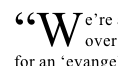
Usually The New Yorker is the epitome of good and consistent typographic design. Oops:

newyorker-straightquotes.png

Note that they’ve got it right for the running text, but for whatever reason the quotation mark in the lettrine remains uncurled.

2008/06/03

Mathematica packages of mine

A couple of years ago I picked up Mathematica to use for some of my PhD research. And I quickly grew enamoured to its programming style and mathematical capabilities; as opposed to Matlab, my other tool of choice, which acts like and (mostly) has all the grace of a glorified number cruncher.

Since using Mathematica I discovered a few things it can’t do so well and wrote some packages to help myself along. The cost-benefit time ratio was heavily skewed against me, but what the hell. In for a penny, in for a pound. I could hardly ditch Mathematica because it couldn’t output graphics (say) in a form I felt to be sufficiently suitable.

Now, Wolfram has a site set up as a centralised repository of Mathematica code: the Wolfram Library Archive. At present I have three packages that live there:

(I don’t, sadly, have time to elucidate their existence right now. Some pretty pictures would be nice.)

The terrible shame, however, is that Wolfram has a huge problem actually updating those sites. A few months ago I sent them updates to these packages and I’ve yet to hear any reply. It makes my life hard if I need to pay attention to whether people are even able to access the most recent versions of my code. Frankly, I’m far better off hosting the code myself.

(Cue suppressed announcement of a long overdue actual website that I’ll one day create but which is on ice until I finish my PhD.)

So here I’d like to point you all to the canonical repository for this work (and any future work as well): wspr/mmapkg at GitHub. It contains the three packages above in addition to a couple of other packages that aren’t as generally useful (yet).

I’d recommend that you use these links instead of the Wolfram ones; who knows how long it will take me to update the Wolfram library versions if it takes so long for them to get back to me. I understand the time constraints, but really. CTAN (for TeX and LaTeX code) is staffed by volunteers and they usually check and upload packages for me within 24 hours.

The other advantage to using GitHub for this sort of work is that it makes things easy for anyone interested in using these packages to make changes and fix bugs in my code.

Since posting the original versions at various times I’ve collaborated with two authors on two packages respectively to improve the features and performance of the code. It’s just so rewarding working in collaboration with people I’ve never met because we share some sort of passion with this tiny piece of code.

While I don’t expect any of the readers of this site to actually be using Mathematica (shout out if you are), hopefully Google will render the information here useful to some people at a later date.

Update: Mike Croucher has made his own announcement of the new version of ColorbarPlot with a great explanation of what’s new and — even better — some pretty pictures.

Update the second: The most recent versions of the packages are now (finally) available at the Wolfram Library (16 July, 2008).

2008/05/29

‘Happiness’ by Matthieu Ricard

My reading drought is over! After being stuck on a couple of books for the entirety of this year, I’ve finally got through one of them. Trying to read in parallel is simply a bad idea, even if one is fiction and the other non.

The subtitle of ‘Happiness’ is ‘A guide to developing life’s most important skill’. With respect, this is exactly what ‘Happiness’ is not, but I’ll forgive the marketing people for sexing up the idea of the book.

Oh, sure, there’s the occasional exercise in which we’re advised to perform deep meditative acts, but colour me sceptical that a non-meditator will be able to derive much outcome from such exercises without years of practise. (Indeed, my own experience confirms this :)) Not that the simplifications used to promote these techniques aren’t useful: when grumpy, meditate on your grumpiness itself and you’ll realise it’s meaningless — suddenly you feel better. In a perhaps overused analogy in the book, the negative emotion disappears like a snowflake in the spring sunshine.

What the book does do to great success is inspire one to take up a path of developing their happiness — and it’s not surprising that the teaching that the Buddhist Ricard espouses is Buddhism itself. But that’s, in fact, the strength of the book in my eyes. While Christians might stumble around trying to prove the power of prayer, the Buddhists can equivocally state why and how their practises help develop the mind from an objectively point of view.

Or perhaps I’m swallowing their bait, line and sinker.

Regardless, what this book emphasises is that being happy isn’t a genetic or environmental factor that’s out of your control. Rather, we create our own happinesses in our own minds, and with practise one can be happy all of the time. Sounds good, right? Well, Ricard spends an entire book teasing out the idea of being happy all the time. I guess the easy way to sum it up would be that once you’ve worked out the meaning of (your own) life then you’ll be happy. Simple, huh? Well…

This book isn’t just a “swallow this pill and you’ll be happy” solution. The pursuit of happiness is inextricably tied to the way we live our lives. Perhaps another way to boil it down is to say “be optimistic always, spend every moment doing what you should be doing, and make other people happy at the same time”.

Realistically, everyone’s search of happiness, if they are even trying, will follow a different path. The appeal of this book is that it’s a great elucidation on the different little meanings around “being happy”, and inspiration that our brains are tactile enough that, with practise, we can live our lives in a positive frame of mind.

Now, where do I sign up for meditation lessons?

2008/05/04

A new TeXShop console window

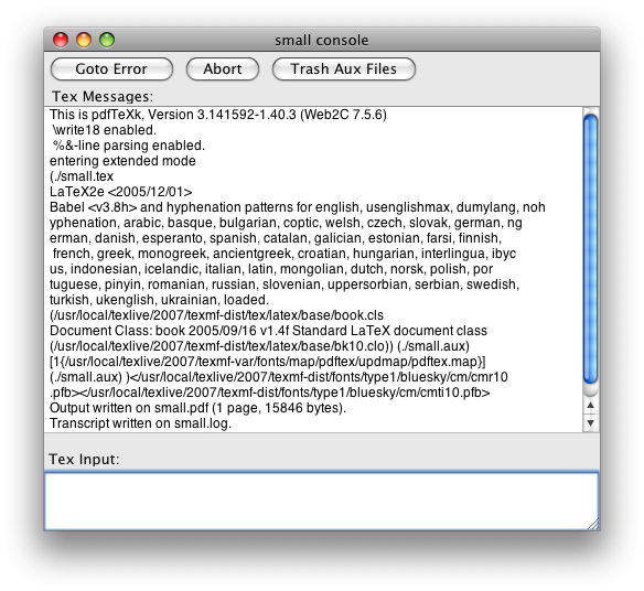
Sometimes I expend energy doing things that to the untrained eye look like a waste of time. Take TeXShop’s console window:

texshop-console-old.png

That’s easily the single ugliest window I have to look at on a daily basis. Running Matlab is a close second, but I’m not doing that quite so often these days. But considering both my work and my play is done in TeXShop, that’s a lot of ugly looking right back at me.

Eventually you just can’t take it any more.

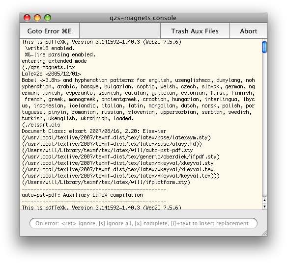
In the end, a few long minutes messing around in Interface Builder yields a relative delight:

texshop-console-new.png

Ah, bliss. I’m literally a happier man for veritable seconds every day. I’m sure you’ll agree that the benefits of this can not be understated.


A couple of notes about the design of the window itself. Note the output of TeX is hard-wrapped before printing to 80 characters, so it’s essential to have a fixed width font in there. Using Helvetica as the default is just crazy. Since we know that 80 chars of Monaco 10 takes up about 500 pixels, the window can be fixed to that width. (To do this “properly”, you would want to adjust the width of the window depending on the size of the fixed width font that has been chosen.)

I’ve added a slight yellow colour to the window; this facilitates easy of background recognition when you’re trying to grab a background document. When there are three windows per document (source, output, console), it’s important to distinguish them in little ways. It would probably be better to consolidate the console window into the source, visible only during a typesetting run; this is more work than I have time for, however.

The placeholder text has been carefully constructed to try and get people to use the various commands that are available on error during a TeX compilation. The best is i, which replaces the token on which the error occurred with whatever text you write. Pity it doesn’t also edit the text of your document to synchronise the correction. Again, it would be better if this text field only became visible after an error had occurred.

The destructive buttons “Abort” and “Trash Aux Files” have been moved to the right to separate them from the constructive button “Goto Error”; I like adding keyboard shortcuts to interface elements (in heavy moderation, of course) so that I remember to use them.

Finally, the scroll bar (that disappears when not required, by the way) is mini-sized. Scroll bars are an anachronism in the era of two-finger scrolling and mouse wheels/balls (to a certain extent; they shouldn’t be eliminated entirely), and the fewer pixels used for their representation, the better.

Update: the NIB file can be downloaded here: TSDocument.nib.zip. To install it, pull up a contextual menu on TeXShop in the Finder and select ‘Show Package Contents’. Then drop it into Contents/Resources/English.lproj/ (or as appropriate for your localisation; only tested with English). Probably a good idea to make a backup of the original…

2008/05/01

The man who absorbed the world

One day I’m going to write a fairy tale about a man whose affection for the people in his life grows without bound, unchecked, until he ends up absorbing into himself everyone that he loves in the exterior world and then becomes totally alone. It may or may not be partly auto-biographical.

The whole notion of “absorbing” another being seems a little creepy when taken literally, but that’s kind of the point.

2008/04/29

Applescripting Mail.app

Applescript support for Apple’s own applications has typically been absent or poorly implemented. Leopard’s Mail.app is no exception, which is a pity because there are many nice things that a functioning scripting interface could perform. In this post, I’ll expound a couple of irritating bugs I have quickly run into while trying to write Applescripts for Mail.app; I’ll finish up with a useful Applescript that actually works and that I frequently use.

Bug the first

This one’s easy to sum up: get the properties of just doesn’t work. This works fine:

tell application "Mail"
    get the front message viewer
end tell

The usual way I write Applescripts is to just bung in a the properties of after the get to receive a nice list of, well, properties that I can extract and set for the object. Sure, I can get this sort of information (in the abstract) from the documentation, but querying the object with Applescript is easier and much more useful for debugging purposes. Alas, Mail does not support this, despite claiming to be able to:

properties inherited from item [snip] properties (record) : All of the object’s properties.

Here’s an example of the fail:

tell application "Mail"
    get the properties of (the front message viewer)
end tell

Update: this is Bug ID# 5981534.

Bug the second

I find Mail’s “Inbox” to be largely useless, because I filter much of my mail into sub-mailboxes as it arrives. Only unfiltered Mail is shown in the Inbox, which isn’t very helpful when there’s no “jump to next unread message in any mailbox” feature.

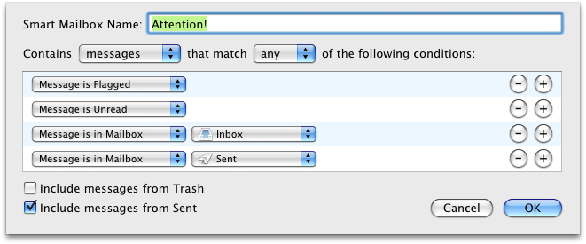
To work around this perceived problem, I have a “Smart Mailbox” to collect all Mail that needs my attention:
attention-mailbox.png

The “Message is in Sent” is so that I file/delete my own messages rather than let my Sent mailbox accumulate to thousands and thousands of emails.

Now, I really like Mail.app’s ⌘1 shortcut to select the “Inbox” mailbox. But since I don’t use the Inbox, I’d much rather it select my “Attention!” mailbox instead. This is the perfect case for Applescript, and should be a one-liner:

tell application "Mail"
    set the selected mailboxes of the front message viewer to {mailbox "xxx" of application "Mail"}
end tell

where xxx is the name of the mailbox. Well, sure, that works fine for a regular old static mailbox. But for a smart mailbox? Not a chance.

tell application "Mail"
    get the selected mailboxes of the front message viewer
end tell

With a selected Smart Mailbox the result is {application "Mail"}, and trying to set the selected mailboxes to a Smart Mailbox just gives an unhelpful error. Not very helpful at all, in the end.

Update: this is Bug ID#5981547.

Bug the third

This bug is less major because it can be obviated by using GUI scripting. I’m not really a fan of GUI scripting, though. Not very elegant (says the Applescript user).

Anyway, I’d like to be able to customise the template used to construct “Reply” emails (as you could in Mac OS X 10.2 or so by tweaking some hidden system files); specifically, I find the line

On 02/04/2008, at 9:13 PM, Will Robertson wrote:

terribly verbose and overly detailed. There’s a couple of other things that could be improved, too (cf. this year-old post by John Gruber in a similar vein; by the way, I’m a staunch bottom-posting advocate — although I prefer a top poster than a bottom poster who doesn’t snip).

The main problem is that Mail’s reply Applescript command has buggy side-effects:

tell application "Mail"
    set sel to the selected messages of the front message viewer
    set repl to reply (first item of sel)
    set repl_contents to the content of repl
end tell

Two reply windows are opened, only one of which is the actual reply. More often as not, the message repl is the other one, which is simply an empty Mail message. To add insult to injury, the empty reply requires a save/discard confirmation when the window is closed, whereas the actual reply lets you close its window (and destroy its content) with nary a warning in sight.

Finally, adding to reply the boolean without opening window doesn’t do what it claims.

I’ll probably adapt Gruber’s script, in the end, to do what I want. But this stuff is supposed to be quick and easy — and it’s not.

Update: this seems to have been fixed in Mac OS X 10.5.3; it's necessary to call `reply (first item of sel) with opening window` to get the reply window to appear.

A nice script I use

Okay, I don’t want to complain too much — when it works, Applescript can make life much easier and I bug report because I care. Now I’d like to share a script, Next-message.scpt, that I use many times in Mail on a daily basis (with the help of FastScripts to assign it the convenient keyboard shortcut ⌘\ ).

This script exists to make it easy to jump to the next message when you’re not using Mail’s three-paned interface (I greatly prefer having to open the message in a new window). To quote from the blurb at the top of the script:

This script is designed to open the next message in a thread when Mail is used in two-paned mode. To elucidate the problem, when viewing messages in the third pane below the mailbox list of messages, the space bar does a great job of jumping to the next unread message. When the message pane is hidden and messages are opened in their own window to be viewed, there’s no way to get to the next message without switching to the message list, selecting the next message, and opening it. This script automates this process, closing the original message and placing the next message in a window of the same size, in the same location.

The script currently does not detect if the next message is part of the same thread as the current. In fact, I don’t think it’s possible within Applescript to detect that (especially as their subjects will not necessarily be the same). Besides, sometimes you want to jump to the next message even if it’s not in the same thread as the one you’re reading.


As soon as I can I’ll write these up formally for Apple’s bug reporter. I needed to get them off my chest before doing that, however.

In closing, I really appreciate the power that Applescript can give, especially for cross–application tasks that would be otherwise impossible to achieve. For example, running a script in TeXShop to highlight uncited references in BibDesk.

I’m happy to see even lacklustre support despite the frustrations when it doesn’t work; I hope that, over time, Applescript support improves for all Mac OS X applications.
2008/04/21

iTunes customer service

One of the less tangible aspects of shopping online is the lack of any face-to-face contact in the inevitable case that something goes wrong. I haven’t had much experience with online shopping in general, but I have had a couple of things go wrong for me on iTunes. And I’m happy to report that, in Australia at least, their customer support is excellent.

My problems

The worst of my problems occurred quite some time ago when iTunes was periodically crashing on me. Not really sure how or why, and iTunes these days is fairly reliable, but back then it was rather a pain in the ass. Playing music over wireless was fraught with embarrassment (“aren’t Apple products supposed to just work?”), and buying music online a risky business. Once or twice, iTunes crashed midway through an iTunes download and a song or two from the purchased album was lost in the æther. (Usually this problem can be fixed with the Store > Check for Purchases… menu item — but not in this particular case.)

Another time, I simply bought the wrong album, due to the ridiculous setup where iTunes will often sell both an AU$18 basic album as well as an AU$22-ish album with music videos or live or bonus tracks — generally I buy the more expensive version, but in this case the link from the iTunes main page was for the basic version and I bought it before checking for the other.

Finally, just the other day I bought the “iTunes Live” Nick Cave and the Bad Seeds EP and found that the last track ended abruptly, mid-chorus, at 5:13. Clearly something had gone wrong with the encoding of this track, and the one review of that album mentioned the anomaly in rather negative terms.

Reporting those problems

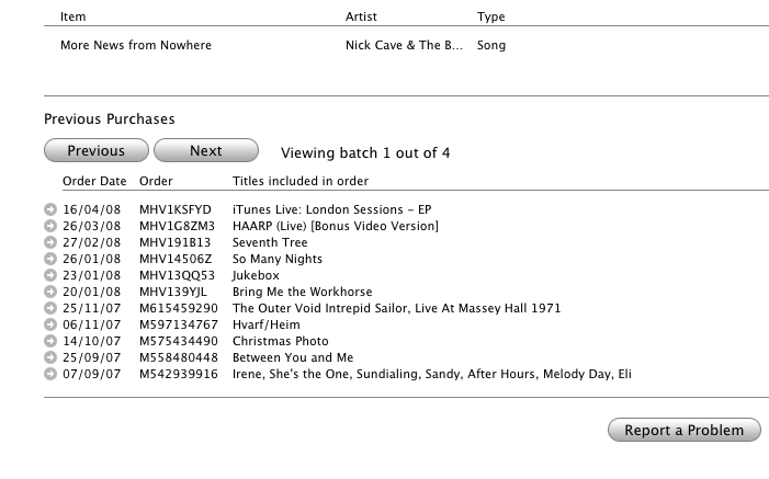
In each case, the response from Apple was swift and appropriate. I had to look around for a little while before I worked out how to report a problem. Recently, Apple’s been sending email receipts on all purchases, and these emails make the “Report a Problem” links rather more prominent. Through iTunes, however, here’s how you do it. In your iTunes account, access your purchase history:

itunes-purchase-history.png

You can then select any of your purchases with the little circled arrows:

itunes-purchase-history-items.png

Thus, each item that passes through your iTunes account can be separately reported upon.

Apple’s response

As previously mentioned, I have been completely satisfied with Apple’s response for each of the small number of problems I’ve had over the last few years. After a very short interval and despite the very brief exchange of words on both sides, I’ve always received a full “refund” to fix the problem by re-downloading the content. (As you would expect considering the cost to them is negligible, and you get to keep what you originally purchased, so it’s more of a “credit” than a “refund”. Whatever.) Apple claims to reply within 24 hours, and I think that’s about right (the most recent one certainly was). It even only took them a couple of days to fix the clipped Nick Cave track, restoring the missing ninety-odd seconds.

To conclude, how they cope with failure is a pretty important measure of the customer service of a business. Any misstep could result in alienating their very customers, especially when the business is as faceless as the iTunes store. (I wonder if this sort of thing can be fixed in the bricks’n’mortar Apple Stores in the U.S.) Disregard for now the causes of the problems that I had, which could probably be blamed in various measures on iTunes itself — that’s a rant for another time. In my own experience, iTunes’ customer service is very satisfactory and reassures me against any further problems down the road.

2008/04/16

Make (in)visible Applescripts

John Gruber’s latest fireball discusses invisibility in Mac OS X. He rightly comments that using the SetFile command line utility (which is bundled with the Developer Tools) is probably not that convenient when dealing with the visibility of items in the Finder.

For simple cases, however, I find the use of programs like “Super Get Info” to be overkill to an extent. Many years ago, I wrote two Applescripts for the exact purpose of using SetFile in a user-friendly way in the Finder.

The first, Make-invisible.scpt, is pretty simple; just select the items you want made invisible and run the script.

The second, Make-visible.scpt, obviously can’t be used by first selecting the invisible items! On run, it will display a list of currently invisible items in the frontmost folder window, from which you can select items to make visible.

To use these, you’ll want to use either the system-wide Applescript menu bar, Red Sweater Software’s FastScripts, Waffle Software’s ThisService, or something else again.

So, there it is.


One thing I just noticed is that the admin privileges no longer work;

do shell script … with administrator privileges

is failing with

Finder got an error: A privilege violation occurred.

Uh, isn’t that the sort of thing with administrator privileges is supposed to avoid? Oh well — I don’t have time to debug this (in my experience, Applescript support from Apple products tends to be a minefield of poorly tested functionality literally riddled with bugs) so if anyone can help with this I’d be greatly appreciative.

Update: this error comes about because the do shell script (with admin privileges) is situated inside the tell application "Finder" scope. Please find new versions of the scripts that fix this error in the links above.

Useless proposal #1

This is an idea that requires way too much engineering, but I wish it could happen: How cool would it be if Mac OS X had a concept of “subscribed RSS feeds”, so that no matter which browser or feedreader you used, viewing a site’s webpage would not offer you the “subscribe” link if you already were indeed subscribed to it.

At present this would require browsers parsing the formats of whichever feedreader the user was using, which is clearly a rather unscalable approach. If all feedreaders used a common format file (ahem, not OPML) then this would be a lot easier :)

2008/04/11

Twitterrific notes

I’ve been using Twitterrific for a while now as my Twitter client. There’s no huge reason, really, that the web interface isn’t just fine, but a dedicated client is nice for a few reasons, such as: polling for updates, albeit bad for productivity; shortcuts for replying; a more compact interface; and so on.

I don’t have time to write extensively about any of my wish-list, so a bulleted list will have to do. Here are a few of features that, individually or together, could make Twitterrific even better:

  • Own posts are automatically marked as “read”.
  • “Favourited” tweets are indicated visually (or at the very least the action of favourite-ing them is indicated; I’ve got many favourite posts by mistake trying to hit CMD-2 to reply and missing).
  • Last read message is remembered so that relaunching Twitterrific doesn’t result in 40-odd unread tweets. (Alternatively, simply zero-ing the unread counter on launch.)
  • On that note, it would be even better if it could track back through the pages of unread tweets until it found where I was up to; currently when I wake up my ’puter in the morning there’ll be way more tweets that I’ve missed than Twitterrific gives me.
  • The input text box grows with my text rather than fixed to a certain height.
  • Less UI preferences. You guys are good designers! No need to ask us if the window should have a drop shadow or not.
  • Auto tinyurl (or snurl, or …) of pasted links.
  • Auto-expanding tinyurl-ed links.
  • Auto-completion of followers’ handles when manually typing replies to them (say there aren’t any of their actual tweets currently visible).
  • Perhaps: ability to un-follow people.

Now, I’m sure some of these suggestions are technically unfeasible due to network latency/efficiency. But without thinking too hard about the underlying technicalities, I think it’s not a bad list. So what have I left off?