2006/08/28

XML document formats (and TeX)

This post began as just a teeny tiny mention of how, with Apple supporting OpenDocument in its next release, TeX supporting unicode and OpenType fonts, and Microsoft Office using Open XML, things are going to get interesting in the document applications arena over the next few years.

But the comments thread in that last link got me going. There’s been beef apparently between the OpenDocument people and Microsoft, whereby the former believe that Office should have just used their solution and Microsoft didn’t want to fit their feature set into what ODF provided. Similarly, MathML wouldn’t have worked as a document format without extending it to support other Office features (track changes, e.g.), and that’s one of the main criticisms generally of how Microsoft “supports” standards (embrace, extend, …). David Carlisle (of LaTeX3 project fame, from my point of view) put things more eloquently in the thread under discussion.

The odd one out in all of this are the TeX-based solutions. While xmlTeX can parse, uh, XML, and ConTeXt can handle MathML, it becomes hard for me to see where or how TeX-based markup documents can co-exist with MathML apps (which will be able to copy/paste editable equations like plain text). You’re not going to want to insert some hideous MathML into your otherwise nicely marked-up TeX doc:

<math>
  <mo> &sum; </mo>
  <msupsub>
     <mi> x </mi>
     <mn> 3 </mn>
     <mi> i </mi>
  </msupsub>
</math>

But it seems that isn’t so much a problem after all, with a quick search resulting in a highly relevant paper on [MathML to TeX conversion]. The problem, finally, is editor support. With tagged PDF allowing MathML copying from PDF documents (correct me if I’m wrong, but I believe this is possible), and editor-based MathML to TeX conversion into the source, TeX would work just as well as, say, Office 2007–Mathematica (to give but an example of MathML applications) as a first-class copy/paste citizen — a situation that’s not true today.

2006/08/24

Text in UI design

Sometimes feeds roll in articles that are surprisingly congruous. Over at Impulsive Highlights there’s a screenshot (which will surely be removed soon) of an upcoming preferences panel in a Leopard app for decompressing zip files.

Sometimes you want to keep the zip file after expanding it; sometimes you don’t. (A brief shoutout here to the old Stuffit archive format since I’ll never have the chance again. It was great back in the nineties when you’d get a progress meter saying things like “Unstuffing 34 files” — I still remember the comment about how on a PC it was a lot more boring to decompress files!)

Back to this preference panel; it offers an option called “Keep unarchiving dearchived file(s)”. Either it’s someone’s idea of a joke, filler text to be improved in the future (and I love it!); or it’s a classic example of why programmers shouldn’t write interfaces. Really, “unarchiving dearchived…”? So great.

At the same time as this nugget crosses my reading path, I also come across ‘The long road to simple: creating, debating, and iterating “Add an event”’. Here, the 37signals guys show how much work is required (or, at least how much work they do) on iterating a single text element in an interface to achieve the right mix of consise-ness and explainability. Wonderful stuff.

2006/08/21

Lemon jam

We’ve got heaps of lemons:

Somewhere along the line I got the idea that it’d be a pretty good way of getting rid of them by making lemon jam. Or lemon marmalade. Or lemon jelly.

Turns out you only need like six lemons to make enough jam for a couple of months. So the long term goal of actually using those lemons is still a little way off. (I’ve started squeezing them into ice cube trays, but I’m dubious if we’ll need kilos of the stuff.) But the process of making the jam, which I now highly recommend, was a bit of fun, and the recipes I found for it were a little confusing in their variety. I just sort of interpolated on the easiest ones.

I think the fact I chose the easier recipes makes what I made lemon jam, rather than marmalade, which seems to be more complicated. Don’t even talk to me about glass jars; I just use a recycled plastic honey container.

First step in the process was to pick the lemons and wash them. And try and remember that boiling the things for an hour would kill all the germs from bird poo. Gross. So, I started off with about a kilogram of lemons:

The first time I made lemon jam, I peeled them and cut the rind into little pieces. This time, it was much easier just using a grater. I chucked this in a huge pot with about 1.4 litres of water.

Since the white stuff on the outsides ("pith") of these lemons was so thick, I didn’t want to use any of it in the jam. (Last time, I added a little and it became a little bitter; add to taste, I suppose.) After taking off all the peel, I realised that I’d lost fully half of the mass of my lemons. So I put in two more just for luck.

Since the lemons are boiled for ages, it didn’t matter that I cut them into fairly coarse pieces to add to the pot.

Then it’s just a matter of waiting. This time ‘round, I boiled the lemons for an hour with the lid on, then took the pot off the heat. (I’m wary of burning the sugar in the next step after an unfortunate housemate incident.) At this stage, the whole house smells like lemon. Yum. But not too good to eat. Now we need sugar. I added about 1.25 kilograms of it, stirring it in as I went.

Finally, I boiled the mixture and left it simmering for about another hour. Apparently I was supposed to be skimming off the foam, but I didn’t. You can tell it’s done when a little jam left on a spoon to cool sets to a jammy consistency.

So, 8 lemons down, 92 to go. To summarise:

  • Wash eight thick-skinned lemons
  • Grate the rind
  • Peel the lemons, discard most or all of the pith
  • Cut the flesh into pieces
  • Boil the rind and the lemon flesh for an hour in 1.4 litres of water, or thereabouts
  • Slowly dissolve in 1–1.5 kg of sugar
  • Boil for another hour
  • Yum!

2006/08/14

Time Machine not quite so ugly after all

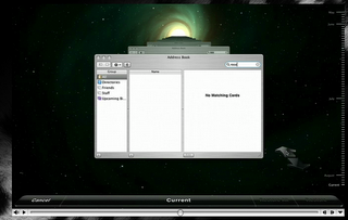
Okay, so there’s some slight good news on the interface front. While Preview.app has gone done the drain with those awful blue pill buttons, Time Machine is more toned down than shown in the keynote. Here’s the version shown publicly on apple.com:

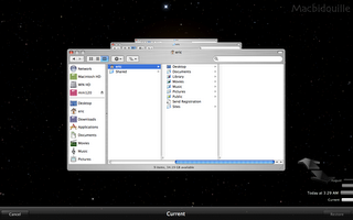
And here’s the version shown on HardMac:

I’m pretty keen on the update, although I think the bottom panel can still be improved. Fingers crossed that I’ve gauged the direction of the user interface evolution correctly; it could well be that the ugly version is the more recent!

Anyway, say what you will about the appropriate-ness of the interface. Those moving stars in the background get my vote any day. Teehee.

2006/08/08

WWDC: Paul Thurrott vs. the Mac community

Just a quick link to Paul Thurrott, who has the audacity to bitch about the newly announced features of Leopard. He’s got a couple of good points. For me, I find it’s the last 10% that makes the update worthwhile, rather than the big ticket demos.

But people in the tech community, i.e., those who should know better, really have to stop taking marketing so seriously. WWDC is covered by, like, mainstream media all over the world, so of course it’s going to be saturated with (a priori overblown and possibly propaganda) marketing. And of course Mac OS X is playing catch-up to Vista. That’s the whole nature of competition.

By now, it should be obvious to anyone interested that Vista’s going to be very feature rich, no doubt over and above Mac OS X (e.g., all the media centre and tablet PC software that Apple doesn’t, regrettably, have the hardware to support). Hell, Steve didn’t even announce anything about resolution independence. And those “top secret” features he doesn’t want to mention yet? Read “not ready yet even for public demonstration”. Here’s for a revamp of the interface (that the interfaces shown are so similar to Tiger’s this idea bears some consideration — and oh god! Mail still makes my eyes bleed).

I’d also like to see features based around resolution independence such as “online Exposé”, whereby background app windows are shrunk by a user-specified magnification factor (the inverse of Dock magnification, of sorts). Not to mention transparent support for high-res displays. I actually expected new displays today with resolution in the order of 200 dpi, but you can’t please everyone. I guess the LCDs just aren’t ready yet for any reasonable price.

Reactions to Leopard: Time Machine

Some details have been revealed for Mac OS X “Leopard”, which will be available circa the same time as Windows Vista. I couldn’t watch the keynote, either through network difficulties or plain congestion. But I’ve some comments on the new features, even if I’ve only got annoying voice-over man to explain them to me.

The most plainly useful, and innovative, feature of Leopard is its backup support through the “Time Machine” feature — see Apple’s explanatory video. John Siracusa discussed the need for this last November: (boy, where has the time gone?)

Her Mac has made creating and organizing digital content so easy that it now contains gigabytes of the stuff. I often find myself thinking ominously about the consequences of a catastrophic hard drive failure in her now almost three-year-old iMac. All those photos, all those movies, just…gone. Poof!

I’m similarly worried about my own computer at the moment, since I’ve a PowerBook with no good backup plan in place. John above proposed two hard drives in every Mac purely for the sake of data redundancy, and this is a stellar plan. “Time Machine” in Leopard is the software component that makes it even better, and is literally better than anything I imagined Apple (or anyone else) would implement. This is more than just backup.

It’s not clear to me how accessible the hooks here will allow such a thing, but imagine text editors being able to visually diff, in real time, content through revisions. That’s system wide changes-tracking, and better than what everyone harps on about in Microsoft Word. I’m now expecting this exact feature in iWork’07. More generally, will Time Machine make local version control systems redundant?

I’m with Jon Hicks though: deep space background with grotesquely distorted type (fine, “in perspective”) at the base of the screen? This could be so much more elegant while still retaining its wow factor. On the other hand, considering how infrequently — and in which contexts (oops, I overwrote a document I need; or, help! where’s my stuff?!?) — I expect the feature to be used as in the demo, I’m not even sure that such a whiz-bang interface is even appropriate! Hopefully there’ll be at least some minor visual tweaks before the final release. Don’t get me wrong, however, I think the basic premise behind the interface is fine. It’s just the useless 3D buttons and background I’m railing against here.

More comments on Leopard as time allows…