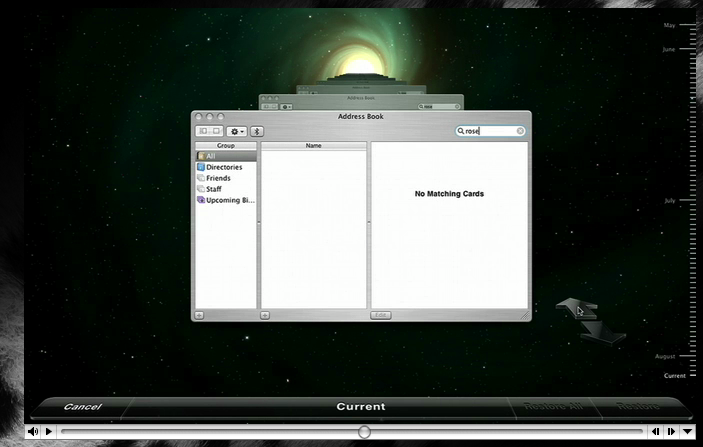
Okay, so there’s some slight good news on the interface front. While Preview.app has gone done the drain with those awful blue pill buttons, Time Machine is more toned down than shown in the keynote. Here’s the version shown publicly on apple.com:
And here’s the version shown on HardMac:
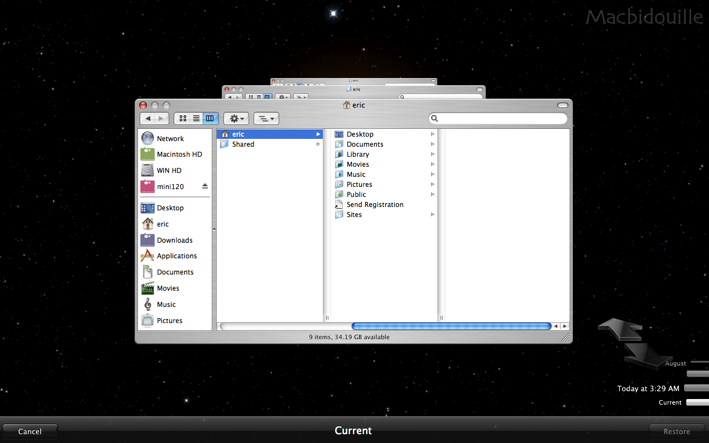
I’m pretty keen on the update, although I think the bottom panel can still be improved. Fingers crossed that I’ve gauged the direction of the user interface evolution correctly; it could well be that the ugly version is the more recent!
Anyway, say what you will about the appropriate-ness of the interface. Those moving stars in the background get my vote any day. Teehee.